Introduction
There’s a scene in the old movie Marathon Man where Dustin Hoffman wakes up strapped in a Dentist’s chair, mouth forced open, while the evil dentist drills into the nerves of his teeth, repeating the same question over-and-over: “Is it safe”? Tortured past endurance, he would answer if he could, but the question has no meaning to him. Is what safe? He has no idea.
I have nightmares where I’m that guy, with someone just out of my field of view repeating over-and-over: “Is it sharp?” I’d answer if I could, but the question has no meaning. Is what sharp? The center at f/8? The edges at f/1.4? Sharp as in high acutance? Sharp as in great microcontrast? Is it still sharp if it has massive distortion but resolves well?
People who obsess about “is it sharp?” believe that things like microcontrast and how a lens ‘draws’ or ‘renders’ are subjective and can’t really be assessed. I work with lenses all day and like to think I’m a pretty decent judge of what’s good and what’s not. I know MTF charts, construction diagrams, and specifications for way more lenses than I ought to, but there are still lenses that I know are great without being able to show on paper WHY they are great.
I also know that really great photographers usually comment on how a lens draws or renders rather than the absolute resolution or MTF chart. They didn’t get to be great without learning something so I pay attention to what they say. Even I, a mediocre photographer, often find myself absolutely knowing that a certain lens makes images that I find much more pleasing than another lens that on paper has better numbers. I hate that. I try to be scientific about these things.
So Are you Going to Tell us About the Thumbtacks Yet?
Not yet. Patience, my friends. Let’s save those who shouldn’t be reading this at all some time first.
This is intended as a moderately advanced article, so I’m going to assume (dangerous I know) that you understand what acutance and microcontrast are, understand in general terms what aberrations are, and know the basics of lens testing. If not, just click on the topic of interest in the previous sentence and it will take you to a superbly written article about that subject. You’ll probably want to read those before you tackle this.
The Setup
This started because I was discussing three 35mm prime lenses that I really like. I stated without hesitation that one was my favorite even though a different 35mm lens for the same camera measures out to be a sharper. So, I thought I’d research ways of testing the lens to measure other things, like distortion and aberration.
That didn’t take long: after reading about methods like “attenuated phase-shifting mask ratios compared with simulated light intensities”; “multiple field measurements by laser collimator” and so on I tried to let it drop. I really need to develop that skill: letting things drop. Instead I found myself doing all kinds of comparisons with those three lenses, trying to find out exactly why I liked pictures from that lens so much. Without comparing any attenuated phase-shifting mask ratios.
I’m going to show a bit of what I found out in this article, comparing three different 35mm prime lenses. I’m not going to mention which lenses they are (although I’m sure some of you will figure it out) because this isn’t a lens review. I think they are all excellent lenses and recommend each often, but it will become apparent they have some differences. The other benefit of choosing that focal length is that by definition 35mm SLR lenses are all retrofocus designs, which makes the lens designer bring out his entire bag of tricks to make a good lens.
Lens A is a good consumer-grade lens that most people consider an excellent buy. Lenses B and C are expensive, professional-grade lenses that are both considered excellent. Some people prefer one, some the other, but everyone considers both to be excellent. Each lens I used for this article has been through the steps described in my Basic Lens Testing article so we know they’re good copies. They’ve also been compared to other copies of the same lens to make sure they are functioning as well as they should.
Evaluation
Resolution
When we use the vague and unscientific term ‘sharpness’ we’re really thinking of resolution and acutance, so that’s where we’ll being our evaluation.
Center Resolution
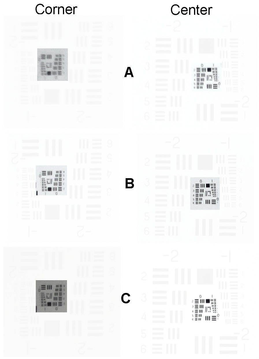
Below are center and corner crops of resolution chart images from the three 35mm lenses (all taken at f/2.0 under the same lighting and conditions).
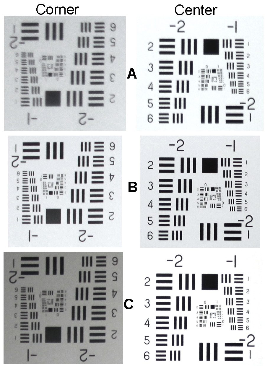
First, everybody who immediately thought “Lens B is the sharpest” go to the back of the class. Lens B does have the highest acutance in the center: the transitions from black to white (well, light gray) around the numbers, large bars, and black box are sudden and complete. If we apply some unsharp mask in Photoshop, we can improve the acutance quite a bit for Lens A and slightly for the other two (they’re already excellent). This may explain why some people might claim Lens A is nearly as good as the more expensive pair. Its acutance in the center nearly as good as the other two with a little postprocessing, and acutance is the primary concern for photographers making only small prints or web graphics.
But let’s look at the resolution – the smallest objects the lens can actually resolve clearly. Examine the smaller bars in the center of the images. On the center crops, even with Lens A, you can make out the three separate bars, both horizontally and vertically in the smallest set under the “0”. In lens B and C you can also make out the first set under the “1”. That’s the resolution and in this case B and C are even and A, the much cheaper lens, isn’t too far behind. Unsharp mask isn’t going to improve resolution and in fact may cause artifacts in areas of the image nearing the resolution limits of the lens.
Corner Resolution
In the corner crops, Lens A falls farther behind the other two lenses in resolution and acutance. Lens B has lost a little more ground in the corner compared to its center than Lens C has. Lens B clearly had better acutance in the center crop, but B and C are pretty even in the corner. (You may have to look carefully to decide that though: since lens C vignettes the most, its corner is much darker than its center.)
Our resolution charts do a pretty good job of explaining why many photographers own Lens A and feel they’ve gotten a bargain: in the center, when acutance is the main consideration (small prints and web images), it does just about as good a job as lenses costing 3 times as much. It also shows why some photographers are happy to pay 3 times the price for the more expensive primes: if the corners are important to you, you have to spend the money. But the resolution test doesn’t show why some people absolutely prefer Lens C to Lens B.
Aberrations
Resolution charts aren’t very good ways to examine lens aberrations, they’re too complex. And as I mentioned above, scientific ways to assess such things are too expensive and too complex to be used by mere mortals.
Introducing the PhotoGeekathizer
However, you can make a perfectly serviceable test chart to look at these kinds of things for about $12. It’s simply a black 4 X 6 foot posterboard with round white thumbtacks placed in the center, diagonals, and in straight lines around the edges. This one is incomplete but complete enough to give you the general idea. (And it has day-glo yellow dots, because yellow shows up well in web browsers. And Staples was out of white ones.)
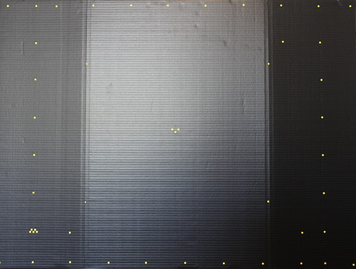
Doesn’t look like much, does it? Wait until you see what we can do with it! Perfectly round dots can show us things that all the resolution charts in the world can’t. My original plan was to market Roger’s Photogeek-a-Thizer for about $600 a copy because I knew every gear-head on the planet would want one — and I want to retire to Tahiti. Unfortunately, my attorney says I can’t really get a patent for putting thumbtacks in a posterboard so I dropped Plan A and wrote this article instead.
Let’s take a look at those corners again
I’ve cropped out the near-corner group of 5 dots and the corner dot and pasted the images shot with each lens at various apertures together so we can examine how each lens handles the edges and corners as we decrease the aperture. We all know that decreasing aperture improves many types of aberrations and sharpens the corners and edges, right?
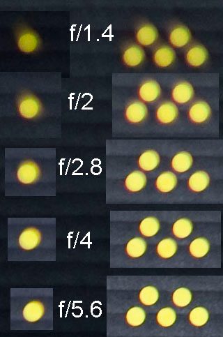
First let’s take a look at Lens A:
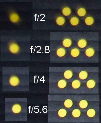
Wide open, you can see some coma-like distortion and smearing of the dots, especially in the corner at f2.0. As we stop down we notice it’s better by f/2.8 in the ‘near corner’ (5 dot pattern) but not entirely gone even by f/5.6 in the absolute corner. Of course this area is not even visible on a crop sensor camera and rarely of importance in any photograph. Overall, I’d say this lens has sharpened up nicely by f/4.
One thing I will note: I used the term coma-like aberration. Modern lenses are all designed to correct aberrations to at least some degree so you rarely see a classic demonstration of the aberrations. Rather you see partially corrected aberration, like this. And reflected dots won’t show as spectacular a coma as a bright point of light would. But evaluating the dots certainly demonstrates why the resolution chart on this lens is weaker in the corners in a way the resolution chart itself can’t.
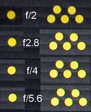
Things get a bit more interesting with lens B.
Wide open (f/1.4 for this lens) we see a very similar pattern to Lens A, but as we stop this lens down to f/2.8 the smeary coma tails disappear. However, a new aberration becomes evident: our circles are becoming distorted and oval-shaped, with the long axis of the oval at right angles to the smearing tails seen wide open. This probably represents astigmatism of the lens. The reason for the change is that coma and spherical aberration are reduced exponentially by closing the aperture, but astigmatism is only reduced linearly. (That’s a bit of mathematical approximation, but a pretty close approximation.)
Lens C shows quite a different picture:
There is some blurring wide open, but no coma-like tail and no spherical aberration. At f/2.8 there is less aberration than with either of the other lenses at f/5.6. You can also see that the vignetting, which is quite severe at f/2.0 is much improved at f/2.8.
Notice also the background of the posterboard, particularly around the groups of 5 dots and compare it to the other lenses. Even at f5.6 Lens B and Lens A don’t look nearly as realistic and 3 dimensional as lens C does.
(I should mention here that none of the 3 lenses in question have significant field curvature and all of these images were shot with best focus on the group of 5 dots using Live View bracketing, tripod, yada, yada. Focus is as good as it could be made for the lower left corner.)
But, Wait! There’s More!
Since we have this nice setup, it’s very easy to flip the lens over to manual focus and move the focus in front of, and then behind, our posterboard. The bright dots on the dark background give us the opportunity to see what the out of focus highlights will look like. One thing you may find surprising is they can look quite different in front of the plane of focus than they do behind it.
LensB gives us an interesting picture:
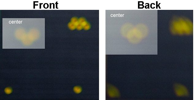
The out-of-focus highlights are quite different in front of the plane of focus, where there is mostly chromatic aberration, than in back, where there is a large amount of coma distortion.
While I didn’t have time to create real-world photographs trying to reproduce the highlights like this, I can certainly see why bokeh might be considered less than ideal, especially in images having both foreground and background out-of-focus highlights.
Lens C is quite uniform front and back:
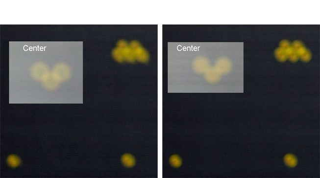
Again, one would assume the bokeh being more uniform would probably give a subtly more pleasing image. At least in certain images.
Conclusion
It’s not my intention to show one of these lenses is superior to the other: the tool is too blunt and my experience with it too insufficient for that. But I do think we’ve clearly shown they are different. That, to me, is enough to explain why some photographers would clearly prefer one to the other.
I mentioned earlier that retrofocus (AKA reverse telephoto) lenses are perhaps the most difficult to design. This is partly because the elements can’t be made symmetric about the central stop and symmetry reduces aberrations markedly. In reducing aberrations without symmetry designers may sometimes use one aberration to partially cancel out another. That seems to be the case with Lens B, which exhibits different aberrations at different apertures and markedly different out of focus highlight patterns in front of and behind the plane of focus.
This would certainly explain why Lens B showed coma which disappeared as we decreased the aperture, but astigmatism remained until the lens was stopped down further — coma has greater improvement with decreasing aperture than astigmatism.
Speaking of aberrations, we generalize that they are worse the farther from the center we go, but they don’t all behave exactly alike:
- Uniform severity across image: Spherochromatism, spherical aberration
- Somewhat worse further from center: Coma, lateral chromatic aberration (purple fringing)
- Much worse further from center: Astigmatism, field curvature, distortion.
We also know aberrations are lessened when we close the aperture. However, all aberrations are not created equal in this regard, either:
- Improve greatly with decreasing aperture: Spherical aberration, coma
- Improve somewhat with decreasing aperture: Astigmatism, field curvature, spherochromatism, lateral chromatic aberration
- Does not improve with decreasing aperture: distortion
It’s hard to put dozens of images in a blog post, but the dots-on-poster board does a great job of showing what effect the distance from center and of decreasing aperture has on a lens’ aberrations. That’s information really worth knowing in the field: it helps you determine how best to frame the shot and what aperture to shoot at.
Now, if some of you have some thumbtacks and black poster board handy, let me know what kind of things you find! I’ve got all kinds of questions myself: about wider lenses and longer lenses; if different camera bodies (which have different microlenses on their sensors) behave differently with the same lens; and even if certain cameras are using computer algorithms to correct some aberrations in-camera.
Roger Cicala

20 Comments
mshafik ·
And I would assume there are no bokeh tests for lens A because they would reveal the pentagon. 😉
Roger Cicala ·
Yessir, you are correct 🙂
Actually didn’t even do it, because I knew there was no purpose in it.
jtra ·
Bokeh is important for me, that is why I wrote an article on evaluating bokeh:
http://jtra.cz/stuff/essays/bokeh/
It is something that rarely gets investigated in depth.
mshafik ·
I enjoy every single one of your articles, I only understood MTF charts from your article.
I also agree with jtra, I am trying to analyze bokeh more, but I don’t understand why does a lens like the Canon 50mm f/1.8 II sometimes produce pure smooth bokeh @ f/1.8 (to eliminate aperture blades from the equation) whil in other times it just looks real ugly and nervous.
Roger Cicala ·
mshafik, that’s one of the type of things this has me thinking about. I wonder if we use a standardized tool like this we might see that bokeh depends on whether the out-of-focus highlights are in front of or behind the plane of focus. Maybe they also vary by distance. And certainly they will depending on whether they’re near the center of the image or near the edges. Knowing things like that will probably be useful in helping compose our shots.
Bruce in Philly ·
This stuff drives me nuts. Not you Roger, but this holy grail thing.
What is missing from all dialogs about lenses is a reference model to compare with. We need a perfect lens. A simple, cost-no-object, lens that represents the ultimate state-of-the-art in knowledge and manufacturing. Seriously, hearing about trade-offs and “no free lunch” or “at this price point” does me no good unless I have a reference point to judge. That reference point should be the The Absolute Lens.
Having said all that, I find that more often than not, you get what you pay for. Your opinion on this?
By the way, I love your articles.
Roger Cicala ·
Thank you, Bruce.
I’ve been told the closest thing to the Holy Grail is the Coastal Optics 60mm f4 Macrhttp://diglloyd.com/articles/CoastalOptics60f4/designer-notes.html I don’t have one but I’m considering correcting that deficiency. And probably the Canon and Nikon 200 f2.0s. But I think there’s no absolutely perfect lens: to me the idea is to find lenses with imperfections that don’t affect the way I shoot, or to adjust my shooting to avoid the imperfections of a given lens. The more I know about each lens, the better I can use it.
But I have to admit, I find there’s maybe a dozen lenses that I absolutely love to shoot with. So far I’ve successfully avoided putting it in a list because it will just start an endless argument thread and reality is what’s best for my type of shooting probably would not be the best for someone else’s.
Roger
Carl Eberhart ·
Roger, again congrats on another great article! I love learning new things. Very interesting about the Coastal Optics lens…
I am guessing Lens C’s maximum arperture was f/2? If that’s the case, I thought you preferred the new f/1.4 version (or maybe you haven’t had the chance to try it yet)? I’m NOT asking which brand it is, I’m pretty sure I know.
Also, maybe this is a dumb question, but in your front and back focus test…I assume that was at wide open arperture? The posterboard with the tacks is a great idea…
I own the 50mm f/1.8 II, and I find its bokeh to be fussy and full of purple chromatic aberration under high contrast conditions, I believe on objects mostly behind the plane of focus. If I remember right, this is whether wide open or closed down. That said, I enjoy it a lot on my crop camera (I don’t own a full frame). Not sure I want to keep the lens forever, though. The plane of focus seems to be curved, as well…but then I assume most of the portrait lenses don’t have a perfectly flat plane, unless they are planars? Anyway…it is very…sharp! Haha…
I think someday I want to own the 35mm f/2 lens (C) this article seems to be written about…(and that goes for even if you Roger, really do like the newer f/1.4 version better). I think before that though, I’m gonna want to buy a pro body camera…and that will be a while!
Regarding the Canon 200 f/2 lens…I have yet to try one (and definitely want to!), but I have researched it in the past. You all might be familiar with a guy, I forget who it was, found it in a google search a year or more ago…He did astrophotography shots of a star field for comparison, with a Canon 200 f/2 mounted piggyback on his telescope, and compared it to his 300mm f/2.8 Canon. I think he used a Canon 40D camera. His results showed coma distortion towards the edges and corners of the 200, where the 300 had none. He posted diagonal corner to corner crops full size on his website. I’m not making a judgment one way or another…but judging by Canon’s MTF charts alone, I could believe the 200 would have more coma than the 300. NOT that this somehow makes the 200 f/2 an inferior lens. Quite the contrary…even having never tried it…if I could have only one lens right now, and could afford it…I would buy it!
Since Canon is finally coming out with a 200-400 f/4 zoom, I think they should do something else Nikon has been doing for years…make a 1.7x teleconverter. If they do, I think that would be the only one I would own. Or perhaps a 1.55x converter….I also wish someone would make an even faster arperture telephoto…not that I could afford it if they did…yet. All the wildlife seems to come out at dusk…and I dream of being able to shoot an action shot at 1/500/sec at ISO 100…of deer splashing each other in a big flooded field, just for the fun of it…at dusk. I had to miss out on that shot!!
I finally entered 5 of my telephoto landscape photos in Outdoor Photographer’s recent “assignment #59”. Two of them were shot with the Zeiss 100mm Makro Planar that I rented from Lensrentals. And my favorite one was shot with a Canon 85mm f/1.2 that I also rented from Lensrentals. Shot at f/5.6 at a slow 1/30/second on a monopod of all things, with a Heliopan filter mounted…it’s the sharpest picture I have yet taken (tripod shots included). I was able to boost sharpness with “.5” radius in ACR, and it looks natural and detailed! (Of course you can’t see that from the tiny picture they have online). You are all welcome to vote heavily for my pics if you want, haha. I doubt any will even place, since they aren’t of rainbows and flying unicorns over Yosemite, the Tetons, Yellowstone…Narnia…etc…like the rest of the entries seem to be, haha. I need to travel more!
I recently discovered NatGeo’s photo prints website…those are all stunning. There is a picture of a redwood tree that is a stitch of hundreds of shots…looks amazing! I am also looking for a shot I saw in the magazine a year ago of a bay in Greenland, I think with an approaching storm. I forget which photographer…I’ll eventually find it I guess.
Cheers Y’all!
alek ·
Another GREAT article Roger … except now I have even more to think about when testing/obsessing over my gear! 😉
And as someone with poor eyesight with a cataract developing a couple of decades early (darn!) and causing increased astigmatism, that set of pictures of Lens B really hit home.
Well done,
alek
P.S. Wasn’t entirely in your Bokeh test, but I’m assuming you moved either the camera or the poster-board, rather than rotating the focus ring (?) since the former would be more consistent/real-life..
Roger Cicala ·
Alek, a good point and one I didn’t think about when playing with this. But I did do it by switching to MF and moving the focus ring.
Marc de Vries ·
Interesting article, but there is something that I don’t understand.
Why is the smearing that is so clearly visible in the “dots-on-a-posterboard” test, not visible in the resolution charts?
Are we looking at a higher magnification at the dots?
Roger Cicala ·
The magnification is similar, and what we see as smearing of the larger circle is part of what causes the “blurring” of the resolution in the corners. With thin lines it’s difficult to tell what type of aberration causes the blurring, but it gives you a number that quantitate how much has occurred. The larger circles show the type of distortion involved more clearly, but don’t quantitate it as well as the lines. Basically it’s two different ways of looking at the same effect. One is good at showing “how much”, the other is better at showing “why”.
Roger
Marc de Vries ·
hmm, to me it seems that one is good at showing nothing, while the other is good at showing both “how much” and “why” at the same time.
The problem I have with the resolution chart is not that I cannot tell what type of abberation causes the blurring, but that I cannot tell there is any significant blurring going on at all. It’s very difficult to see any difference in B and C. And it’s not only horizontal and vertical lines in that resolution chart. There are numbers that have circles in there too.
While it is obvious there is a huge difference between B and C when you look at the dots.
Could it be something about the color that makes the blurring easier to see?
I wonder what would happen if you put a dot on the resolution chart so you could see both in the same shot.
As it looks now, I would forget about test with resolution charts and just test with the “photo-geek-a-thizer” 🙂
Phyl ·
I always read your articles with interest. They are helpful and informative, even if a lot of it goes over my head.
But, your PhotoGeek-a-Thizer is just “tacky”! 😉
aK ·
A: Canon 35mm f/2
B: Canon 35mm f/1.4L
C: Zeiss 35mm f/2 (probably ZE version assuming Roger used the same body, most like a full frame, high res such as 5D2 or 1Ds3) 🙂
Doug ·
Roger,
Another great article you’ve written has taught me quite a bit in a relatively short amount of time. Also, in despite of the fact that you didn’t include lens names, I figured it out on my own. That being said, I appreciate the fact that you didn’t concentrate on that aspect. Each brand and each lens has its own associations, followers and preconceived notions that would get in the way of the lesson here. Although I am often skeptical when I hear people talk abstractly about the “rendering” or “3d properties” etc of certain lenses, the more I use different lenses, the more I realize their is definitely some validity in this. What you have shown is that there may be scientific reasons behind what lenses we prefer, we just don’t necessarily know the names behind the affects that contribute to our assessments.
Keep them coming… thanks!
Doug
Pavan ·
Great article! I finally understand MTF charts. Armed with this new knowledge, I have been looking at the MTF charts of various lenses over the past week. An interesting question comes to mind regarding Sigma lenses… Are the published MTF charts made on Foveon sensor cameras or ones with a Bayer sensor? If the charts are made on a Foveon body, how different might they look if they had been generated on a Canon or Nikon body?
Also are the MTF charts of Canon lenses made on full frame or crop sensor bodies?
Would be interesting to know. Thanks again for your articles.
Roger Cicala ·
Pavan,
They’re none of the above: except for Zeiss and Leica all the other manufacturers use computer generated MTF charts based on the theory of the lens, not actual testing.
Roger
Bubba ·
Lens C is non retrofocus 35 Cron?
Adam ·
Hi Roger,
I always love reading your articles. I had to come back to this one because I find the information very interesting. As an owner of Lens B (or at least I think I am…), there is a certain lack of sharpness at or near wide open that I have never quite put my finger on, but believe that you have. Hopefully the make is coming out with a Mark II version soon.
That being said, I would love to see some additional comparisons like this of other popular lenses. Especially between the latest versions and older versions to see the improvements made. I think it would be very popular and generate considerable interest. You have a unique position with access to so many different lenses. This would really help to put some myths to bed.
Thanks again for your work!