MTF – The English Translation
This post contains absolutely no mathematics. Explaining MTF without math is sort of like doing a high-wire act without a net. It’s dangerous, but for any number of reasons is more likely to keep the audience interested.
Why Am I Doing This Again?
I wrote an article on reading MTF charts several years ago. It focused on deciphering the MTF maps that many lensmakers publish when they release a lens, like the one below. But I get a lot of emails asking me asking me how to compare the MTF graphs we use in testing to the manufacturer’s MTF charts. Or asking me to show an MTF frequency chart (and if I show it, then lots of emails asking what it means). So I thought I’d write a quick post about the different types of MTF data and charts.
So first, an overview of the common types of MTF charts.
MTF Maps
I use the term “map” because the horizontal axis maps the lens from the center (‘0’mm) to the edge of the frame (24mm). The colored lines show how certain MTF values change as we move from the center to the edge of the field of view.
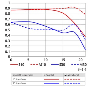
Except for the ones put out by Zeiss and Leica, these MTF maps are generated from computer models. Looking at the computer-model MTF map is like looking at a retouched photo of a swimsuit model — the real-life the curves are never quite as good as the image suggests.
A real MTF chart, put out for an actual lens, looks like the one below. Notice it has “0” (the center) in the middle and goes to both sides, showing one dirty little secret: very few copies of any lens have exactly the same MTF curve on both sides.
What About Those MTF50 Numbers in Lens Reviews?
These days more people seem to pay attention to MTF50 tables generated by computerized target analysis, which appear on most review and testing sites (including this one).
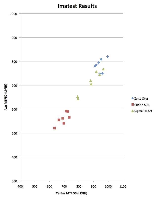
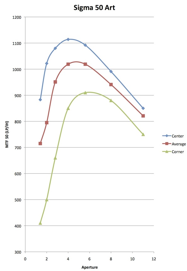
MTF 50 graph of the Sigma 50mm f/1.4 lens, showing MTF50 of the center, average value, and corners at different apertures.
Those are useful, of course, but now we’ve perhaps gone too far. People who don’t actually know what the MTF50 means think it means sharpest or even best lens, which isn’t absolutely true. Just like Mount Everest is a good, but not perfect, definition of “the world’s tallest mountain,” the highest MTF50 is a good, but not perfect definition of “sharpest lens.” (Depending on your definition of ‘tallest’, Mauna Kea or Chimboraza might actually be tallest.)
It gets even more confusing. The MTF maps the camera makers put out, like the one at the top, gives MTF results in 10 and 30 lines/mm. Some people think MTF50 means MTF at 50 lines/mm, but it doesn’t. It actually gives you a completely different set of information.
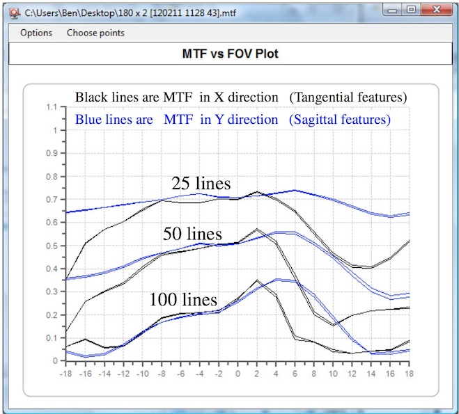
MTF Frequency Graphs
Finally, you sometimes see a frequency MTF graph for a lens, that looks something line this. It kind of looks like the MTF map I showed at first, but actually they have very little in common. The Frequency graph shows you the MTF50, but adds a lot of additional data.
If you bear with me for a few minutes, I’ll explain what these various MTF numbers and graphs are showing us. If you like lab testing, this will let you understand the tests you more clearly. If you hate lab testing, it will still be worthwhile because you’ll be able to say things like, “The MTF50 numbers in that post don’t show anything about the fine detail resolution capabilities of the lens” in online discussions.
So What Are These Different MTF Numbers of Which You Speak?
MTF
They aren’t actually different MTFs, they are different ways of using MTF (Modulation Transfer Function) to show different information. Let’s start with a simple definition of the MTF. We’ll do it without math, which will be better for everyone. (For 95% of people it will be better because they can understand what they’re interested in. For the other 5% it will be better because they can break out various formula and make lengthy posts about why this definition is incomplete.)
When a lens makes an image, it’s never a perfect image. For example, let’s start with some thick, black and white bars like this:

If I focus a lens on them, the image the lens makes looks almost, but not quite, the same, like this:

If you look closely, you’ll notice the second image is just a tiny bit blurry. If you measure it very carefully, you’ll find the black isn’t quite as black as the original, and the white not quite as white. You might not notice it on a computer screen, but the difference is there.
Now I’m going to show you the MTF formula without any math: MTF = contrast. We can make it just a bit more complex and more accurate without getting mathematical: MTF = blackest**–whitest/blackest+**whitest.
You can handle that even with some numbers, right? Let’s say pure black is 1 and pure white is 0. Since the original object is pure black and white we have (1-0/1+0)=1. It’s perfection.
The image a lens makes isn’t quite perfect. In my example, the black is 98% as black as the original image, the white is 98% as white (or put another way, the white is now 2% black). If we plug that into the formula (you don’t have to, just showing you) it would be .98-.02/.98+.02=.96. So the MTF of this lens for these thick black bars is .96.
What if we use smaller bars put closer together, like the images below?

Lenses have more trouble as the bars get smaller. Pretty soon, the grayish blur from the edge of one bar starts to touch the edge of the next bar. The image looks like this.

Now the blackest bars in the image are 66% as black as the original, while the white areas are actually 34% black in the image. I won’t bore you with the formula, but the MTF for our close lines is .32. The difference between an MTF of .96 and .32 is pretty obvious just looking at the pictures, but the numbers make things more comparible. Saying “the MTF drops from .96 to .32” tells someone else the results more accurately than if you said, “It goes from barely blurry to pretty blurry, but I can still count the bars.”.
What About Those Line Pair Things
If we want to be all scientific, we can’t just use some arbitrary ‘thick lines’ and ‘thin lines’ like I did above. We need to quantitate them, and the quantity we use is lines or line pairs per mm. It’s the same thing, basically; a line pair is a black and white line, a line would just count black lines.
The ‘per mm’ part is mm at the image plane. (The camera sensor is at the image plane). If everything were perfect, the test target would show X number of lines across each mm of the image plane. Thick lines, like the first example, might be 10 lines per mm. Thinner lines, like the second example, might be 40 lines per mm.
The lines per mm count is usually referred to as the “Frequency” or “Spatial Frequency.” So now we have two things we’re looking at: the MTF, which is a measure of contrast, and the Frequency, which is how small the lines were that we used to measure the contrast.
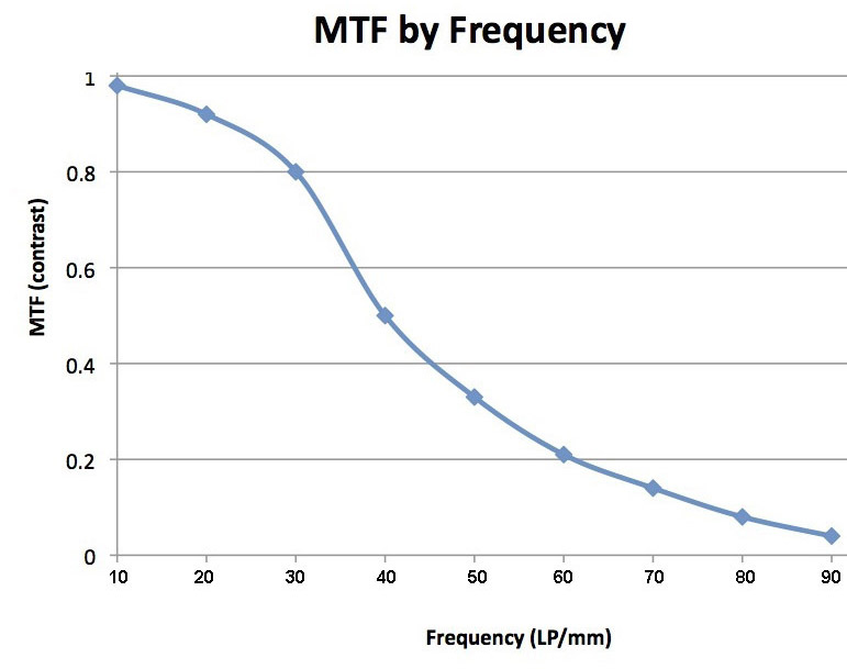
At a single point on the lens (right at the center, for example) I can measure the MTF at different frequencies (lines /mm) and make a nice graph of the results. Remember, this isn’t across the entire front of the lens like the very first graph. This is measuring one point on the lens at different frequencies (smaller and smaller lines). Every lens, like the graph below, has lower MTF as the lines get smaller (the frequency gets higher).

If you look at the left side of the graph, the MTF (contrast) measurement, it’s a simple matter to find the MTF50 (or MTF 10 or MTF90 for that matter). It’s simply the frequency (lines per mm) at which the image retain 50% of the test target’s contrast. (Or 10% or 90% of original contrast form MTF10 or MTF90).
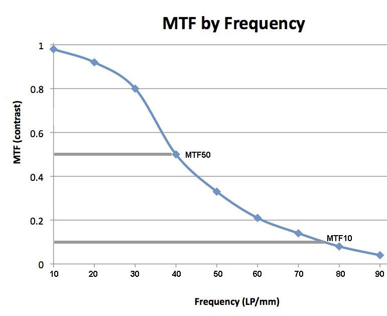
In this example, the MTF50 is about 40 LP/mm. When I (and most current reviewers) report the MTF 50, this is what we’re showing you. Most of us use LP/Image Height rather than per mm, so we just multiply LP/mm by 24 (since a full-frame sensor is 24mm high). So in one of my standard reports for this lens I’d say the MTF50 was 960 LP/IH, which is quite good. But my reports wouldn’t tell you the MTF10 is about 77 LP/mm, or the MTF90 (which doesn’t have a gray line in the image above) is about 22 LP/mm.
Also, remember the Frequency graph is for just one point on the camera lens. When we post a set of bar graphs showing center, average, and corner MTF50, we’re showing you the MTF50 at different locations.
So is the MTF50 the Most Important Number?
Why do we lens testers give you the MTF50 numbers? Well, the first reason is it’s the default reading in Imatest software, so it’s simple and easy. There’s also the fact that most of the lens testers use it and people like to be able to compare results from different testers, so there’s kind of an MTF50 gentleman’s agreement going on. Plus, 617 different graphs showing MTF Every Frequency at lens locations Everywhere just cause an article to be confusing and chaotic.
But the truth is that MTF50 is a probably the most important overall MTF number when evaluating a lens. MTF50 is has been shown in numerous studies to be the point where humans perceive an image to be “sharp” rather than blurry. That makes sense – it’s basically where the contrast is greater than 50%.
But MTF50 is not the only important number. Those other frequencies give us different, but important, information. Lower frequencies, like MTF 80 to 90, show how “contrasty” an image is. If you photograph large, bold structures, this area of the frequency curve may be more important to you than the MTF50.
Numbers like the MTF10 or MTF5 are the absolute resolution limit of the lens. They show what the smallest detail that the lens can possibly resolve is. Anything smaller is just smooth gray blur. Trained human observers and image enhancement programs can actually make out some details at MTF5 in a photograph, but most of us need MTF10. Landscape and macro photographers trying to get the most detail in their large prints might consider MTF10 to be more important, or at least nearly as important, as the MTF50.
For example, here is a frequency graph of another lens that has exactly the same MTF50 as the lens above, 40 LP /mm. However, the MTF10 is lower (about 69 LP/mm compared to 77) and the MTF90 is higher (30 LP/mm compared to 22). So this lens should be more contrasty but not resolve tiny detail as well as our first lens.
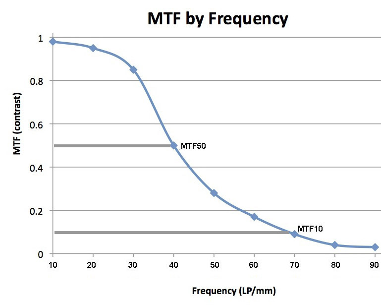
Some lenses with very high resolution have rather poor contrast. Other lenses have very good contrast, but their resolution is poor. Stated another way, some lenses have very high MTF10, but poor MTF80. Other lenses have great MTF50 and MTF30, but low MTF10.
One Point
It’s really important to emphasize that the MTF10 in these frequency charts is completely different than the MTF at 10 lines/mm in the MTF map of a lens I show at the very top of this post. The MTF at 10 lines/mm (in the MTF map at the top of the article) is showing you how much contrast thick lines have at various positions as you go from the center of the lens to the edge. The MTF50 in the frequency graph is showing you how small the lines can be that still retain 50% of their original contrast.
So Why Am I Bringing This Up Now?
Because it’s time to improve. Like everyone else we’ve been showing MTF50 results from Imatest shot at fairly close range charts. That gives us a number for the whole system (camera and lens) in a map across the front of the lens.
Soon we’ll be adding optical bench results to our Imatest results when we test lenses. This will allow us to look at several other things: the performance of just the lens rather than the lens-sensor combination, the performance at infinity focusing distances rather than close up, and MTF at different frequencies among them. We’ll even be able to create front element MTF maps of the lenses we test, and compare those to the computer generated MTF map of the manufacturer. That should be fun and interesting. (Well, it will be fun and interesting for us. I’m guessing maybe some manufacturers won’t be so crazy about it.)
When we test lenses we’ll continue to show you the same MTF50 data that we’ve been showing and that everyone else shows. It’s important data and we already have a huge database of MTF50 results for lots of lenses so it’s great for comparison. We’ll also be adding Frequency MTF charts for the center of the lens, and probably for one or two points off-center. We don’t have a big database of this information yet, but I’ll be able to give you some comparisons to one or two similar lenses.
Since we’ll be showing things besides simply the MTF50 map of the front element, I wanted to show what those other values meant and why that is worthwhile information. The bottom line is we’ll be able to give a more thorough evaluation of lenses than we’ve ever been able to do.
Roger Cicala
Lensrentals.com
April, 2014
Further Reading (with Math)
http://www.normankoren.com/Tutorials/MTF.html
http://en.wikipedia.org/wiki/Optical_transfer_function
http://diglloyd.com/articles/UnderstandingOptics/understanding-MTF.html
http://kurtmunger.com/sitebuildercontent/sitebuilderfiles/zeissmtfcurves2.pdf
30 Comments
omer einav ·
Great read
Thanks roger
JL Williams ·
Great explanation and, amazingly, a fun read. But I’m going to put on my pedant’s hat and note that most sources say MTF stands for “Modulation” (not “modulated”) transfer function. Modulation is what is being transferred.
Roger Cicala ·
JL, you are correct and I’ve now corrected where I was less correct 🙂
Thanks,
Roger
mrc4nl ·
nice article, though i wonder the correlation between lpmm and lw/ph 😛
and the math behind it of course.
ginsbu ·
Roger, your future plans are very exciting! I noticed that you have only one of the Zeiss MTF papers on your reading list, and are missing the example images for the paper you do have linked. I’d strongly recommend including them all on the list and have included links to them on the Zeiss website below. The example images from CLN31 do a wonderful job of illustrating how varying MTF for different spatial frequencies translates into real images.
CLN30: How to Read MTF Curves I — http://www.zeiss.com/content/dam/Photography/new/pdf/en/cln_archiv/cln30_en_web.pdf
CLN31: How to Read MTF Curves II — http://www.zeiss.com/content/dam/Photography/new/pdf/en/cln_archiv/cln31_en_web_special_mtf_02.pdf (Example images: http://www.zeiss.com/content/dam/Photography/Camera%20Lenses/international/zip/cln_blog/MTF_images.zip )
Beat Stamm ·
Thank you for this easy and effective intro.
(BTW: last MTF graph probably meant to read 10, 20, …, 90 on its frequency axis, like the other graphs)
Roger Cicala ·
Thanks, Beat Stamm – I put up the ‘pre’ image. Corrected that now.
Nqina Dlamini ·
Great article and reads quite nicely.
Was “thew world’s tallest mountain” meant to be “the world’s……” (I feel so smug now, I have corrected a spelling error, where is my cookie…LOL).
Thank you
L.P.O. ·
“the white is now 0.02% black”
Shouldn’t this be “2% black”?
I’m intrigued to see where this epic story goes in the next episodes.
Lynn Allan ·
Good explanations. I’m looking forward to lots of OLAF results. I think LensRentals articles have the potential to be unique because of the availability of multiple lens copies.
henkie ·
Interesting read, Roger. So there is an actual basis for it when people say that, for instance, their Zeiss lenses are more contrasty than other lenses.
Btw, in the second to last graph, it says MTF60 instead of MTF50 at the black line. At least, I’m assuming that’s what it is supposed to show, as the last graph does say MTF50 and the text with the graph also suggests MTF50. Well, and most of the article is about MTF50.
Mike ·
Thanks for this Roger. I’m reminded of this more ‘math heavy’ essay about resolution and pinhole cameras that demonstrates these issues rather well. It’s probably more difficult to read for most, but with accessible cartoons and prose for others.
http://www.biox.kth.se/kjellinternet/Pinhole.pdf
Rick Shimonkevitz ·
Roger, does Leica publish actual measured MTF curves? I read on a Leica “authority” site that Zeiss does, but Leica’s are calculated?
Thanks for all your recent articals, histories included, I now am a regular reader.
Roger Cicala ·
Rick, Leica’s used to be measured, but they may have moved to computerized and I just missed it.
Roger
Mark Turner ·
Once again, Thanks Roger for a great read, and Mike, thanks for the pinhole link, not the least of which because I goof around with them. I’ve been convinced that one of the differences in Zeiss/Leica vs modern “digital” lenses is partly the MTF vs frequency plot, where lower frequencies are either more marketable or more yield-able in high volume manufacturing than the high frequencies. I’ve been pondering whether a low contrast-high frequency lens could have its contrast enhanced in PP, but a high contrast-low resolution lens will always be resolution limited. I play with a $14 ZU 50 f/1.7 as my “pancake” lens, and by today’s standards I have to increase contrast a bit, but it can look over-sharpened pretty quickly if I’m stopped down a little. Even a friend’s borrowed EF 85 f/1.8 had the same relationship compared to my 18-200mm kit zoom, the older design of the 85mm lens had little less contrast but I had to be careful with any sharpening above about f/5.6, whereas the zoom is more contrasty but some sharpening is almost always required.
Arun H ·
With all the technical discussion here on MTF, I wanted to share something I learnt from Nasse’s whitepaper, which you reference here as well as in your first article on MTF. There is a beautiful graph and associated takeaways on page 6 and 7. What it boils down to is this: if what you are shooting has low contrast to begin with, then MTF numbers above 0.7 or 0.8 are basically indistinguishable. Increase the scene contrast on the other hand, and even the difference between 0.94 and 0.97 is perceptible.
My takeaway from this? Your skill matters. Choose your scene, subject, and lighting carefully, and that 24-70L II will make it eminently clear to you why you paid so much for it. Don’t do this, on the other hand, and you might as well spend your cash on something else.
Aaron ·
“So I thought I’d write a quick post about the different types of MTF data and charts.”
Every time you say this is going to be short, I plan on dedicating an extra 10-15 minutes to read and understand the post. Not that I’m complaining, quite the opposite. But when you say “short”, that’s shorthand to me for going to be a long read and technical article that I’m going to need to take my time reading in order to understand.
More of these please 🙂
Will Frostmill ·
Hi Roger,
This one is really tickling my brain. Can you explain a little about how different contrasts at different frequencies relates to sharpening and acutance or microcontrast? I remember reading that someone picked a very large sharpening radius and a very low amount to goose the MTF in some frequency that made things look crisper. (I can’t find the reference, but I know it was on T.O.P.) I get the feeling that there’s something pretty significant here, with how MTF and sharpening relate, but I don’t quite get it yet. (I’ll read the article again, too.)
Karel Kravik ·
My point of view is probably oversimplified, but considering that contrast is relatively easy to add in postprocessing, but very hard to take away, then should we value the lenses with high resolution and low contrast?
Samuel H ·
Very useful refresher post. Of course I’ve read your earlier ones on the topic, but this is one of those concepts that my mind tends to forget about very easily.
Now, to complement the article with a practical example: how does the sigma-canon-zeiss 50mm chart change if you use MTF10?
Pelle ·
Thanks for a great article.
Some nitpicking though; the normal Canikon MTF maps go to 22mm which is an image corner. To reach the upper/lower frame edge you only need 12mm and 18mm to left/right edge.
Brian Chambers ·
I was told there would be no math.
I don’t know if it is appropriate to share this here but it reminded me of this …. watch the embedded video in the middle of the page
http://pjmedia.com/eddriscoll/2012/05/17/high-school-kids-nyt-confused-by-definition-of-caveat-emptor/
NancyP ·
Very clear explanation. For your next post on the topic, you might address why MTF testing is done and shown on sagittal lines and meridian lines, and why we should care (a link to your “7 deadly aberrations” post may be in order here). I have heard it said that the sagittal and meridian curves at a given line frequency should be close together for best bokeh. I would guess that the various aberrations (longitudinal, lateral, astigmatism, etc) should be similar in degree, maybe canceling each other out, to have harmonious bokeh.
oeriies ·
I’ve been confused and continue so with regard to why the relative sharpness of lenses based on the maker’s MTF charts is different from the relative sharpness based on MTF50 tests such as those published here and elsewhere. For example my Nikon f/4 500mm VR G is a bit sharper than the Nikon f/2.8 300mm VR G based on Nikon’s MTF charts, whereas at DPReview, DxOMark, and other sites that use MTF50 there is no contest (the 300mm is much sharper than the 500mm). Why?
Joel ·
Roger,
There is a lot of very abstract discussion about lenses, with instant characterisations of “good” and “bad” bandied about with little appreciation of their complex behaviours or their artistic merit. As sensor resolutions increase, these behaviours are more clearly in evidence and we photographers have to up our technique to get the best from a system.
In order to help photographers better understand their lenses, would it be possible for you to generate and publish interactive 3D models of the zone of focus, angle of view, field curvature etc. as the various virtual lens controls (focus, aperture, zoom) were adjusted?
I imagine a lens floating in the air with a region projected in front of it that illustrates where best focus might be achieved for the current setting. The zone would change shape and depth in response to control settings. The model could be spun around to fully appreciate the characteristics of the lens. Various scales could be embedded in the model so that approximate measurements could be made. Characteristics like field curvature or spherical aberration would be much easier to understand with this model.
This would obviously not be a full exposition of the lens’ performance but it would be a very useful guide to how best to choose and use a lens to obtain the maximum performance from it and in what circumstances and at which settings one should be paying special attention. One might embed within the synthesised region, thumbnails of the type of aberrations that the lens produces, giving a spatial context to them.
The aim would be to understand a lens rather than just rating it.
Roger Cicala ·
Joel,
Actually, that’s some of the reason I recently bought an MTF bench. It will generate field curvature in both 2 and 3-D among other things. We’re still working the kinks out (which is why I haven’t written much lately) but those things are comign soon.
Ramon ·
On one of the MTF videos I saw, the person claimed that the most important line in a Canon MTF map, was the top dark one. From my understanding that is the contrast graph at 10lpm, but after lookng at many such graphs from Canon, that graph is always on top, so, pretty much all the lenses have good contrast?, (or is it micro contrast?).
Gary ·
Dear Roger.
By far the simplest and best MTF frequency (for dummies) I read. Thank you and well done.
It is so simple the way you explain it.
Yucel Yalim ·
Best explanation of MTF charts every. Thanks
Rahul ·
Hey Sir,
Great Article, while checking out some of the lenses, (they were amazing) i was wondering how these MTF charts would come out, especially MTF50.
2 stand out lens that i recently tried (via lensrental)
are canon RF 85 1.2 with desmoothing ( https://www.lensrentals.com... ) and canon rf 50 1.2.
Both of them being phenomenal lens, when shooting actually at f/4-8 (because i mainly do studio beauty and fashion) i thought Nikon Z 85 & 50 1.8 held their own. This could be contributed to my Nikon bias. or partially to me owning all time greats by Nikon such as micro 200 f/4, latest on f mount 70-200 2.8 (with lot of abbreviations).
I'm renting Hasselblad XCD lens (Lensrental order is in transit) and i wanted to check if MTF testing is still in and how can we (the fans) of lensrental can get access to those readings.
This will help (immensely) to make decision to commit to camera mount. Though it is kind of made, given the amount, i was hoping some justification via the MTF charts so i can convince myself that that amount is actually worth it :)