Note: This is a Geek article. If you aren’t into geeky stuff, you won’t be into this.
“We take a step back so that we may leap further.” African proverb
I wrote a post a couple of weeks ago about our first copies of the Sigma 50mm Art lens, and promised to follow up when we got more samples. Unfortunately, for the first time in history, Tyler just can’t get any copies, so I’ve been unable to look at sample variation any further.
It’s always been my practice to not write anything when I don’t have anything to write about — somewhat unusual for a blogger, I know. But it’s been so long since I posted that several people have asked if I was OK. So I thought I’d show you why we’ve been so busy, and why we should start posting some very cool things quite soon.
More Equipment
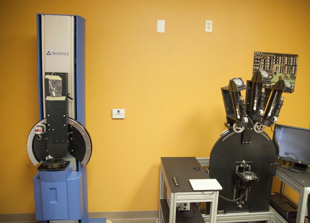
Right after we moved into new space, we took delivery of OLAF and started improving our lens adjustment and assessment techniques. We spent most of April learning what OLAF could show us and how we could use it.
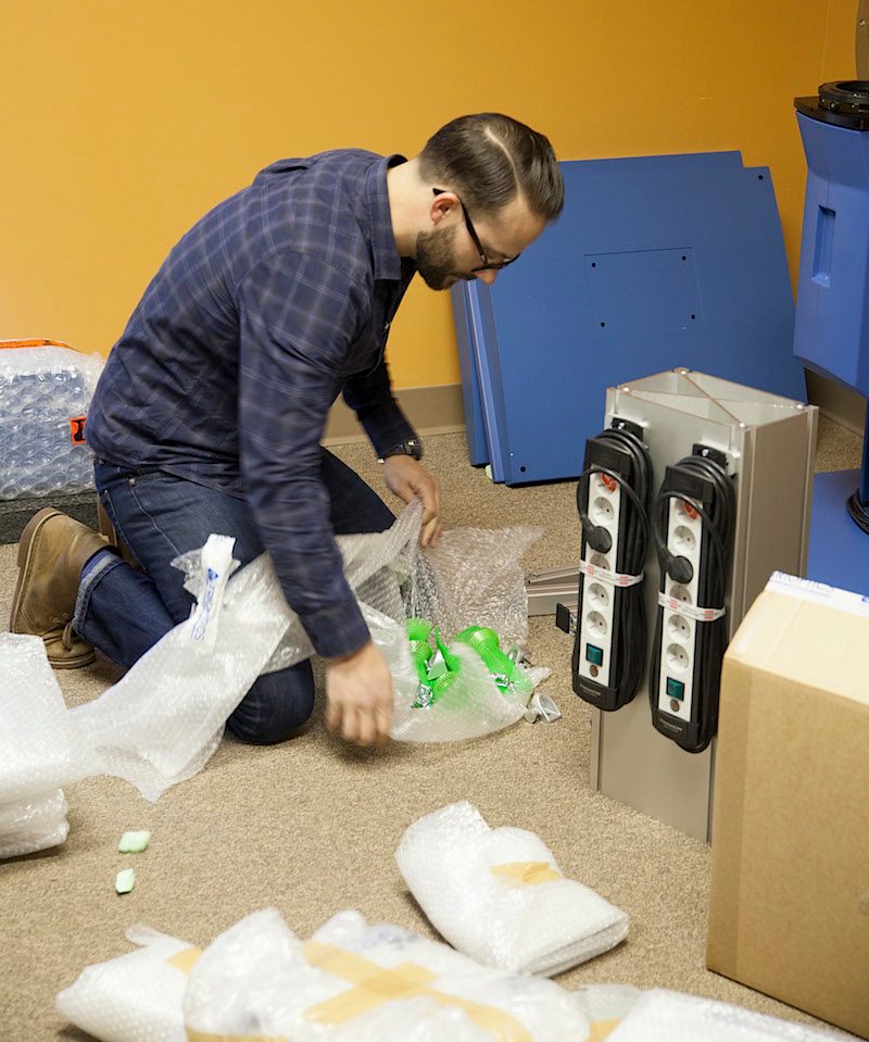
Our Imagemaster optical bench was delivered from Trioptics the first week in May, arriving in a crate that was larger than some hotel rooms I’ve stayed in. Unpacking it was fun – although we had to wait for Byron, the Trioptics engineer, to arrive before they’d let us open it.
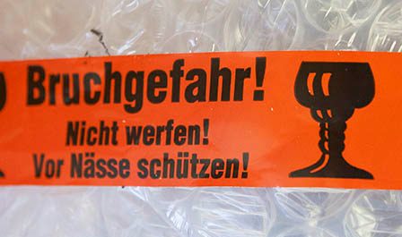
Even warning labels seem much more serious when they’re in German. I thought this meant ‘have a beer before setting up this equipment’, but apparently it’s just ‘Handle with Care’.
Set next to OLAF, I thought our new toy testing equipment looked very nice and I was ready to play with it.
But assembly took a lot longer than I expected. Judging from his expression, I think it took longer than Byron expected, too.
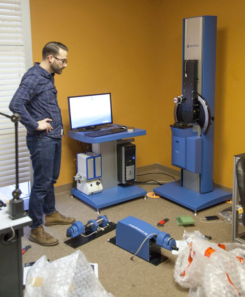
Once it was finally together, I thought we’d get to play with it. But there was lots of calibration and recalibration left to do.
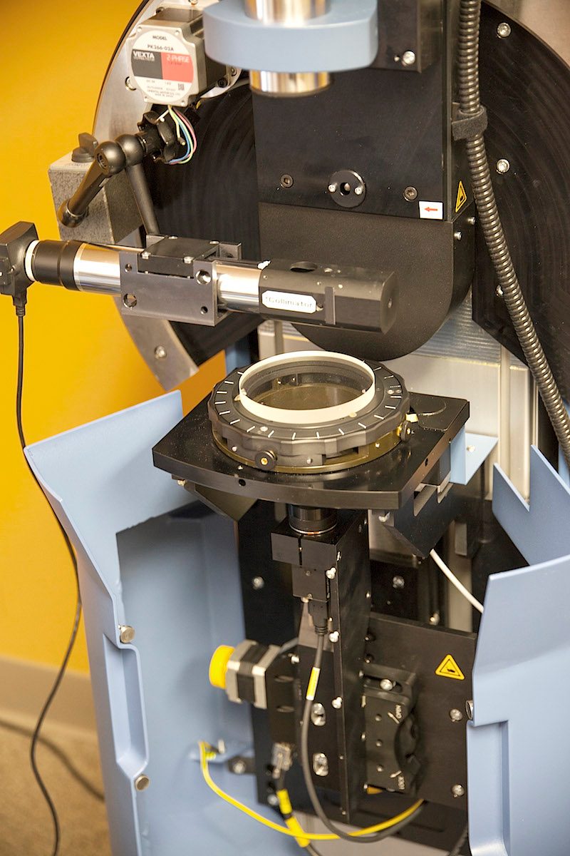
Followed by two full days of rather intense training complete with a 200-page manual to study. I was afraid there’d be a test and we wouldn’t get to keep the machine if we failed.
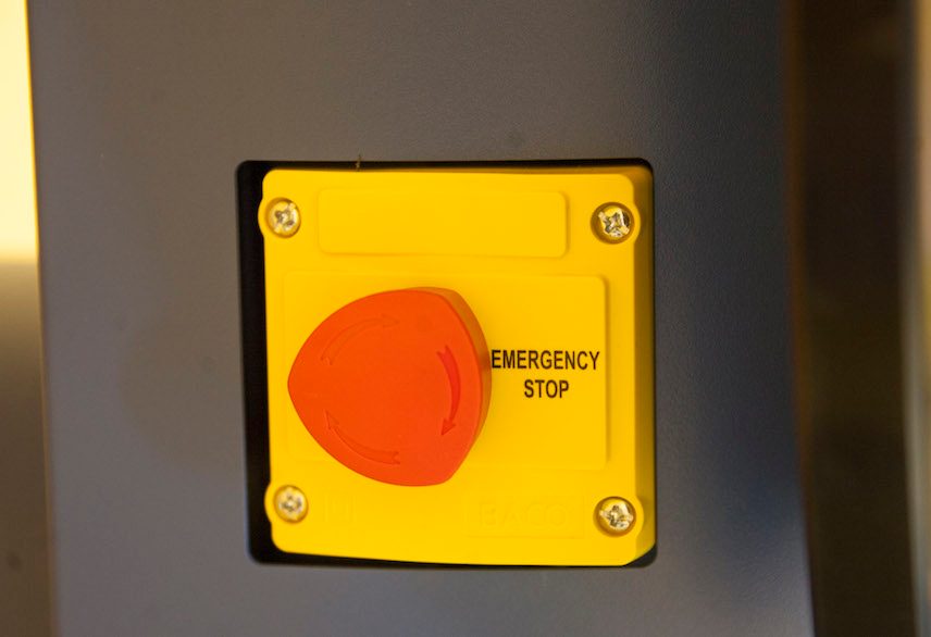
And I’ve always wanted to have a machine with an emergency stop button. I can’t imagine what we would need to emergently stop testing a lens for, but we’re absolutely ready if it happens.
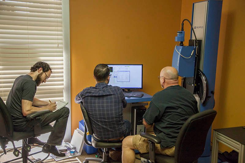
Of course after taking 3 days for that stuff, we were so backed up in repair that we had to spend a couple of more days catching up. So it was last week before we really got to start playing with using our new toy equipment.
So What Does This One Do?
First and foremost, of course, it measures the MTF of the lens. As opposed to Imatest, it measures with the lens focused to infinity (depending on focal length, Imatest measures at distances from 5 to 30 feet). Having both capabilities is important because many lenses perform differently at infinity than they do close up.
It also measures just the lens, where Imatest and DxO measure a lens-camera combination. That’s important because it lets us separate out many variables, especially when so many cameras are now processing even raw files in-camera. And it does it quickly, as you can see in the video below.
MTF testing with the TRIOPTICS ImageMaster from LensRentals.com on Vimeo.
It does a lot of other very nice things, too, like measure field-curvature, distortion, actual focal length, lateral and spherical chromatic aberrations, and shoe size. The bottom line is we now have access to more optical testing equipment than – well, anyone in the U. S. except a few government installations and some Universities.
We’ll be using it for lens tests and reviews going forward, but before we start doing that I have to assemble a comparative database: right now I have data for thousands of lens copies using Imatest, so I know things like expected sample variation, acceptable ranges, etc. Until we get some similar data using the Imagemaster I won’t be comfortable making generalizations. But in the meantime I thought I’d show you some examples.
Some Optical Bench Examples
MTF Across the Field
Remember that in some ways optical bench results are very different from Imatest results, as I blogged about earlier and more like the MTF maps that manufacturers give for their lenses. With the major difference that these are measurements of real lenses, not computer-generated ideal-o-graphs.
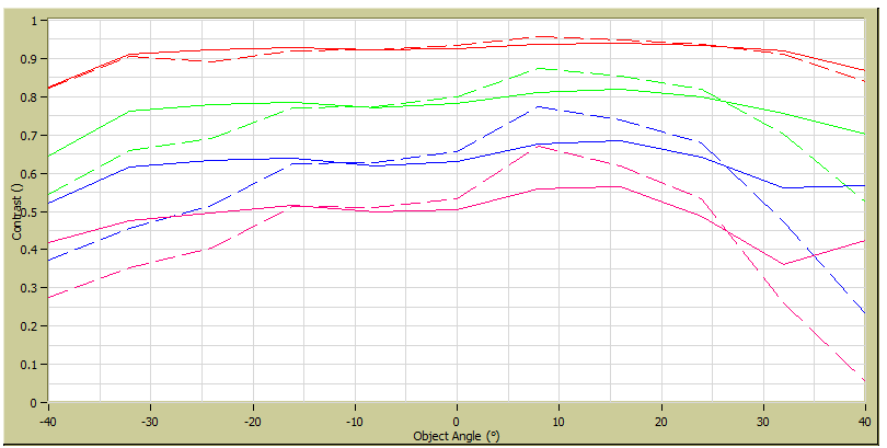
Below is an example for Imagemaster results for a very good lens, the Zeiss 21mm f/2.8. Notice the graph shows 10, 20, 30, and 40 line pairs / mm. (Since we’ve previously reported MTF50 in line pairs / image height, we can multiply by 24mm to get the numbers per image height, so if you’d prefer this is the graph for 240, 480, 720, and 960 lp/ih.) The solid lines are sagittal resolution (lines going from the center of the image toward the edge); the dotted lines are tangential (lines at right angles to sagittal lines). The difference between the two is astigmatism.
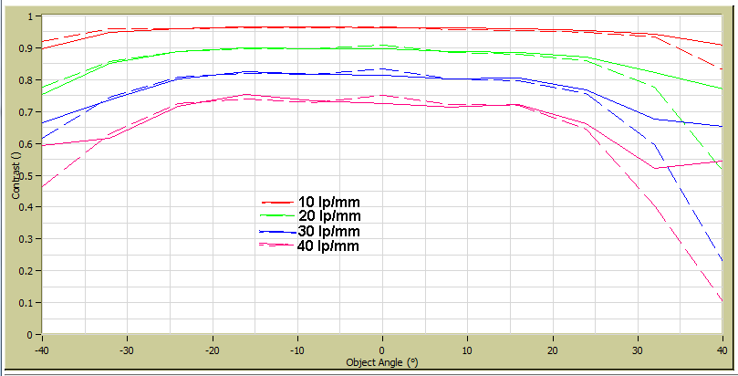
Probably the first thing you notice is this lens has a bit more astigmatism on the far right side. This is just minor sample variation, every lens is slightly different. For comparison the image below shows another copy of the Zeiss 21mm that was decentered enough to be noticeable when carefully shooting a test chart. Not only is the astigmatism much more severe, but the absolute MTF numbers are lower (notice the 20 lp/mm lines are around 0.9, or 90% in the good lens, while they’re largely below 0.8 in the bad lens).
Frequency Graphs
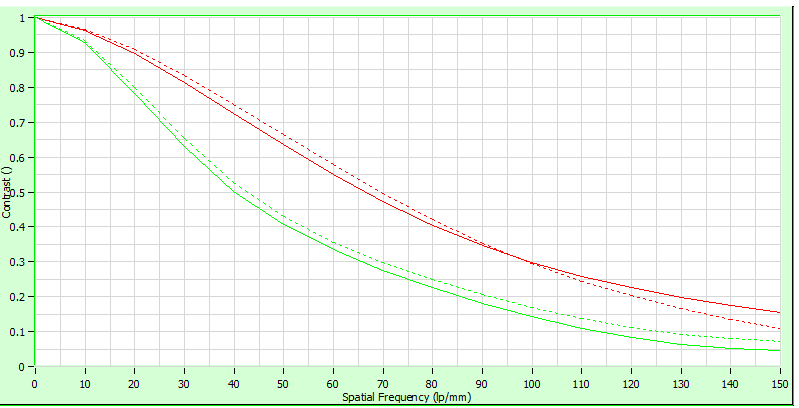
Frequency graphs show us how a single point on the lens (usually the center) resolves as the lines get smaller and smaller. Here is a frequency graph comparing the centers of the two lenses in the graphs above. The better lens is the red curve and again, solid lines are sagittal and dotted lines tangential. You don’t have to understand what this is to realize it’s a tool that does a nice job of comparing lenses.
Distortion
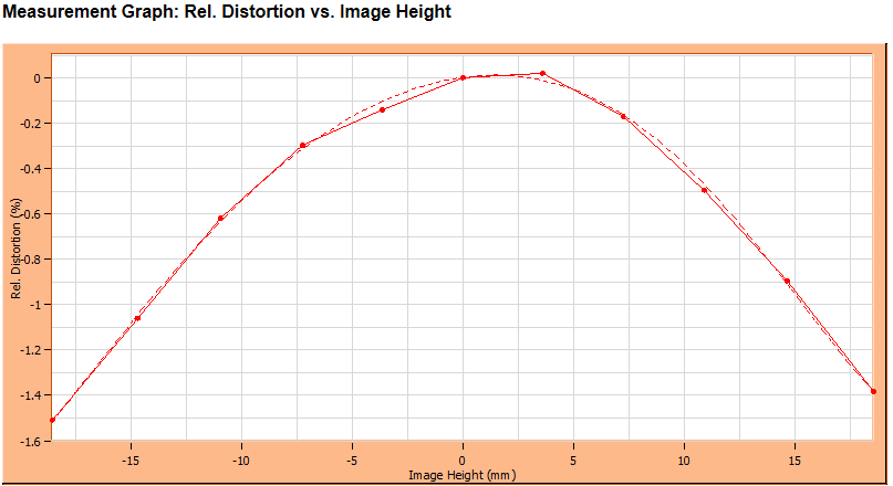
It doesn’t take an optical bench to show distortion, but it’s nice to be able to check it at infinity. The Canon 50mm f/1.2, for example, shows the same amount of distortion (1.45%) at infinity as it does close up (the dotted line here shows a normalized curve, the solid line actual plot points).
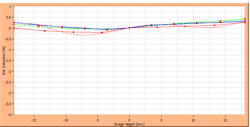
It’s also nice to be able to test multiple copies, because there is a bit of copy-to-copy variation with distortion, too (note the scale of the graph has changed here). The graph below shows 3 copies of the Sigma 50mm f/1.4 lens.
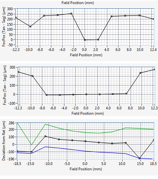
Field Curvatures
One of the coolest, and perhaps almost overwhelming, features is the ability to plot out field curvatures. It’s the only really time consuming test, taking 5 to 6 minutes while the others are done in a minute or less, but it’s well worth the wait.
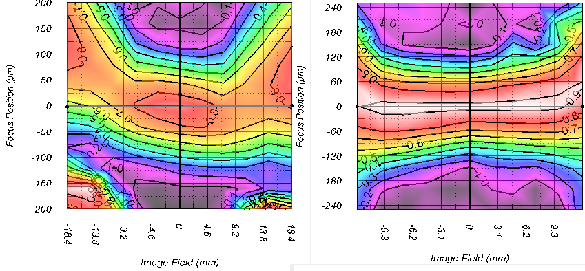
Obviously, knowing the field curvature of a lens is helpful when framing a shot, but it’s helpful when we’re adjusting a lens optically, too, since a field tilt often requires different adjustments than other causes of ‘soft on one side’.
Astigmatism
Another test result that’s interesting in comparing different lenses, but also very useful when we’re optically adjusting lenses is an astigmatism plot. The first two examples below just show different lenses, one in which astigmatism occurs even slightly off-center, the second in which it occurs only near the edges, and a third in which it is abnormal because of decentering.
Actual Focal Lengths
The Imagemaster contains a grid that lets us measure the exact focal length without a lot of calculations. It isn’t particularly important to note that the Sigma 50mm f/1.4 Art lens has an actual focal length of 49.5mm, while the Zeiss 50mm f/1.4 is 51.5mm and the Canon 50mm f/1.2 is 51.8mm. But I found it amusing when I saw the Zeiss 55mm Otus is actually 54mm, because I’d just read a comment that someone found the Canon 50mm focal length much more usable than the 55mm of the Otus. Really, 52mm is much more usable than 54mm?
It does become slightly interesting with zooms. For example, the 24-70 f/2.8 zooms are between 66 and 67.5mm at the long end, while all 70-200 f/2.8s we’ve tested start at 74 to 76mm.
So Why Aren’t You Posting Some Tests, Roger?
Time, of course, is the major factor. We’ve spent most of the last two weeks just learning the equipment; testing lenses we already know well to make sure our results are accurate and reproducible. Our second priority (which justifies spending all of this money) was getting the optical bench inserted in our testing protocols and learning how to use it to help us with optical adjustments.
We will be starting to do some testing and comparisons, soon, but before that I’ve got to figure out the best ways to present the data from multiple copies — the major contribution I make when evaluating lenses is showing sample variation and the range of expected results. The sheer mass of data generated by the Imagemaster makes that challenging. An Excel spreadsheet with the results of one MTF run has about 500 cells of data. Multiply that by two to three runs per copy of 25 copies and pretty soon it’s a lot of numbers.
For example, below are composites made from MTF runs of 5 copies of the Zeiss Otus 55mm and 5 of the Sigma 50mm f/1.4 Art, each run at two angles.
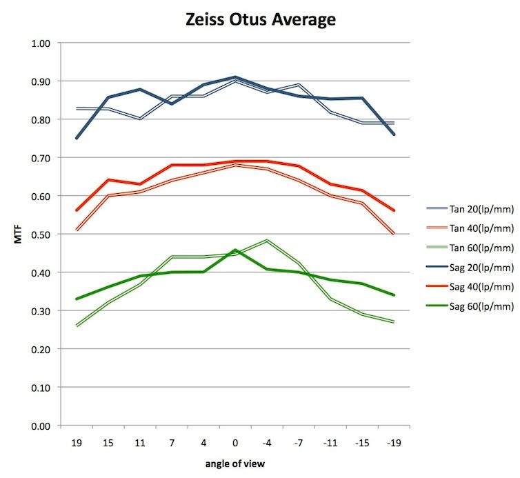
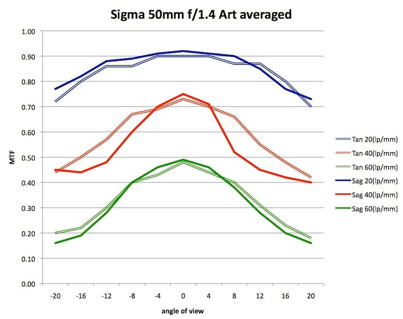
Showing sample variation in so crowded a graph is going to be difficult. Standard deviation bars are probably the best solution, although they’ll get crowded and aren’t very elegant. But I’m open to other suggestions as I try to figure this out, so if you’ve got some great ideas please let me know.
I know many of you have 632 awesome ideas for things we should test tomorrow, but please be patient a bit longer. We still don’t have all of the various lens mounts machined and calibrated yet, so it will be a while before we can test those Sony and micro 4/3 lenses without a camera modifying the images. Canon and Leica comparisons should be coming out fairly soon, and hopefully we’ll use those first posts to work out the best ways to present all this data to you.
Roger Cicala and Aaron Closz
Lensrentals.com
May, 2014

60 Comments
CarVac ·
Wow. Very data. Much lens.
You have so many dimensions to present now, and only two to output on…
Dom ·
It looks like you’ve drunk some beer, as coasters were left under the machine 🙂
With equipment that precise I think it is actually bad idea to not to install it on hard (and flat!) surface: when off-level, device’s frame will warp, misaligning whatever (everything?) is attached to it.
Roger Cicala ·
Don, those were temporary to move it where we wanted, of course. The actual mount is a 1″ rubber vibration dampener. The machine self-levels within it’s base, expecting that over time there will be some changes. It does need to be on a concrete slab (which is what’s under our carpet) – the only problems they’ve had are when people use it on upper floors of frame structures. It even does a vibration time out after each movement before taking the reading, although our floor is solid enough that it’s only for a fraction of a second.
Lee Saxon ·
Fascinating stuff! Can’t wait to see what you learn!
James Scholz ·
Thanks for the vision and investment to push the limits of solid technical information. As an architectural photographer things like curvature of field and distortion and infinity results are often as important to me as lens resolution. You are enabling us to look at more sides of lens performance then just one dimension, and that is a welcome amount of information.
Thanks again for pushing the envelope.
Siegfried ·
Roger,
good luck with your new baby!
As for the graphs – I can’t think of anything better than graphs with variable thickness, though I know no standard graph libraries which have this feature implemented. If I were you and googling came up with nothing, I’d design my own (there are some benefits of having some s/w design experience in the background).
Cheers,
Zig
P.S.
Just curious: what do Mordor warning signs look like to Elves? I mean like this one: http://www.domznak.ru/c8/sosulki.jpg
Or this one: http://govp.info/sites/default/files/musor07061310.jpg
Josh ·
Always an interesting read Roger. Can’t wait to see what can be learned about various lenses in the coming months!
RussellInCincinnati ·
‘twould be so fine, if Roger could cogitate for us and figure out what, if any, optical bench info could foreshadow which lenses will have more trouble with darkening/color shifting corners, on some not-ideal sensors. Uh, for example, would lenses with more astigmatism tend to have worse corners on a Nex 7? Maybe another way to ask this is, can the optical bench ever predict which lenses will “be the most tele-centric” with annoying sensors like the Nex 7?
This is not imply that the optical bench isn’t wonderful.
Roger Cicala ·
Russell, probably not. But I do reserve judgement a bit. If we see, for example, that certain lenses look great not on a camera, but then fade with certain types of sensors, we might start learning how to make such predictions. ALthough certainly not for a while, and certainly not certainly.
Roger
brandon ·
Thanks.
Globules ·
> but before that I’ve got to figure out the best ways to present the data
> from multiple copies
Once you have some raw data you could make it available, then hold a contest
to see who can come up with the “best” visualization.
Roger Cicala ·
Globules, that might work out. But the raw data would be a 30 or 40 page Excel spreadsheet. Still, I get some macro wizard could figure something out. Good idea.
Jon ·
Hi Roger
I have read nearly all of your lens test articles and found them very insightful.
You mention center point PDAF is just as accurate as LVAF in several of Canon’s newer lenses (24/28 2.8 IS, 40 2.8, 70-300L).
Would it be possible to check the 16-35 2.8 II, 24-70 4.0 IS and 70-200 4.0 IS? I realise f/2.8 lenses have greater AF accuracy than f/4 lenses when used with certain AF sensors so would be interesting to see how these f/4 lenses fare.
Dave M ·
Since you already have OLAF, your new toy should be named TROLL. TRioptics Optical Lens Luminator.
Joe ·
Hey Roger, with all these tools, when are you going to start building frankenlenses? I mean, between all the ‘parts’ left over from repairs, there has to be a LR, fully manual lens in the future right? It may be a fixed focal length, and manual focus, but optical perfection is within your grasp now!
Nqina Dlamini ·
^I was think of a similar thing, minus the “frankenlens” part. More along the line that Roger&Co, have so much know how and equipment, they might be tempted to do the next step…..Design their own lens. Wishful thinking and probably impossibly expensive.
Great article as usual.
Thank You
isaac ·
Roger, Thank you for being so intrigued (and thorough) as I only dream of being. Please know that we watch you posts fully ad really listen to what you have to say. Thanks for taking the effort to move to the next step. ib
Mihail ·
Hello Roger,
From your descriptions I gather that the machine spits out data in xls files. Which is nice, but I don’t think that Excel is very convenient for handling large data sets. It might be more useful to load the raw data in some kind of database and crunch the numbers in there. Relational databases are really good for handling large amounts of tabular data, after all this is what they are designed for :). After that the graphs could be visualized more easily with the proper tool.
I’m an oracle dba, so my firs suggestion would be of course Oracle Database Express for the database and Oracle APEX for the visualization layer (both free) 🙂 I’m not really sure if APEX will be able to handle the more advanced graphs ( field curvature for example, which is actually similar to a heat map ), but some other tool might.
Actually, my real suggestion is what Globules said – collect some more comprehensive data, make it available and start an open-source project for building a tool for visualizing and comparing the data. Again, I think that it should be something database-driven. 50 spreadsheets times thousands of lens copies almost amounts to a small data warehouse. And when you can test a lens in 10 minutes and have historical data, there are no limits for creating interesting graphs and reports.
I am sure that you can easily find a team of photo geeks with the proper experience and fund the whole project with spare lens elements 🙂 (make a contest, overseas shipping would be nice). The end result should be that you will enter a lens model and serial number, push a button and watch all the graphs go by.
Of course, the bench’s own software might already have similar functionality, in which case I’m just rambling 🙂
Regards, and thanks for the great articles,
Mihail.
Freeze ·
Roger, for the data-plotting, perhaps you can give the 95% interval? As in: calculate the interval for each measured point, and plot a line through the upper and lower points. This would increase cluttering of the graph, but allows overlapping ranges for different lenses (which would be hard to see if the interval was solid color). Interpretation is quite easy, lines close together = little variance, lines far apart = large variance. Also, it allows people to pick either the upper or the lower line to make their point 😉
Christoph Breitkopf ·
@Nquina certainly not “impossibly expensive”, if you come up with a lens design that enough people will buy. E.g. Brian Caldwell’s CoastalOptics 4/60 UV/IR lens. And Brian apparently came up with the idea for OLAF, so there’s already a lens designer available (sort of…)
But the hard question is: what lens do you miss really from the big manufacturers? And would enough people be willing to pay for it? Given the success of the Zeiss Otus, maybe quite a lot, but I’m still sceptical.
For example, I’d like a pure macro lens, about 100mm focal length, going from about 1:3 to 2:1 magnification (i.e. no infinity focus). I imagine that’d be much too niche to be commercially viable.
A Ronald Gallant ·
Roger,
How about lightly shading each graph with ± 1 std shading the same color as the graph. The overlap of Tan and Sag shading would show up as slightly darker shading, which would be interpretable to the eye.
Ron
Dave M ·
I’m still looking for a name to go with OLAF.
OLGA. Optical Lens Grading Assistant.
OLE. Optical Lens Enhancer.
THOR. Tangential Harmonic Optical Resource.
LARS. Lens Astigmatism Resolving System.
LEIF. Lens Enhancing Image Focuser.
Peter K ·
In fairnes to German Let me translate the Warning signs more or less verbally:
“Bruchgefahr!” = Breaking Danger! (you know, they tend to write consecutive words in a heap…)
“Nicht werfen!” = No throwing! (considering the size of the thing this warning is probably unnecessary)
“Vor Nässe schützen!” = Protect from Humidity! (i.e. keep it dry – makes sense)
Roger Cicala ·
Peter, I love the “No Throwing” warning. I think at one point the engineer got frustrated enough that it probably was pertinent.
Peter K ·
Roger
Looking at your fourth picture I probably understand how you arrived at this interpretation
Lars Jansen ·
“Followed by two full days of rather intense training complete with a 200-page manual to study. I was afraid there’d be a test and we wouldn’t get to keep the machine if we failed.”
Yep, sounds like the Germans. I would not have been surprised if they actually did have a test to ensure you can be allowed to use their machine.
You mention that you plan to use Imatest for short(er) distance measuring and LARS (like the name, Dave!) for infinity measurements. Will these numbers be fully comparable? It would be interesting to test lenses at several different distances, independent of their angle of view.
Roger Cicala ·
Lars, working out a comparison number is one thing I’m working on right now. The simplest thing will be, I think, to generate MTF50 numbers on the bench from the frequency graph, then comparing those to the Imatest numbers to get some baselines. Of course the bench will offer more information than Imatest so we’ll have to extrapolate a bit.
The good news is that in another 2 months we’ll also be able to test finite conjugates (shorter distances) on the optical bench so we’ll be able to have true apples to apples comparisons there.
Tony ·
Roger, take a look at “Processing” language for presenting the mountains of data you’ll soon be collecting. It’s extremely flexible and pretty darn capable. You can create charts with the plotted points having customized colors, shapes and sizes, pulled directly from a .csv file, with something like 20 lines of code. One option that came to mind was to use ellipses to present the astigmatism results. The best part could be the price (exactly $0).
another thought is that your friends over at LensAuthority could use the new tool to generate pedigree papers for the lenses they sell. Or at least someone might more fully explain the meaning of the lpm numbers that are sometimes shown.
Roger Cicala ·
Tony, thank you. And that’s exactly what we plan to do. We’ve already started it for some prime lenses.
Roger Moore ·
If you have a lot of curves for a given lens, you might just try superimposing all of them. The areas of overlap will add, giving greater density. You’ll wind up with a wide line that’s stronger around the average and weaker at the extremes. You could probably do this by having each graph as a layer in Photoshop and using an appropriate method of merging them.
Lasse Beyer ·
This thing sounds much like a copy machine…
I’d be interested in participating in a graph contest, too.
Waiting for the raw data now :).
Byron ·
Another approach would be to render the standard error of the measurements as a shaded area with the mean curve plotted in between. This is essentially a continuous variation of a Box plot (although they don’t usually show the standard error, preferring to show the inter-quartile range). It can be a little bit of a bear to learn, but the R language (http://r-project.org) has a variety of tools for helping with the analysis and/or drawing of the plots.
MaxNoe ·
Hey Roger,
at first i want to say how fascinating I find the work you guys do. And that I highly acknowledge that you seem to be the only “lens testing website” that do tests for more than one copy of a lens.
Now to your plotting and error part.
At first:
Do not, never and under no circumstance connect measured points with straight lines. It’s simply wrong.
Second:
If you don’t know what is an appropriate fit function to get continuous results you maybe want to do a spline interpolation.
Third:
I for myself do really like python with it’s immensly powerfull packages for scientific work and plotting.
matplotlib for plotting
numpy for array and matrix oprations operations (makes plotting and loading data easy)
scipy for fitting and other useful stuff
uncertainties for error analysis.
Show errorbars, mostly they are more important than the data itself.
If a plot gets to crowded, split it into two. Leaving the errorbars out would loose more important information.
I hope i didn’t sound to harsh.
Keep up the good work!
Aaron ·
I was just about to suggest what Mihail did. Can you publish the information openly as the raw data? Or at least via a Service call to a database? I’d actually be happy to help develop & host it if you’re interested. I don’t do pretty user interfaces, but I’m plenty good with APIs and databases & such.
It could be rather interesting to add in the raw data from all of your tests. Given the right design, it could be possible that you simply dump all of the raw data into it each time you get it back, hit compute, and it’ll compare to previous measurements and tell you if something has changed or if it’s consistent in all respects with what it was when it was last measured.
I’m actually kinda drooling at the idea of architecting and building a system like that. It’d basically be a 2nd full time job for me though.
James Conner ·
Outstanding. I especially like the feature that quickly determines the actual focal length of the lens. If I had that, I wouldn’t need to venture into a cold northern night to shoot the Moon, as I recently did, to measure the focal lengths of my long lenses.
In many photographic endeavors, incidentally, knowing the actual focal length of a lens isn’t a bid deal, but it is in certain kinds of scientific photography, so I wish that the manufacturers and reviewers of lenses would publish that information. It’s useful.
Andy ·
I have to second the notion that for data visualization R is your friend. Scriptable, graphics friendly, able to leap large datasets in a single bound. To tie in to your reliability studies, you could regress against rental parameters (days, total rentals, shipping distance, etc) to see which affects lens performance. You could spawn a whole cottage industry with test data from tools like these…*grin*
Tony ·
To James Conner… hopefully you took into account how far the moon was from Earth at that moment in it’s orbit. The apparent size varies by several percent throughout the course of a month. The is much less complication and much more rigor to the math if you use the length of a star trail during a carefully timed exposure. Look up the declination of the star you use and calculate one cosine. This method isn’t any better for staying warm though.
Vincent ·
Roger, this is seriously the most exciting thing I’ve read in a while. Having this test bench, along with your vast inventory of lenses, will allow you to to gather data that no other site on the Internet has access to. Most of the talk on the Internet is based sparse reviews of a single sample using questionable techniques. Lensrentals can now compile data that nobody, except perhaps the manufacturer, will have access to. You can prove and disprove a number of myths. You’ll be able to provide hard data to end countless debates in the photographic community. You’ll be the “MythBusters” for photography gear 🙂 I’m eagerly awaiting any data that you can share with us. Seriously Roger, your blog is so much more insightful than DPReview. Thanks for sharing.
Roger Cicala ·
Thank you, Vincent. I’ll want to take my time making sure we have everything right, but we will be the only place I know of (including any of the manufacturers) who has both a full Imatest suite and an optical bench. I think we’ll be able to learn a lot of interesting things. Plus I just signed a PO for an addition to the Imagemaster: we’ll have the capability of testing at finite focal lengths on the bench, too. I think this will be important because I’m already seeing some very real differences between bench results and Imatest results. I think that what I’m seeing is mostly the difference between testing at close distances and infinity, but it could also be testing on-camera versus off, so the being able to test with the bench at close distances is necessary to tell.
But I should have our first little optical bench review out early next week. It should be fun!
Vincent ·
Roger, since Lensrentals sells used lenses perhaps you can include an Imagemaster characterization report with the those units. You can sell the better samples at higher prices. You might also consider offering a lens characterization service as a way to boost revenues. At the right price there might be a demand for this. It will be useful for people who want to have more insight into their particular sample. In addition, there might be demand for this for the large second hand lens market. Heck, Lensrentals could become a certification facility which helps to add value for the resale market 🙂
Regardless, I’m predicting that when your database of raw data is developed you guys will become the most cited source on the Internet. Certainly you’ll be a lot more credible than the dubious DXO metrics.
Roger Cicala ·
Vincent, great minds think alike – I’m considering all of those things. We’ve already started testing a few Lensauthority samples to see if people want to see MTF printouts of a lens before they buy. I don’t know about most cited source on the internet, but at least I’m trying to tell people what the actual findings are and be transparent in my methods.
NancyP ·
I am not a programmer or a serious statistician so I can’t help with designing a clean graphic statistical representation. Box-whicker plot? Your blog should become more influential among consumers and thus among the lens manufacturers, because you provide lots of information on large sample numbers of lenses. Concerning the emergency-shutdown button, all equipment with lasers above a certain wattage (for wavelength) must have an emergency-shutdown button (per US regulations?). At least the confocal microscopes and research-grade flow cytometers tend to have such shutdown buttons.
Roger Cicala ·
Thank you, Nancy, I didn’t know that about the shut-down buttons. Interesting, and makes sense.
Don Cox ·
One way to show multiple graphs might be to make them the frames of a GIF anim. I think the brain would be able to “see” this quite well.
To the person wanting a “true macro lens” — look for top class enlarger or process camera lenses. Some of the latter are designed for 1:1. Enlarger lenses are for various ratios. You can focus them with either a bellows or a helical extension tube.
There is also the Olympus 80mm, designed for 1:1 and for use on bellows.
andrew ·
ive not read the rest of the posts so forgive me if this has already been suggested
why not use gauge r and r – repeatability and reproducibility from sample to sample and then rather than posting multiple samples using SD bar’s, once you’ve got a bench mark, set a go / no go limit?
so, one person repeats the same test, compare result to result and then whether its reproducible from one tester to another. Once you know you can both test individually and comparatively, then once you’ve measured a given sample size simply have a go / no go limit – if its within tolerance, whilst some anoraks might care that one sample is 1 trillionth micron more accurate than another, for most, knowing its within the accepted tolerance or not will be sufficient.
andrew ·
edit for clarification – I should point out – that’s for ease of communicating rather than not collecting the data – it seems to me that the number of variables involved; operator, lens, camera, sensor, environment all will or could impact the results, so knowing whether the same result is reproducible is the first key factor. Having established the operator tolerance, once the repeatability tolerance is determined, it may be that you can not simply say these 10 Zeiss lenses have a variation of 10X as that could all be accounted for through process and operators, so it would be much easier to set limits on each of the measurement criteria
Samuel H ·
What I would do: try to get something as concise as what you posted with Imatest.
So: only MTF-50, probably averaged for the sagital and tangential lines, and only center+corner+average.
You can always plot additional data (tangential and sagital, a different MTF level, etc) when there’s an interesting oddity to be told.
Steven Lungley ·
Typo:
“the range of epxected results”
Roger Cicala ·
Thank you Steven, fixed that.
Louis ·
Roger,
Fascinating as always!
As part of my job, I do a lot of complex visual representations with very large datasets representing measurements of a large number of samples over many dimensions of data. My method of choice is Python with matplotlib. If that is a viable option, I’d certainly be willing to give you guys some pointers and help getting things going. Feel free to email me if you are interested.
Thanks for all the insight and great data! I always enjoy it.
Someone ·
Thanks for the short video. Man that thing sounds like a dinosaur, like a raptor from Jurassic Park. Nice to meet your new machine, Mr. JP Raptor. j/k
Things are getting exciting over there I’m sure. Can’t wait to see how your review evolve with the new test equipment, err, I mean toys. 🙂
Btw, it’s always a please to read your posts and your humor always improves my day!
gandalfii ·
The label reads:
Danger of Breaking
Do Not Throw
Protect from Wetness
Sharky2014 ·
Roger, how much, if any, of a role have you seen interior lens dust, smoke, grime, haze, etc. play in your testing experience? Have you seen it affect results at all?
How concerned (or not) should we be about this stuff? It’s easy to keep the outside clean, but any recommendations or guidelines for interior lens cleaning?
Roger Cicala ·
Sharky, I’ve never seen dust have an effect unless it’s a total coating of dust or a huge piece (think insect). Smears like from lubricants, though, have more of an effect, probably because they actually refract light rather than just stopping it, or interfere with coatings.
Roger
Daryl Ovadia ·
Hi Roger,
Where can I get one of these? 🙂
Please blog all you can, for us lens geeks this is heaven. The graphs you have posted are spectacular, many I have never seen but the information is so useful. The field curvature images are difficult to understand, can you give some explanation, if only briefly, as to their meaning?
Can’t wait to see further information. Thank you.
Roger Cicala ·
Daryl,
I’ll try to explain the field curvature thing. When we test the MTF, the machine focuses best for the center, then keeping that focus tests all of the other points on the graph. When we do the field curvature test, the machine goes to each testing point, goes through all of the possible focuses, and notes which one is best. The plot then show where the lens is sharpest with focusing point being one of the axes. So if on the edges, the machine focuses at +37 microns, while in the center it was +26 microns and half-way +30 microns, it shows that as curvature. If the field was perfectly flat, the best MTF reading would be at +26 microns at every tested point.
I think I said that right, but it’s Sunday and I’m not all that mentally engaged.
genotypewriter ·
Very nice article and gear, Roger.
A quick question… when this measures the MTF, does it measure it on a flat field or based on individual lens’ measured curved field (as in the point of best focus)?
Thanks!
Roger Cicala ·
geno – it can do several ways, but what we’re generally measuring is MTF at best center-focus. We can individually focus at each point but I feel performance at a single focus is more real world.
genotypewriter ·
Thanks, Roger. So if resolution at best focus is taken off center, which do you think wins… the Apo Summicron 50 or the Otus 55? 🙂
Frank Sheeran ·
> Standard deviation bars are probably the best solution, although they’ll get crowded and aren’t very elegant. But I’m open to other suggestions as I try to figure this out, so if you’ve got some great ideas please let me know.
I could picture a solid line with the average, and a colored zone on each side showing the std dev. Picture a map of an east-west river of close enough scale that the river isn’t just a line, but a 2-D shape, and further a state line running down the center of the river (which might be the definition of a state line’s location).
Can tan and sag lines be collapsed into one line, either an “average” or a “worse of the two” or possibly some other function of two variables (root of sum of squares, basically finding a hypotenuse of a triangle?), that would give an accurate enough summary? Or, simply present tan and sag on two separate graphs?
It needn’t be either/or: a reasonably cheap programmer with experience in a language like python or perl can produce huge HTML pages for you in a semi-automated fashion. For instance you could pick a combined graph but then also have the individual tan and sag graphs that people who prefer them can check instead. You could also have just “average” vs. “average with std dev band” if it turns out the latter is a pain to read.