A couple of years ago I gave a talk on the history of lens design at the Carnegie-Mellon Robotics Institute. The faculty members were kind enough to spend the day showing me some of their research on computer-enhanced imaging. I’m a fairly bright guy with a doctorate of my own, but I don’t mind telling you by the end of that I was thoroughly intimidated and completely aware of my own limitations.
I’d love to tell you I gave a brilliant and entertaining talk that evening, but there were a lot of witnesses, so I’d better not lie that openly. I think only the fact that they serve cookies at the end of the talk kept most of the audience in place until I finished. I do remember, though, looking up at that room full of brilliant scientists and starting my talk with, “It somehow seems wrong that the guy with the lowest IQ in the room is the one giving the lecture.”
Two weeks ago I asked some of the more computer-literate people who read my blog to help me handle all the data our new optical bench generates. Over 70 people asked for the data sets, and 40 of those sent their ideas back to me. After spending the last five days poring over all of those suggestions, I feel just like I did that day at Carnegie-Mellon. I’m thoroughly intimidated and wondering why the participant with the lowest IQ is the one writing the blog post.
Mostly, though, I’m left with an incredible feeling of Internet camaraderie. Sure, there were some prizes offered, but the amount of time dozens of spent preparing contributions and sharing ideas dwarfed the insignificant prizes I offered. Several people sent 20+ pages of documentation along with their methods. (I don’t mind admitting I had to get out my college statistics books to help me translate some of these.)
Some submissions just suggested methods to display data for blog reports. Others focused on methods for decentered or and inadequate lenses within a batch. I’m going to show some of the data displays, because that’s the part I want reader input on. Let me know what methods you think provide you the most information most clearly.
I’ll also mention several of the submission that went way past just graphically representing the data (although most included that, too). I’ll mention these at the end of the article when I discuss the Medal Awards. Don’t mistake me leaving them to the end to mean I wasn’t overwhelmed by them. Honestly, several of them completely changed my thinking about what the best ways to detect bad lenses are, and what the most important data to share with you is.
But really, I’d like to give everyone who sent in a contribution something, because every single one helped me learn something or clarified ideas for me. It also reminded me why I do this stuff — because deep under all of the Google Adwords, the best part of the Internet lives — the part where people freely share their knowledge to help other people. Very cool things come out of that part of the Internet, and that’s the part I want to hang out in.
I also want to be clear that while those submitting gave me permission to reproduce images of their suggestions here, the images and intellectual property rights of their contributions remain theirs. You need their permission, not mine, to reproduce their work.
What I’ve Already Learned
A couple of general suggestions have been made by several people, and make so much sense that we’ve already adopted them.
From now on we’ll test every lens at 4 points of rotation (0, 45, 90, and 135 degrees). This will give us an overall image of the lens that includes all 4 corners as mounted on the camera.
Displaying 4 separate line pair/mm readings makes the graphs too crowded, so we’ll probably use 3 going forward. I’m still undecided whether that should be 10,20, and 30 or 10, 20, and 40 line pairs/mm.
Displaying MTF50 data, or more likely, Frequency response graphs, is very useful and needs to be included along with MTF curves.
We knew that each lens’ asymmetry as we rotate around its axis is a very useful way to detect bad lenses. Some contributors found looking at the average asymmetry of all the copies of a certain lens is a good way to compare sample variation between two groups.
Variation of astigmatism, both between lenses of the same type and comparing groups of different type, is also worthwhile measurement to report.
Outside of that, nothing is written in stone, and I look forward to your input about the different ways of displaying things. You don’t have to limit your comments to choosing just one thing. We want the best possible end point, so taking the way one graph does this and combining it with the way another does that is fine.
Several people found similar solutions separately, so where possible I’ve tried to group the similar entries. I apologize for not showing all the similar graphs, but that would have made this so long I’m afraid we would have lost all the readers. I can’t give you cookies for staying until the end of the article, so I’ve tried to keep it brief.
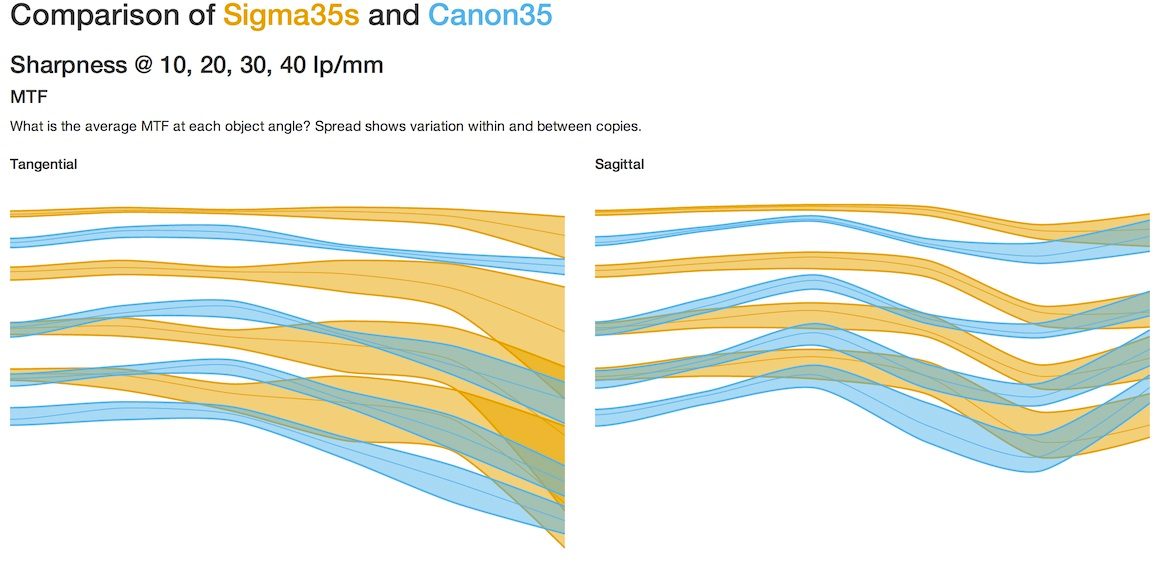
MTF Spread Comparisons
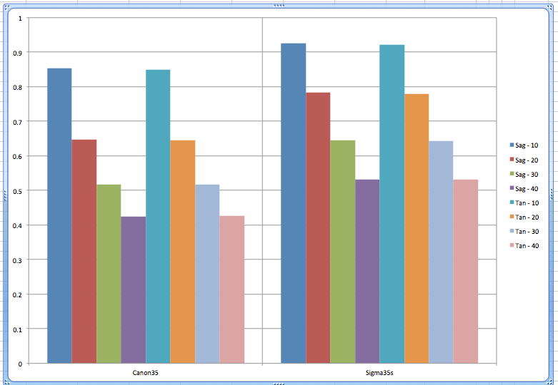
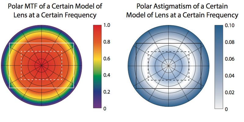
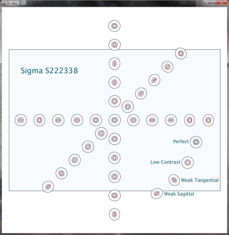
These graphs show the range or standard deviations of all lenses of that type, while comparing the two different types of lenses. Obviously they aren’t all completely labeled, etc., but they all give you a clear idea of how the data would look. Remember, the data is for just 5 Canon 35mm f/1.4 and 5 Sigma 35mmf/1.4 Art lenses, and I purposely included a mildly decentered copy in the Sigma lenses. Please don’t consider these graphs are anything other than a demonstration — they are not a test of the lenses, just of ways of displaying data and detecting bad copies.
Area Graphs
Several people suggested variations using a line to show the mean value and an area showing the range of all values. I won’t show all their graphs today, but here are some representative ones.
Curran Muhlberger’s version separates tangential and sagittal readings into two graphs, comparing the two lenses in each graph.
Jesse Huebsch placed sagittal and tangential for each lens on one graph and then placed the two groups side-by-side to compare. (Only the 10lp/mm has range areas. The darker area is +/- 1 SD, the lighter area is absolute range.)
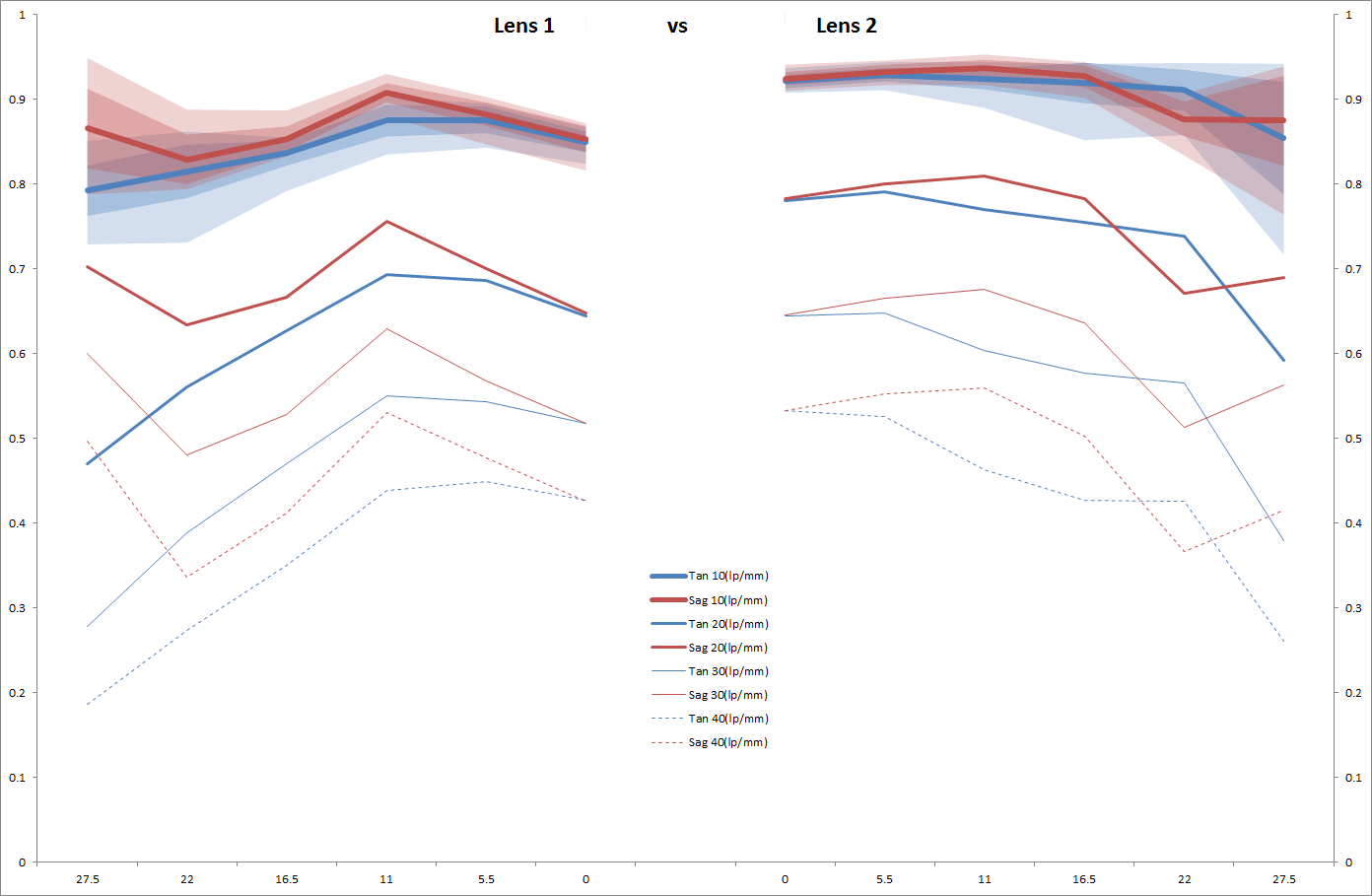
Winston Chang, Shea Hagstrom, and Jerry all suggested similar graphs.
Maintaining Original Data
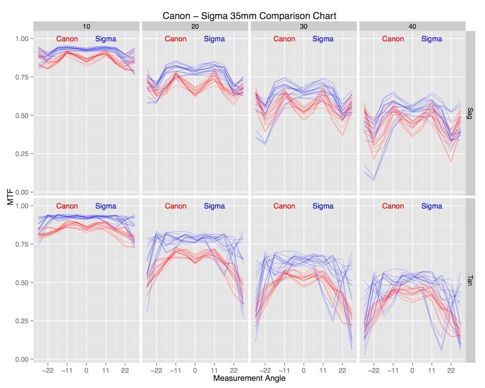
Some people preferred keeping as much of the original data visible as possible.
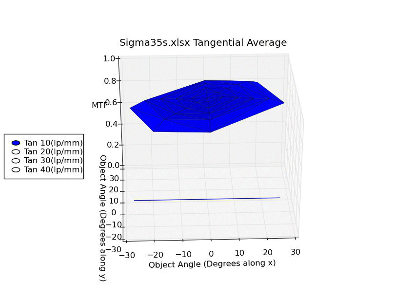
Andy Ribble suggests simply overlaying all the samples, which requires separating out the different line pair/mm readings to make things visible. It certainly gives an intuitive look at how much overlap there is (or is not) between lenses.
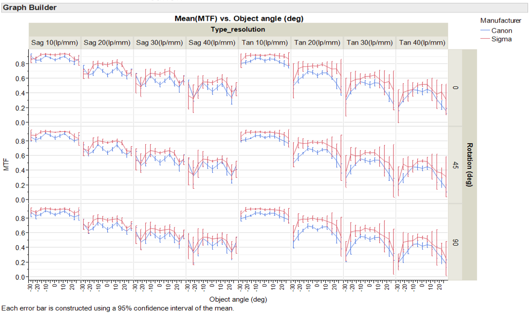
Error Bar Graphs
Several people preferred using error bars or range bars to show sample variation.
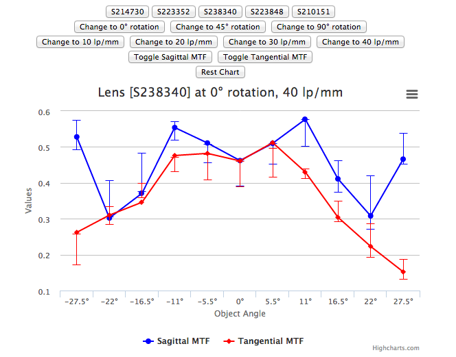
I-Liang Siu suggests a similar separation, but using error bars rather than printing each curve the way Andy suggested. For this small sample size the error bars are large, of course, especially since I included a bad lens in the Sigma group. But it provides a detailed comparison for two lenses.
William Ries suggested sticking with a plain but clear bar graph. Error bars would be easy to add, of course.
Aaron Baff made a complete app that lets you select any of numerous parameters, graphing them with error bars. While it’s set up in this view to compare a specific lens (the lines) to average range (the error bars), it would function very well to compare averages of between two types of lenses.
Separate Astigmatism Readings
Several people suggested that astigmatism be made a separate graph, with the MTF graph showing either the average, or the better, of sagittal and tangential readings.
I-Liang Siu uses an astigmatism graph as a complement to his MTF graph.

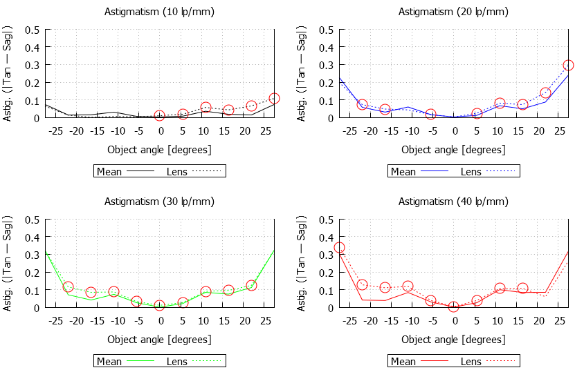
Lasse Beyer has a similar concept, but using range lines rather than error bars.
Shea Hagstrom‘s entry concentrated on detecting bad lenses, but the astigmatism graphs he used for that purpose might be useful for data presentation.
Winston Chang‘s contribution used also used astigmatism for bad sample detection, presenting each lens as an area graph of astigmatism. I’m showing his graphs for individual copies of lenses because I think it’s impressive to see how the different copies vary in the amount of astigmatism, but it would be a simple matter to make a similar graph of average astigmatism.
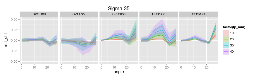
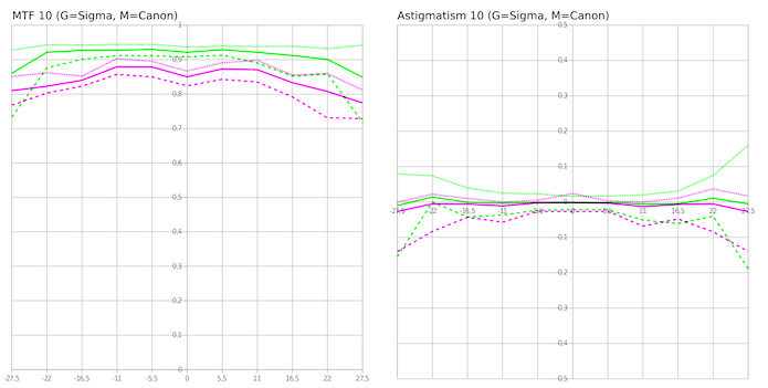
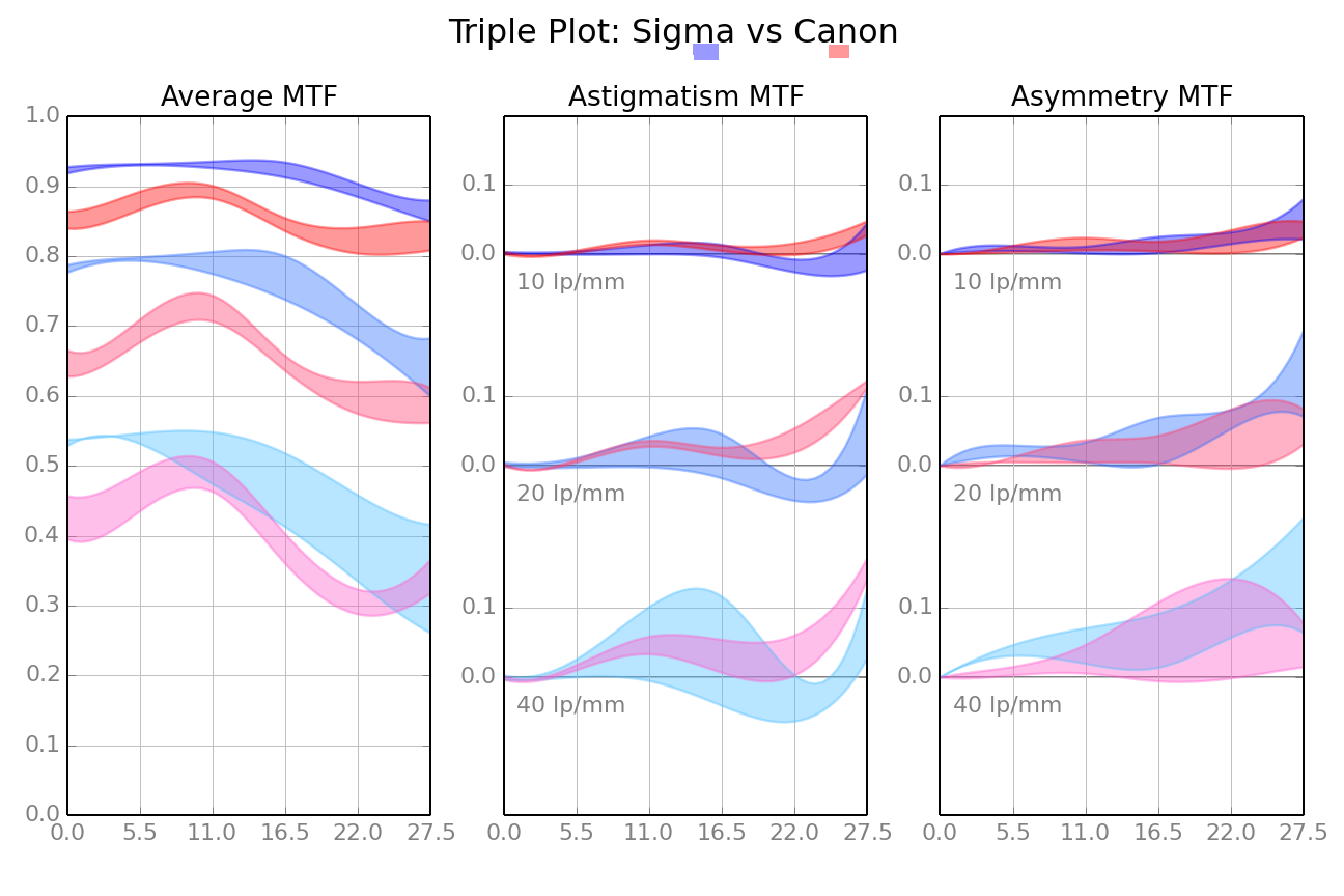
Sami Tammilehto brought MTF, astigmatism, and also asymmetry through rotation (how the lens differs at 0, 45, and 90 degrees of rotation) into one set of graphs. While rotational assymmetry is one of the ways we detect truly bad lenses, it is also a good way to demonstrate sample variation, too. In this graph, the darker hues show 10lp/mm, lighter ones 20, and the lightest ones 40, which would be useful if there was significant overlap.
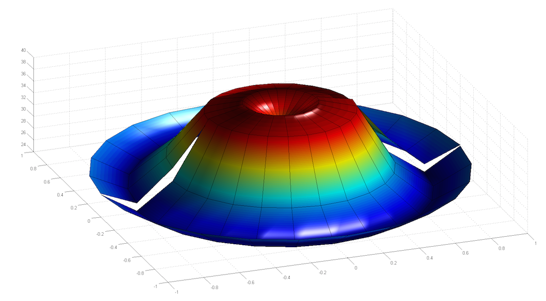
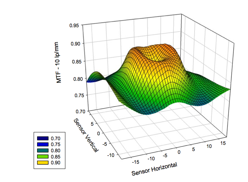
Ben Meyer had several different suggestions, but among them was creating a 3-D polar map of MTF (note his map is incomplete because we only tested in 3 quadrants rather than 4. The fault is mine, not his.) This one is stylized, but you get the idea.
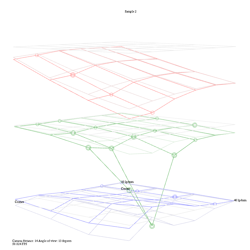
Like Ben, Chad Rockney‘s entry had a lot more to it than just data presentation, but he worked up a slick program that gives a 3-D polar presentation with a slider that lets you choose what frequency to display. Chad submitted a very complex set of program options that include ways to compare lenses. In the program, you’d click which frequency you want to display, but this automated gif shows how that would work. You can also rotate the box to look at the graph from different angles.
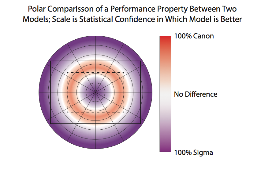
Daniel Wilson uses polar graphs for both MTF and astigmatism. It’s like looking at the front of the lens, which makes it very intuitive.
He also made a nice polar graph comparing the Canon and Sigma lenses which I think is unique and useful.
Vianney Tran made a superb app to display the data as a rotatable, selectable 3-D graph. I’ve posted a screen clip, but it loses a lot in the translation and I don’t want to link directly to his website and cause a bandwidth meltdown for him. This screen grab compares Canon and Sigma 35s at 10 lp/mm.
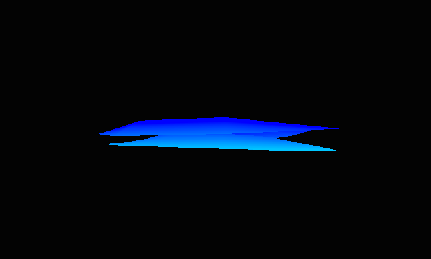
Walter Freeman made an app that creates 3-D wireframes. It’s geared toward detecting bad lenses and the example I used is doing just that – showing the bad copy of the Sigma 35mm compared to the average of all copies.
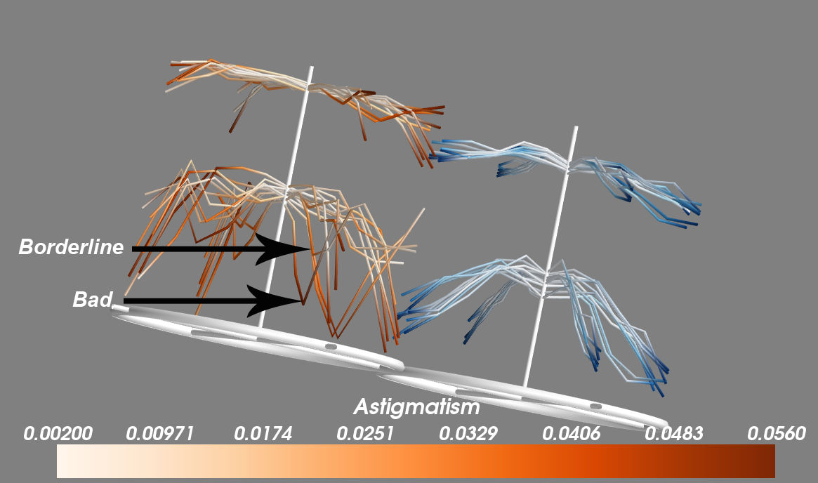
Subrashsis Niyogi came up with one of the coolest looking entries, presenting things in a way I’d never thought of. His Christmas tree branches represent the MTF at 10,20, 30, and 40 lp/mm for each lens with each branch showing one rotation. How low the branches bend represents the average MTF. The darker the color of the branch the more astigmatism is present. It’s beautiful and brilliant.
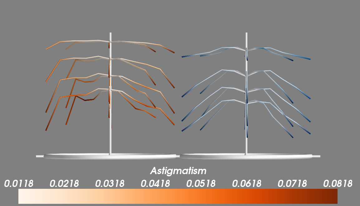
His application makes them tiltable, rotatable, the displayed lp/mm can be selected, and multiple copies can be displayed at once to pick up outliers.
Rahul Mohapatra and Aaron Adalja put together a complete package for testing lenses to detect outliers, but also included a very slick 3-D graph for averages.
Still More Different Ways of Presenting MTF data
These graphs are really different, but that makes them interesting. I’ll let you guys decide if they also have a better data presentation factor.
Brandon Dube went with a graph that shows the difference between lenses. In this example, all 5 Sigma lenses are plotted against the mean for all Canon lenses (represented as “0” on the horizontal axis) at each location from center to edge. This would have to be a supplemental graph, but it does a nice job of clearly saying “how much better” one lens is than another.
Tony Arnerich came up with something completely new to me. His graph presents the various tested points as a series of ovals on a line (each line consists of the measurements at one rotation point). More oval means more astigmatism and more color means lower MTF readings.
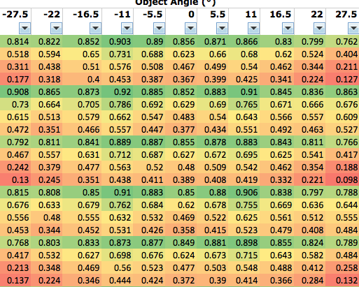
William Ries suggested a “heat map” similar to the old PopPhoto methods, giving actual numbers in a table, but using color to signify where MTF falls off.
Bronze Medals
The Bronze Medal is for people who made a suggestion for graphing methods that we will use in the blog. I’m still not sure which methods we’ll finally choose and want reader input, so we may award more Bronze Medals later. But for right now, the following people have made suggestions that I will definitely incorporate in some way, so they are Bronze Medal winners. The official Bronze Medal prize is we will test two of your lenses on our optical bench and furnish reports, but those of you who live outside the U. S. email me and we’ll figure out some other prize for you, unless you want to send your lens by international shipping.
Jesse Huebsch (I’ve already used his side-by-side comparison suggestion in my first blog post). Several people made similar suggestions, but Jesse’s was the first I received.
Sami Tammilehto triple graphs of MTF, astigmatism, and asymmetry are amazingly clear and provide a huge amount of information in a very concise manner.
Winston Chang, whose display of astigmatism as an area graph will be incorporated.
Again, Bronze Medal awards aren’t closed. There are several other very interesting contributions and I suspect the comments from readers will help me see things I’ve missed, after which I’ll give more Bronze Medals. Which, of course, aren’t really medals. Each Bronze medalist can send me two lenses to have tested on our optical bench. If they live overseas or don’t have lenses they want tested, we’ll figure out some other way to thank them – so if that fits you, send me an email.
Outlier Lens Analysis
A number of people did some amazing things to detect decentered and outlier lenses. To be blunt, we’ve been doing a pretty good job with this for years, better than most factory service centers. But after getting this input, I can absolutely say we’ll be upping our abilities significantly soon.
Nobody actually made the Platinum Prize, but a number of people came close. So instead, I split the Platinum Prize up so we could award a large number of Gold Medal prizes. Since most of the winners live outside the U. S. and can’t use the $100 Lensrentals credit given for a Gold Medal, I’ll give it in cash (well, check or Paypal, actually).
Gold Medal Winners
Gold Medal Winners had to develop a fairly simple way to create logical, easy to understand graphs that demonstrate the variation copies for each type of lens, and offer an easy way to compare different types of lenses. It turns out there were a lot of paths to Gold, because so many people taught me things I didn’t know, or even things I didn’t know were possible.
Professor Lester Gilbert. His work doesn’t generate any graphs, but the statistical analysis to detect outlier lenses is extremely powerful.
Norbert Warncke‘s outlier analysis using Proper Orthogonal Decomposition not only shows a new way to detect outliers, it does a good job of detecting if someone has transcribed data improperly.
The following win both Gold and Bronze medals.
Daniel Wilson’s polar graphs provide a great amount of information in a concise package. Several people used polar graphs, but Daniel’s implementation was really clear and included a full program in R for detecting bad copies.
Rahul Mohapatra and Aaron Adalja whose freestanding program written in R not only made the cool graph you saw above, but also does a powerful analysis for variation and bad copies.
Curran Muhlberger’s (You saw the output of his Lensplotter web app at the top of the article) programmed a method to overlay individual lens results over the average for all lenses of that type, showing both variation and bad copies.
Chad Rockney wrote a program in Python that displays the graphs shown above, it analyzes lenses against the average of that type and against other types.
Subrashsis Niyogi’s Christmas Tree graphs are amazing. While his Python-Mayavi program doesn’t mathematically detect aberrant lenses, his graphics make them stand out dramatically.
Where We Go From Here
First I want to find out what you guys want to see — which type of displays and graphics you find most helpful for blog posts. So I’m looking forward to your input.
The contest was fun and I got more out of it than I ever imagined. I want to emphasize again that the submissions are the sole property of the people who did the work (and they did a lot of work).
I’m heading on vacation for 10 days. (There won’t be any blog posts from the cruise ship, I guarantee you that.) Once I get back and get everyone’s input on what they like, I’ll contact the people who did the work and negotiate to buy their programming and/or hire them to make some modifications.
We’ve already been modifying our data collection procedures (and our optical bench to account for what we’ve learned about sensor stack thickness). Hopefully we’ll be cranking out a lot of new lens tests, complete with better statistics and better graphic presentation within a month or so.
Roger Cicala
Lensrentals.com
June, 2014

52 Comments
EJC ·
I had a priest growing up who said “show me who your friends are and I’ll tell you who you are”.
If it wasn’t already obvious prior to this project, it is now clear why lensrentals is such a great resource: Roger, you, and the company you keep, are par excellence.
I started working on several ideas to send to you but couldn’t find the time to develop them fully. What an amazing breadth and depth of knowledge and ideas were provided.
I’d happily pay a subscription to review the results if you were able to build a sufficient lens database. Such a complete technical analysis would be very complimentary to my only current resource, Lloyd Chambers qualitative reviews.
Roger Cicala ·
EJC – no subscription will ever be necessary. This, as I enter my sort of semi retirement, has become the funnest hobby ever. Or most funnest. You know grammer isn’t my strength.
richard ·
Wow. Lots of good choices here and a lot to consider. I have no doubt that whatever you choose to use, your presentations will be both clearer and more in depth. You may be on your way to redefining how the whole industry presents lens data.
Aaron ·
Wow. Ok, so, some people went really far beyond what I was thinking. I guess I better stick with being a great architect/coder, rather than algorithms 🙂
David ·
My favorite displays were Andy Ribble and Winston chang’s. That’s kind of how I see these things. Although I would have to get my head around what is what, but the oval graph and christmas trees also seem good.
Lex ·
Definite upvote for Daniel Wilson’s polar MTF plots. Those do a very good job of keeping one’s head out of the clouds, and of comparing the specific weaknesses of any two lenses. At the moment, I use The-Digital-Picture’s database of test charts to compare lenses, but a LensRentals database with selectable lenses presented with Wilson’s comparison method would be an extremely interesting tool.
In the interest of detecting bad copies, I wonder if a more limited version of Wilson’s polar plots might be best. For instance, only displaying the 0 to 135deg measurements collected by the optical bench. The current iteration appears to assume the lens is symmetrical, but that may be inaccurate if it’s simply displaying the MTF results from a good lens. Using it to display the delta in MTF readings could also show the affected areas of a decentered lens fairly clearly.
Even if I’m too late for the competition, I have the urge to mess with this data a bit now. Seems like a nice, meaty problem.
Sloan Lindsey (SoulNibbler) ·
To me as a data grunt I find that Tammilehto and Wilson present data in a way that is both data dense and intuitive. They are similar to the approaches that I would take in my approach that never got past the drawing board for reasons of time constraints. One idea that I had for my approach (it would have also been self contained in a scripting language) was that the outlier detection should be posted as a colored dataset. Of course this requires that the outlier detection be rather tunable by the user, but I like the idea of showing colored tolerance bands (I’m also a huge fan of interline fill). Therefore my simple suggestion for demonstrating varriance in a reader legible manner would be to use the favored outlier detection and plot the outlier(s) on top of the filled bands for the standard deviation of the sample group *including the outlier!!!*. I’m still looking forward to getting some time to play with the dataset outside of the competition.
Back to graphs, I find that 3D plots are incredibly sexy but difficult to read for information outside of what the presenter is trying to show. Active 3D plots on web pages are usually a bit overwelming and intrude on storytelling. Therefore I prefer 2D plots. The polar plots are nicely interesting because they show what we think the sensor shows. I’m pretty sure that they might be a very nice tool for detecting decentering in a visual manner if you were to do Z-stacked contour plots with very well defined ranges (basically posterizing the output) and thus create slices that are easy to compare for polar differences. The satistical difference shown in polar is very useful for comparing trends but I think that the inversions shown would make reading an outlier approach rather difficult.
Thanks again for the update!
grubernd ·
here’s a box of double chocolate cookies, help yourself.
[//////////]
Daniel Wilson ·
Hi Lex and Sloan,
Thanks for the compliments!
Lex, regarding your comment about using the polar plot to detect bad copies, I agree that is a good idea. The graphs shown here are just the “summary” graphs for a theoretically large sample of lenses. Representing the performance of any individual lens is a different challenge. A few of the graphs I submitted to Roger showed examples of single-lens performance. You can imagine, for example, the rainbow-colored polar plot only showing the 0, 45, and 90 azimuthal angle “sweeps” of a single lens. You could then either look at the MTF in each sweep represented by a colored bar, or just color image circle sections that are within spec green and bad areas red. Here are a couple examples if you are interested:
(1) Polar MTF chart of a single copy of a lens (Lex’s suggestion) tested at 0, 45, and 90-degree azimuthal angle sweeps
(2) A polar plot of a model of a lens showing performance at 4 frequencies and 4 apertures.
Peter K ·
The Wilson idea made me almost gasp – superbly intuitive and still very dense with respect to information.
SoulNibbler ·
Daniel,
figure 1, is certainly interesting. I think it works better than my proposed idea, I forgot that the azimuthal sampling is so sparse.
figure 2, is discreet and stylized and shows a lot of information but the loss of the mapping to the sensor corners due to the overloading of the frequencies limits its utility for me. The apertures per quadrant works out really nicely with the assumed symmetry of an non-defective lens. I think it would make two very nice plots for characterizing a lens. Very nice work. Are you working in R?
Samuel H ·
From the ones you selected, my choice would be the one by Andy Ribble.
Daniel Wilson ·
Hi SoulNibbler,
I agree that the second figure is very dense, and it is a shame that some of the spatial information (especially performance relative to frame corners, as you noted) is lost. Yes, I am working in R.
Danny
Curran Muhlberger ·
As Roger mentioned, my submission was a webapp, so I suppose I should share the link here: http://lensplotter.muhlbergerweb.com/ . The “diagnostics” pages are more for identifying bad copies, while the “comparison” pages evaluate lens models as a whole.
It’s amazing the number of similarities and differences in our varied approaches. I can’t wait for this new database to come online, and I’m glad we all got to play a small part in designing it.
Aaron ·
@Curran Muhlberger
Looks like you went a bit further, especially with the polar and area/point comparison (rather than the line + bars) that I did.
One thing that Roger didn’t show for mine was that I put in a 2nd which showed that lens compared to itself with previous readings (faked with random 1-3% +/- on each reading) which might be a really quick way to see if a lens has changed from it’s own normal.
Anyone can take a look at http://www.darkobjects.net/lensrentals/canon35.html or http://www.darkobjects.net/lensrentals/sigma35.html for the Canon & Sigma data on separate pages.
Roger Cicala ·
Aaron and Curran, thank you for linking to your apps. I think that gives a much more in-depth demonstration of what you accomplished.
I didn’t want to link them on the blog page – in the past I’ve caused some people to exceed their bandwidth constraints and caused problems when doing that.
Thanks again!
Roger
jill ·
i like this…
Subhrashis ·
Wow! The level of work presented here is simply amazing. Thanks a lot to Roger for giving us this opportunity, and to everyone for sharing.
Sloan,
I agree with your comment about the relative difficulty of gaining new information from 3d plots than 2d graphs, but I’d like to point out that once you wrap your head around what the 3d graphs represent, they show quite a lot too.
The data here is arranged in a polar fashion in the XY plane, i.e. directly over the section of the lens they represent. The circle (Christmas tree base) represents the front element. The MTF data is now plotted in the Z coordinate to get the branches, different lp/mm measurements automatically settling themselves in layers. The central column height equals an MTF of 1. Color can code for astigmatism or standard deviation over copies of a lens.
One problem I had initially (I have no formal training in coding and picked up Mayavi for the first time while working on this) was figuring out how to label and annotate the data, so my graphs are incomplete in that respect. I got a bit further, chewing through the docs and tutorials in the last graphs I sent Roger, with separate colorbars for the two lenses etc. Cutplanes can be added as the Z axis ticks to make reading data off the graphs easier.
So, in this image, you can see that the Sigma (orange)has a higher central sharpness, retained further out to the corners, but a lot more astigmatism peripherally. The Canon (blue) on the other hand, has a central well of low sharpness, getting almost as good as the sigma, but falling again faster. Astigmatism is low and only in the far corners. Another interesting thing is that the Sigma apparently resolves finer details better too, from how high the lower branches are.
If we replace astigmatism by standard deviation, you’ll see there is more variation in the outer regions of the Sigma (all those bad copies).
I also like Daniel’s idea of plotting the 3:2 sensor area within the lens element, and his whole idea in general. I also like how Andy Ribble has shown all the available data while keeping things sane.
Andrew Vinyard ·
Nice Work Guys. You certainly put my entry to shame. My one suggestion is to keep the displays simple. I think the 3D surface maps are pretty, but I prefer the 2D maps and graphs for comparing lenses. I also prefer to look at the different facets of the data separately, rather than combined into one graph. I would prefer to have MTFs, Std Deviations and Astigmatism all separated out. It’s easier for me to visualize and conceptionalize that way, even if it is less succinct.
Ben ·
I think the best visualization is not a fixed thing, but strongly depending on the purpose.
So I give my votes in relation to purposes:
1) Visualizing the special characteristics of one specific lens sample (probably Roger is the only person who should want this, to show something to us).
Here we want to see the selected lens property as a function of two spatial variables (object angle & azimuth/elevation)
–> 3D graph: Christmas Tree, or 3D surface plot (with multiple slices, if needed)
(One could use a polar plot, too. But as the purpose is too visualize a specific point of argumentation, I think a properly oriented 3D graph is way more ‘right-in-the-face’-clear.)
2) Visualizing the characteristics of a ‘representative’ lens (group average of a set of lens samples). Purpose: Describing/understanding lens properties before rental/buying decisions or out of interest.
Here we don’t need to visualize two spatial variables, but only one (object angle, to show field curvature). Azimuthal orientation is of limited value, as rotational assymmetry over a set of lenses will always vary widely at different places. We need a separate graph/figure which reflects sample-sample-variation for this asymmetry.
–> 2D polar plot; very intuitive, shows field curvature; allows great side-to-side comparisons. And, most important: The sectors/subsectors of the polar graph can be used to show additional characteristics [see figure 2 of Daniel Wilson in the comments above!).
My favorite would be: Resolution (//in lp/mm for MTF50//, encoded as posterized color shades), as function of object angle (as radiant), of aperture (encoded as subsectors), and (for zooms) of a limited set of focal length (encoded as 3, max 4 sectors).
Of course, that would be very dense. On the other side: Those polar plots/field maps/mesh plots at dpreview/DXOLabs/SLRgear are quite sparse. If one wants to see something (except of a symmetrical color blob, or a colored grid), one has to move a slider for aperture and/or focal length. From my point of view, at least one of those could be incorporated into the polar graph.
Vertical/Horizontal/Corner position of the sensor frame could still be shown (not as rectangle, of course). Optimally would be an user-controlled option for selecting sensor size (35mm, APS-C, MFT).
One question with respect to data processing: Am I the only one who would like to see an abstraction from the MTF ‘raw data’? E.g.:
– resolution in lp/mm for MTF50,
– microcontrast as MTF-value for 10 lp/mm (already available),
– differentiation between field curvature and rotational asymmetry…
In the surface plot above (which is not very slick, admittedly) I visualized the isosurface of resolution for a certain contrast threshold (MTF50, as that’s a typical value for something to be considered sharp by human vision), and showing only field curvature.
From my point of view, one Daniel Wilson-style polar plot of this would be easier to understand than a set of 4 plots showing the MTF-value for the frequencies 10/20/30/40 lp/mm.
What do you think?
I-Liang ·
I was also really impressed by how creative the proposals were. Here are some of my random thoughts:
– I think the 3D plots are great for visualizing how performance is mapped onto the lens surface. But the viewer needs to be able to manipulate the orientation because there will always be some portion of the plot that’s in the rear and can’t be read clearly.
– I like the polar plots (and overlay of the 3:2 frame) even better than the 3D plots because I can get quantitative information much faster from the polar plot rather than the 3D plot. DPReview lens reviews also publishes a 2D surface map along with an x-y plot of a cross section slice that communicates alot of information clearly and efficiently. Here’s an example of Sigma vs Canon mean MTF: http://www.dpreview.com/reviews/lens-compare-fullscreen?compare=true&lensId=sigma_50_1p4_a&cameraId=canon_eos7d&version=0&fl=50&av=1.4&view=mtf-ca&lensId2=canon_50_1p4&cameraId2=canon_eos7d&version2=0&fl2=50&av2=1.4 I can tell right away that the Sigma has higher resolution everywhere on the image area, the Sigma shows more resolution degradation from center to corner (but still higher than the Canon), and the Sigma has nearly zero CA everywhere. I think it would be straightforward to generate simliar plots that show MTF sigma (lens-to-lens variation), astigmatism mean and sigma, etc. I really like that format.
– I also tend to prefer looking at separate plots that clearly show one or two things rather than a single plot that includes everything, because the latter is usually visually complicated and takes more effort to glean the desired info.
So big congratulations to everyone – I think you all did a great job.
Ben ·
@Aaron, @Curran (@everyone else):
These web-apps are an absolutely teriffic job of data handling and presentation with an user-customized interface, really great work!
What comes to my mind when I see things like this – and considering the widely varying opinions w.r.t. the ‘best visualization’: wouldn’t it be possible to cater everyone’s (well, most people’s) needs by just letting the user decide what he wants to see?
A limited, pre-selected set of plot types, with toggles/slides to add/or manipulate the presented data. Well, pretty much what Murran did, just only showing one (few) plots type at a time.
The set of possible graphs is not that big, for our application those pretty much fill the envelope I see, 1 each should be enough:
– 1D: area charts, line charts
– 2D: polar charts
– 3D: (sliced) surface plots (the christmas tree also falls here), mesh plots
– nd: radar charts, parallel coordinates charts
Something similar, but not really suitable for lens data, can be found here: http://app.raw.densitydesign.org/
Tony Arnerich ·
I have to say up front that I feel honored to have gotten onto the same page as the other entries. There is some truly outstanding work gathered here. My day job is test engineer and I feel Roger’s pain when he wants to figure out with as little delay as possible whether a particular lens needs attention or if it should head back to the shelf. One thing that helps me the most is to settle on a standardized view. When I do that I can tell the Good from the Mediocre (let alone the truly Awful) from 30 feet away. Auto scaling in particular makes the Horrible look too much like the Excellent.
Whichever methods Roger ends up using, I vote for Curran to pick the colors. When you have to look at these kinds of charts for hours during a day there’s no harm at all in having them be beautiful.
Aaron’s live application really brought his entry alive. It will be even better without auto scaling. That makes you need to shift your eyes from the chart to the axis labels, and then re-interpret the chart based on the numbers. If everything was on a scale of 0-1 you could literally fly through hundreds of results in seconds and easily spot overall trends and outliers.
Andy’s entry was very quick at communicating variation. I’d especially like it for a way to display the full history of one lens. Plot the most recent result with the boldest line; older results would be progressively fainter. Plot the initial as-received result in a different color. You can’t take a lens back in time but you do want to know where it’s been.
Daniels’ entry is especially quick at communication. Like him, I showed the FX frame as a spatial reference but he was more thorough by also showing the APS-C rectangle. I’d like to see the true azimuthal variation instead of the averages, but sharp edged pie wedges would tend to be distracting. Maybe smooth interpolations could solve that.
Subrashis’ Christmas tree approach may be the best at incorporating a lot of information into a small space. There is probably a good standardized viewing point with just a little tilt that would make it possible to quickly grasp the character of a lens. It may be very useful as a display engine for Roger’s blogs.
General comments on color: I personally find it to be a relatively slow way to communicate subtle differences of quantities, but an excellent way to differentiate two items from each other. Dpreview’s lens test charts just don’t give me the same picture that I can get from Slrgear’s surface charts. I think it would also be useful to receive input from some people who have a color blindness condition. Some color choices will not look different enough to them.
Thanks again Roger, I think we’ll all end up benefitting from this exercise.
mrc4nl ·
I tried to make it automated by creating a windows program. the 2 sheets needed to be selected and the program would show the graphs`o compare them (perhaps including standard deviation)
But i didnt come far, got stuck reading xlsx files. and when i noticed the program had to run on a mac i stopped developing.
Maybe i should have been more focused on represening the data, buy hey i think i am alrealy to late 😛
Ilya Zakharevich ·
Let’s see: for every radial distance, you measure 16 numbers: T & S MTF for 8 different directions of radius; all this multiplied by 3 (or 4) to cover 10/20/30/40 lp/mm. A complete mess of data?—?and most of it useless for any practical purpose.
How to weed out the non-interesting measurement is probably covered by other people who run a statistical analysis on your data. For the purpose of this discussion, I assume that only 5 derived numbers are “interesting” (here I mean 5 numbers per every lp/mm number, and per radial distance) (the method may be modified to visualize up to 11, but the graph may become cluttered):
a) the best of T & S MTFs over all directions;
b) the worst of T & S MTFs over all directions;
c) the direction of “b”;
d) abs(worst difference) between T & S over all directions;
e) Percentile of “b” among acceptable lenses.
(So “d” is the worst astigmatism. In “e”, out-of bound numbers should also be color-coded according to how far away from the worst-allowed they are.)
Again, I assume that the knowledge of “b/c/d/e” is needed only in a few distances from the center (e.g., 0%, 33%, 66%, 100% of the max radius). Additionally, I assume that 30 lp/mm can be for all practical purposes replaced by interpolation between 20 and 40. (If expected MTF is almost 0 at 40 lp/mm, this can be stored on a per-lens-type basis, and 40 lp/mm REPLACED by 30 lp/mm on the graph.)
So, use a “tree bearing fruit” approach:
? For every of 10/20/40 lp/mm, plot the branch: the curve of “a” depending on distance (say, in black?—?and see below).
? For every of (4) points on the curve where “b/c/d/e” are needed, draw an elliptical fruit encoding these numbers:
• One vertex of the ellipse is the corresponding point on the branch;
• The (larger!) axis passing through this vertex encodes “a” — “b”; its direction encodes “c”
• The perpendicular (smaller!) axis encodes “d”;
• The ellipse is filled by color encoding “e”.
? To avoid clutter for high-quality lenses, where 3 branches for 10/20/40 lp/mm may be close to each other, stagger them vertically (move 20-branch extra 0.3 down, and 40-branch extra 0.6 down)
[Variations:
* Replace “black” for “a” by a color-coded percentile among the pool of acceptable lenses;
* Draw 3 separate vertical axes (with tiny horizontal spacing) for 10-branch, 20-branch, 40-branch (color-coding would allow using one set of numbers on these 3 axes);
* With 40 MPix on a FF sensor, it is 5000 Pix per 24 mm. Assuming that Bayer easily resolves at 70% of Nyquist (better with weaker AAF!), this is 70 lp/mm. So I would think that the measurements at 15/30/60 lp/mm may be more appropriate for today’s hardware…
]
Net result: 3 well-separated branches, each with 4 fruits.
Ilya Zakharevich ·
Thinking aloud: these are probably not fruits, but windsocks showing the direction of decentering…
Aaron ·
@Tony Arnerich
Thanks, and I’m pretty sure in that charting tool I could give it a fixed scale…I was just too busy trying to get the darn thing to work 🙂
I still think you need 2 comparisons. One is against historical values for the lens model, and the second is the lens against it’s own, individual variation. Because a lens that starts off as superior, even if it’s slightly mis-aligned when it comes back it might still manage to be acceptable by the overall model values.
And once I hook it up to a live database, I could even turn this into non-interactive images and auto-scroll through all of the charts/lenses. Optionally.
Speaking of which, Roger, want to try and work together and put together a prototype with a database store?
Andy Ribble ·
@Aaron
If you build the database, I’ll help with the analysis!
@all
What a great collection of visuals! We should page Edward Tufte, get him to weigh in. I think I will try to send him an email, maybe if enough of us do we can pique his interest.
I told Roger in my email the key will be data management. This is a unique situation in the world, lensrentals.com buys multiple copies of a lens as a user, I buy one. Degradation over time/initial quality/manufacturing variability, by manufacturer/model/family/customer…the ability to reward customers who’s rentals are well cared for with lower insurance costs. The ability to find out what causes increased degradation from customers who are statistically hard on lenses (could penalize them, but then you lose both a customer (and it might not be their fault, could be their delivery driver, for example) and a source of valuable use data for us). The ability to both skim the very best performing lenses at initial test and resell at a premium, as well as provide a performance report on lensauthority.com for used buyers. Lots of possibilities.
I think I am describing an unholy trinity: lots of impartial data, open access to that data, and camera geeks. *grin*
Aaron ·
@Andy
Give me a weekend and I’ll have the ingestion setup. Just need to define how to feed the files in with Roger. Then all it needs is more data and designing the proper interface to make queries and give the data to whatever analysis package.
Roger Cicala ·
Andy and Aaron,
I’m out of the country this week with limited email, but we’re working on a better way to capture and store the raw datat instead of Excel sheets. When I get back next week hopefully we’ll have something concrete. Or at least more concrete.
Roger
Subhrashis ·
@Ilya, Your fruits-on-a tree approach reminded me of something I had tried – showing astigmatism as colour on the branches, and standard deviation as spheres on each of the points of measurement, as shown here : http://intangi.bl.ee/LR/fruits.png
@Tony, that image also probably shows the ideal single view you were talking about, along with cut planes for scale.
I am also looking into redoing the whole thing in R – that could allow making this as a web app showing interactive 3d models (with the shiny wrapping for rgl).. but I know even less R than python, so this is slow going.
@Aaron, I think the excel format provided here isn’t the most intuitive – I spent much of my time figuring out how to read this into my final data format – a numpy n-dimensional array with lens id, scan angle, lp/mm step, tangential or saggital and finally object angle on successive dimensions. However, once made, maybe I can save this array into some universal format (suggestions?) and use this for ingestion for now?
We also need to see what format Roger finally comes up finally.. that is what we’ll need to ingest. 🙂
SoulNibbler ·
You can pickel numpy arrays or use the savez option. However I’m not sure if its just not easier to have it in a tab delimited text format; its strongly inferior to a database structure but I like that I can read it using np.genfromtxt(). I’ve been impressed by the results I’ve seen from R here but I wouldn’t switch unless you need a feature. Numpy + matplotlib + scipy + mayaavi is a scarily effective combo and python is still one of the most readable languages that I’ve worked with.
Subhrashis ·
@SoulNibbler,
I’d think of switching to R only if it was necessary to view the 3d plots in a web app. I couldn’t find any way to do that in Mayavi. The best I could find was exporting .vtk from mayavi and read and display it using xtk, but that works only for single plot elements and not for the whole scene – too complicated. R on the other hand has a ready setup for that – shiny-rgl .
Are there any other ways from mayavi to a web app? Of course all this is moot if we stick with raster outputs of an ideal view for web…
And, thanks for the advice on the formats. I’ve been looking into np.save(), but tab delimited txt also seems good.
Aaron ·
I think as an initial output from the measuring process, either the excel sheet (a bit of a pain to read, but I did some complicated Java using Apache POI to read the sheets) or a plain text tab/comma separated format. However for real storage long term including historical data & in order to easily do comparisons, I’d say a traditional RDBMS system would be better. SQLite actually might be ideal, as it’s easy to work into a standard backup practice for those who don’t normally have a sysadmin/engineer who knows how to properly set up the backups.
Let me do a bit of work on it tonight, and I’ll see about coming up with a schema, although I do wonder that I might need to eventually shard the fact tables by lens ID in order to keep queries fast.
Assuming 8 (tan/sag, 10, 20, 30, 40 lp/mm) rows per reading, 4 readings per lens (0, 45, 90, 135), 40 rental & returns a year (for a popular lens), 100 lenses in the group, that’s 128,000 rows. 20 popular lens models, that’s 2.5M rows. Something to think about, maybe keep only the last N per Lens ID, with N being something like 10 or 20 full readings, and then a summation row of each for long term, which would lead to 11 or 21 total full reading records per Lens ID.
Ilya Zakharevich ·
@Subhrashis: your image is extremely sexy.
On the other hand, I thought more about fatigue from looking at hundreds of such images a day than about sexiness (especially knowing that I would not be able to achieve this level of attraction).
This is why:
• I choose 2D, not 3D;
• I weed out as much info as possible;
• The most attention-grabbing factor (color) is for being out-of-spec.
On the other hand, I do not know?—?maybe for people who would actually work with these images, sexiness of images is a better weapon against fatigue!
Igor ·
Frankly, I do not see much sense in processing that much data, except for a factory QC service. For any photographer, why in the Heaven it might be important to know the deviation of MTF50 @ XX lppm and @ XX degrees? Who would care about a greater deviation for a certain lens model when choosing glass, and who will measure that MTF in order not to buy a statistically “bad copy”?
If the author’s purpose is to provide the advanced users (photographers, not mathematicians) with some information, imho it should be presented in a simpler and more objective way. For examle, it might be more useful to see the image of a grid of LEDs rather than the graphs describing the coma and astigmatism. That image could be accompanied with the isolines chart showing the astigmatism and coma distribution across the field. Other important things are, for example, lens flare and contrast. Are you going to describe them numerically for any light source position, focal length, aperture etc? I guess it would be more interesting to see a systematized set of test images along with some numerical data for some characteristic points (if you can define such points by clear criteria) and possible a little most characteristic statistics (e.g. average deviation – btw, I guess that higher avg dev translated to comparably higher dev @ any specific coordinates). There are some test shots out there on the Internet but they are too little, hard to compare with each other and often composed far from optimal.
From the other side, for some custom data analyis any presentation of processed data may be not satisfying. Those interested will need pure non-processed data.
Sorry if I did not get the idea.
Roger Cicala ·
Igor,
I accept all of your points except one: that there is such a thing as a factory quality control service that checks data such as this. With the possible exception of Zeiss and Leica.
Igor ·
Roger, I meant that such data COULD be obtained and processed for a factory QC service with some commercial use. Perhaps even they feel it an overshot.
Roger Cicala ·
Igor, I agree they do. But I’m not sure I agree that it’s right that they do. For example I’m testing a new batch of zooms, a large batch. The variation among the good copies is 25%. Do you care if your lens is 25% lower resolution than another copy of the same lens? Especially when one considers that generally that lens can be adjusted to be as good as the others, but isn’t?
Don’t get me wrong, I’m not saying it makes you a better photographer. I’m simply saying that quality control should be better – but the factories (and they’ve told me this) don’t feel people care. I disagree, but it could be me that’s wrong.
Roger
Igor ·
In my last post, it should read “BY a facrtory QC service”.
Igor ·
Roger,
let us suppose (for this discussion only) that the model X show 25% variation, while the model Y show 15% (and possibly cost twice more.) Is that 10% difference THAT important?
Next, do you really need to do that hell of testing just to calculate the deviation? I guess that in general the deviation at 0 degree will be close to that at other angles. Or are you trying to find a specific copy that has a particular defect? In that case, you will need to test a VERY large batch to say confidently that say 1.5% of it showed this particular behaviour. And — another batch could be totally different in this respect.
And last, it well could happen that the X does not have an appropriate substitute for the factors much more important for me, in which case I would not consider the statistics altogether. I could look at the very basic parameters of my copy myself and decide whether it is OK for me.
Basically, I am trying to say two things:
1. Such a thorough testing imho is an overkill. Too much additional work for too little additional value. The requirements of strict science and of real life are different.
2. There are many important lens properties that are poorly covered in the literature. Why not pay your attention to them? When choosing glass, I would be more interested to see THAT results.
Igor ·
In principle, you could derive an endless set of data (e.g. how much the deviation at 0 deg differs from that at 45 deg – that is, the deviation of deviation and so on.) Think about how deep you really need to dig in.
After setting the borders, think of the optimization of your experiment. One example I suggested above. Next, what confidence limits would be sufficient for your purposes? You have not only to calculate the deviations (e.g. 25% and 15%) for two batches, but also to prove that these values do differ statistically. Now imagine that you calculated the deviations (at the standard 95% confidence level) 25% plus-minus 5% and 15% plus-minus 3%. The “10%” difference in the statistical sense almost disappears since the model X may have only 20% deviation (5% being your possible error), and the model Y hay have 18% dev.
Is that really worth that much work?
Roger Cicala ·
Igor,
I’m enjoying this discussion because I find it very pertinent. So let me ask you a real life question. I’m testing a lens now where all 15 copies tested have variance of 25% or more depending on the angle tested. In other words, the angular cut at 0 Degrees (top to bottom in real life) is at least 25% different from the one of the other angles tested (45, 90, 135 – the equivalent of side-to-side and both corner-to-corner). Every. Single. Copy.
A comparable lens that costs about half as much has no copy with variance of greater than 10%. But doesn’t have quite as good MTF numbers (or Imatest numbers if you prefer).
Is that information you’d like to have before purchasing one of these similar lenses? I would. Which is why I do this kind of thing.
Another lens has very excellent resolution as tested by DxO or Imatest, better than it’s major competitor – but that’s at about 8 feet testing distance. When tested on the optical bench at infinity, though, the tests reverse. The second lens is much sharper at infinity. Again, I’d like to know this information before I purchase a lens.
Roger
Igor ·
Roger,
Perhaps I would like to know the information you are writing about, but only as matter of fact. I can not imagine how the real-life or even studio shots would look with a lens showing 25% difference in resolution at 0 and 45 degrees. And I can not decide from the graphs whether I would prefer a lens with a lower resolution and perfect angular characteristics.
Moreover, I doubt tham many people would be able at all to see that angular difference in any shot (except for the resolution chart) even if they were trained for that. And still less of them would actually bother to detect that difference. Like any statistics, the data may have some interest, but I am afraid not for use by photorgaphers.
In science, they say that any instrument allowing for more accurate measurements is a potential tool for discovery. And that it absolutely right. However, testing lens is not science, and any results that are beyong the human perception are useless. Again, there are many things well within the human perception that still need to be covered.
May be I am not right and that difference is clearly seen, in which case your testing is absolutely justified. Unfortunately, it can not be seen from the graphs. That is why I am asking to present some illustrative material. BTW, looking at that pictures someone could decide for himself whether to bother about that difference.
Igor ·
I am sure that the lens you are writing about differ not only in their angular variation and average (by angle) resolution, but only in their flare, contrast, bokeh and other valuable characteristics. So I think that the statistics would be last thing what I would consider. Except if the difference would be really great by sight – then I need to see that difference in nature.
It is even possible that the company that manufactures the lens with 25% deviation at 0/45 degrees already knows that in fact nobody can see that difference. There are whole areas of science (e.g. acoustics) that study the human perception of many factors and their combinations in various conditions. That is science (not QC job), and they have done a tremendous amount of work.
Roger Cicala ·
Igor,
I totally agree that flare, bokeh, and other things are very valuable, often the most valuable things, when choosing a lens. On the other hand contrast, which you mention, is MTF, which is why I find MTF of great importance.
I would love to agree with you that manufacturers have determined a 25% deviation is not visible. Unfortunately I do too much work behind the scenes to be able to do that. You give them far too much credit. I agree with you in principle, that there are detectable deviations that can be seen in the lab but don’t affect images. But I know first hand that the manufacturers don’t use the ‘detectable in images’ criteria to set a point of acceptable deviation.
Igor ·
Roger,
I am no specialist in optics but I do not think that contrast and MTF are the same. MTF is a measure of blur but it has little common with contrast on larger areas which is affected by stray light from coatings, edges etc. I think that contrast has more common with flare. Flare is stray light produced by the lens from a small light source (sun etc) while full stray light comes from the whole frame area. With some level of stray light, theoretically you may obtain zero MTF50 but 50 lpmm MTF40 (sharp lines with 40% contrast.)
To be honest, I do not care what the manufacturers know or test. I am simply not sure that 25% variation makes a visible difference. It is just numbers that do not bring any visual information and are not illustrated with such information. So why should I be frightened? May be someone would exclaim “Wow, 25%, I’ll never buy that lens!” but it certainly would not be me. If it was two times difference, then may be. Why so? Two points. We know that even for a good lens the resolution may fall by 25% pretty close to the frame centre. So should we consider 80% of the frame area as clearly inferior? Second, I think that human eye has angular susceptibility variation, and thus it may be not so sensitive to such lens variation.
Same way, I find it not justified to blame the manufacturers for that difference UNTIL it is shown how much it matters. Why some manufacturers charge extraordinary prices is a much wider issue.
In fact, all above is just conversation what may be or may not be. If you insist that 25% is important, I would like to see visual evidence (if required, with expert explanation). In the absence of visual evidence, numerical data should be supported by some scientific or real-life information (e.g. it is a proven fact that a 100 lumen/cm2 light ray is disastrous for human sight; or I know that a weight of 1 ton falling from a height of 3 metres can kill me:).
Roger Cicala ·
Igor,
I’m not claiming MTF 50 as an overall contrast equivalent. I’m claiming MTF at various frequencies from 10 lp/mm through 80 (or arguably 100) is an excellent measurement of both accutance and contrast. The definition of MTF is simply black % recorded / white % recorded for a given size of pure black / pure white lines. That’s the definition of contrast I use.
I certainly don’t claim anyone should be frightened of a 25% variation.
The problem is how do we ‘show it in a picture’. In some pictures it won’t show up, obviously. In others it will. But the subject matter, background distances, etc. of two different pictures are different. My own focus is on ‘can it ever show up in a picture’ because while 8 of my customers may find the lens superb, if two find that there is a soft corner, they are most unhappy. I have to gear towards making sure those two aren’t disappointed. I don’t ever say it’s necessary for everyone. But it’s what my business demands.
But it has been an interesting discussion and I do find your point of view valid. For my own personal lenses I take one off the shelf, take pictures, and unless I see a problem I don’t look further. But that won’t work for all of my customers.
Best,
Roger
Igor ·
Roger, just two brief points. I think it is the tester’s job to find an object where the customer could see the difference. If such object does no exist even in a studio, the difference does not exist either (in practical sense). Just numbers.
Lenses differ in angular variation of resolution; average (by angle) resolution; flare, contrast, bokeh, weight, focussing speed, handling… add what I forgot. Can it be that for a significant part of your customers the angular variation is the point of choice/satisfaction? Or you will not offer such lenses despite their possible superiority in other respects? What variation would you consider too large if you can not see it in the shots? Well, it is for you to decide, I can not comment on it since I do not have such a business.
Best,
Igor
Roger Cicala ·
Igor, I think we’re actually agreeing. If a customer can see it, it’s too large. If they can’t see it, it doesn’t matter.
Certainly there is a point where angular variation is at a place where one customer might find it objectionable, yet another not notice it. Photographic subject, lighting, method of print, aperture of the shot and other things all would count in that area. My goal is to present that data in a way that a customer would be able to decide if it would affect them. One way is to take 1,000 different shots modifying all those variables so that a given customer can look and say “that’s how I shoot”. Unfortunately doing it that way is impractical, at least for me. Instead, I try to present numbers so a customer will know, generally, if there might or might not be an issue.
Igor ·
> My goal is to present that data in a way that a customer would be able to decide if it would affect them. > I try to present numbers so a customer will know, generally, if there might or might not be an issue.
That is exactly what I can not see: how a customer could decide it from pure numbers? The only way for the customer is to rely on the tester’s *blind* opinion that 25% *could matter* in *some cases*. Kill me but I can not see any sense in that.
However, I can see the point that in any case the customer should be pre-warned of any possible issue, even if nobody hitherto did not see it. That is for you to decide (including how to define the treshold). I am just saying that imho that is not the most valuable object to work at.
Igor ·
Sorry if you find my activity annoying but one thought about the illustrative presentation. I like the idea of Tony Arnerich since it presents the frame that everyone can easily imagine. However, one can not actually see the degree of distortion or loss of resolution at that points (just more or less). This returned me to my suggestion simply to shoot a grid of LEDs (possibly located at the same points as on Tony’s picture). That would show the cumulative level of coma and astigmatism. To assess the resolution visually, the simplest way is to shoot the appropriate text or grid. One look – and you see what lens is better for you in the respects concerned. If you would like to point on differences between the copies, you could present the corresponding shots. Personally for me these several shots would be more useful than dozens of measurements and graphs.