Warning: This is a somewhat Geeky article. It has some real points that are useful for anyone who uses lenses, though, so I’ve tried to keep it mostly in English.
In imaging, there are a lot of topics where people over-generalize; there’s a general tendency for something to happen, but people become convinced that the general tendency is a hard-and-fast rule. Stopping down your lens is one of those things. Sure, if you stop your lens down it gets sharper. But things I hear that aren’t always true include:
- “Two stops from wide-open is where it is sharpest.”
- “All lenses look the same at f/8”
- “A zoom is as good as a prime if you stop down”
- “There’s no need to stop down past f/5.6; you just get diffraction softening after that.”
- “If the corners aren’t sharp stopped down, you have a bad copy.”
- “Stopping down overcomes field curvature.”
All of the above are often, but not always, true. In an ideal world, the more knowledgeable among you would be able to just compare MTF charts for various lenses at various apertures and see how they behave. Unfortunately, that data isn’t available. (For those of you who are new here, I don’t have the resources to do it. If someone wants to donate a million dollars or a year working for free, I can reconsider. Otherwise, it can’t be done.) The next best thing I can do is demonstrate what actually happens to a few lenses when you stop down, hopefully giving you some idea of how stopping down can vary from lens to lens.
I’m testing three very similar lenses for this first post; all excellent 35mm f/1.4 lenses. This should demonstrate a ‘least-different’ floor for how lenses behave when you stop them down. We expect them to be very similar. (As we all know, expectations are a downpayment on disappointment, though.) We’ll compare this to how much other types of lenses vary in a follow-up post.
Today’s Lenses
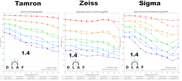
We’re going to compare three superb 35mm f/1.4 prime lenses today: the Zeiss Milvus 35mm f/1.4; Sigma 35mm DG HSM Art; and Tamron 35mm f1..4 SP. Let’s start by comparing what we’ve already shown in MTF articles: the Sigma and Tamron have superb resolution wide-open, while the Zeiss is more about that dreamy look.
Let’s then take a copy or two of each and retest MTF going down one stop at a time, from f/2 to f/5.6
The graphs are small, so I’ll summarize what happens in words.
f/2.0
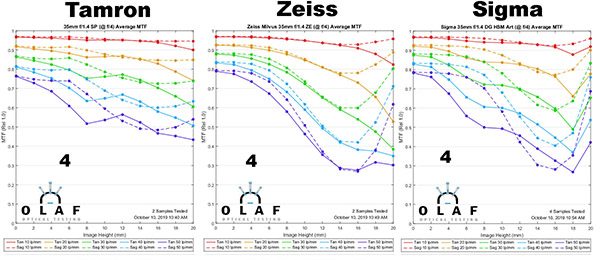
All of these lenses get sharper in the center at f/2, but the Zeiss sharpens most dramatically. You’d be hard-pressed to tell a difference between the three now; the Tamron is still a bit better but the gap has narrowed. The improvement for all three lenses, though, is mostly in the center. The outer half is more ‘different’ than better. The Sigma is interesting, though. It’s sharper at the edges but doesn’t really improve in the middle area, about 2/3 of the way to the edge. There’s a subtle, but really interesting, finding that we’ll explore more later.
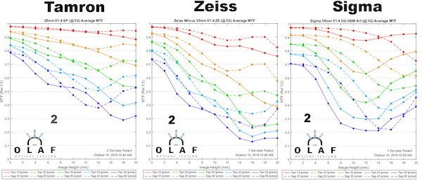
f/2.8
There’s more improvement, as you’d expect, with improvement now showing up more away from center. At f/2.8 the three lenses are almost identical, but if you look closely there are some subtle differences. The Tamron and Zeiss look very good until about 2/3 of the way to the edge; after that, there’s significant astigmatism. The Sigma made big gains in the center of the image, catching the other two and actually keeping that center sharpness a bit further out now.
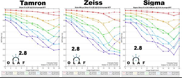
f/4
Let’s bust generalization #2 as we continue. We’re clearly sharper in all lenses (at least away from center) at f/4 than we were at f/2.8, so none of these were at maximum sharpness 2 stops down.The big change here is we now have ‘near center’ sharpness out 1/3 of the way to the edge in all three lenses. The Tamron looks great all the way to the edge, while both the Sigma and Zeiss show that ‘middle sag’ about 2/3 of the way to the edge.
f5.6
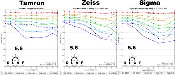
Now, four stops down, we have all lenses behaving similarly with good performance throughout the field. They all look pretty similar and directly comparing a photograph you couldn’t call one better than the others. Just for keeping anyone from looking silly over the next few weeks, this does NOT mean ALL lenses look the same stopped down. We’re comparing 35mm f/1.4 lenses here. If one of these was a zoom at 35mm it would not look the same. It would not look the same even at f/16. What about a 35mm f1.8? I’ll save that for a later article, this one’s going to be really long as it is.
So What is Happening as We Stop Down?
If a lens was perfect, the MTF would be 1.0 from the center to edge (yes, I’m generalizing). But no lens is perfect; they all have multiple aberrations. You see some of these aberrations talked about online, but there are many, many aberrations; you know the names of maybe 6 or 7; an optical designer is worried about dozens. If you want a more complete discussion of all this, I recommend Brandon Dube’s two-part post on Optical Limits, but even that isn’t going to cover all of the higher order aberrations.
The difference between 1.0 and what the MTF actually is, well, that’s the summary of all these aberrations at work. Most aberrations improve when the aperture is smaller. Most aberrations become more severe further away from the center.
The mathematical formula for how aberrations improve as you stop down and as you go away from the center are fairly straightforward, but different for each aberration. For some examples, the amount of spherical aberration is y3; (the cube of aperture). So stopping down just a bit markedly improves spherical aberration from the center to the edge. Elliptical coma severity is y2 h3 ; (in words the square of the aperture and the cube of the distance from center). Stopping down reduces elliptical coma dramatically in the center, but less so as you go away from the center. And again, the ratio of ‘improve with stopping down, worse away from the center’ is different for each aberration.
Every lens has a number of different aberrations, and they are different in every lens. The optical designer can and does calculate how the lens will behave as you stop down. This requires all of the optical formulae of the lens, a good computer, and some very expensive programs. Since neither you or I have access to that, the only way to tell is to test them.
You should expect every lens to behave somewhat differently as you stop down, just like these did, because every lens has a different barrel full of aberrations. (Get it? Barrel full? That’s funny right there.) It’s not surprising that several expensive 35mm f1.4 lenses behave similarly because they have a fairly similar set of aberrations. It will be more interesting to see how they compare to some less expensive 35mm primes and even zooms at 35mm in subsequent posts.
Now for More Geeky Stuff
(You don’t need this, the takeaway message is largely in the first half. But if you have a long enough attention span, it’s interesting and geeky-cool.)
We can get a more ‘visual’ picture of what’s going on if we look at a different graph than just MTF. We’re going to use MTF vs Field vs Focus graphs, AKA field curvature graphs. You can Google “fun with field of focus” if you want to see more about what these graphs can do, they’re incredibly powerful. But first, let me explain the difference between them and regular MTF graphs.
When we measure MTF, the machine carefully focuses right in the center of the lens. It then measures MTF from one side of the lens to the other, never-changing focus. (The graphs that come out of the machine are a bit different than what you are used to; the middle of the lens is in the center. In regular MTF graphs, the center is on the left side and the edge on the right.)
Now this MTF of a single lens shows it’s sharpest in the center and softest away from the center about 12-14mm. I put some subtle red markers to show where that is. But here’s the question: is it actually softer there, or is it out of focus there? If the lens has field curvature, it might be mostly out of focus; it might be sharper than that if we focused at that place rather than in the center. (Of course, if we did that, the center would be out of focus and therefore softer.)
So let’s tell the machine, at every single place, measure the MTF at every single focus position, not just the one that was best for the center. This takes about 20 times longer than a regular MTF, but gives us about 40 times more data. For one thing, at every place we measure we can see if the field is curved (if the best focus position is different than the center). For another, we can determine what the best possible MTF at every position would be if we focused there instead of the center.
Here’s a graph showing those things. The left scale is the machine’s focusing distance, the black line across the middle of the graphs shows “0” focusing distance, that is, the focusing distance where center sharpness is best and therefore where the regular MTF was measured. But this time we’ve measured the MTF at all focusing distances, so if it’s higher away from best center focus we can see it.
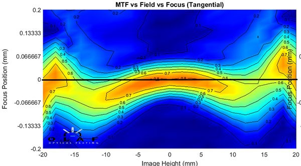
Now if you look at about 12-14mm away from the center you see that the best MTF isn’t ever as high as the center (it’s barely yellow instead of dark orange, which is the highest MTF). BUT, you also see that if we focused a bit behind, it would be higher than what the regular MTF graph measured along the center bar. At center focus (black line) the MTF is light blue (less than 0.5) and that’s what the regular MTF graph showed. But, if it was focused differently, the MTF could have been yellow (more than 0.6).
If you look at the whole graph, you also see the lens is very slightly tilted. If you scroll back up to the MTF graph, you’ll see this explains why the MTF is slightly different from one side to the other.
Now you would think that stopping down would overcome that field curvature. But does it really? And when does it? If we look at these graphs, rather than just the standard MTF graph, as we stop down, we should get a good idea. Before we do that though, there’s one more thing. Remember, these graphs have way more data than a regular MTF, so much more that I can’t easily graph it all in one graph.
The graph above, for example, is straight out of the machine and shows just the tangential plane. We can regenerate more data into a 4-plot like this. (The colors are different because we liked this color pallet when we wrote this software.)
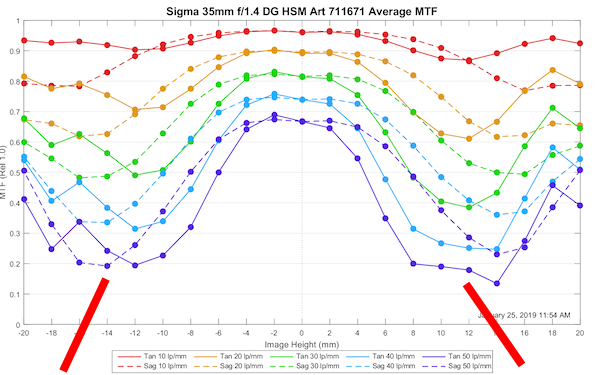
The lower right graph of these 4 is the one I showed above, the tangential field. But notice the one on the bottom left, the sagittal field. It’s shaped quite differently than the tangential field, as is often the case. You can tell at a glance that the best sagittal focus and best tangential focus aren’t in the same place as you go away from the center. This is astigmatism. (For the MTF scientists among you, I know that’s a bit of a generalization, but it’s a reasonable one.) Looking at the field curvature, you get a good idea of why the Sigma MTF curve (see above) sagged around 12mm-14mm away from center.
The top-left graph is a mathematical average of sagittal and tangential, hoping to mimic how sharp the lens is overall when you take a picture. The upper right is basically showing how extreme the difference (astigmatism) is between the two fields.
As an aside, this is why I’m often amused by good bokeh / bad bokeh arguments. Astigmatism affects bokeh and you can see astigmatism varies depending on how far away from the plane of focus you are and how far away from the center you are. Bokeh in those dark blue and dark red areas is going to be different than in the white areas. Which is why a good photographer can get better-looking bokeh out of a given lens than someone else.
Let’s Compare the Other Two Lenses
Here is the Zeiss Milvus 35mm wide open. You can see that the sagittal and tangential curvatures overlay each other more closely than the Sigma’s did in the mid-range. They do tend to separate out at the very edge, though. Again, if you go back and look at the MTF graph above you can see that edge difference.
And here is the Tamron 35mm SP. This copy is very slightly decentered, notice the maximum sharpness is around +4mm from center. Don’t lose your mind, this is very common. The fields are very flat, almost completely overlaying each other until the edges. Again, we saw that separation at the edge of the Tamron’s MTF graph.
Now for Even Geekier Stuff
Just looking at the field curvatures helps explain some of the differences we see in these three lenses wide open. And we know field curvature shape doesn’t really change as we stop down. So if we look at how these field graphs change as we stop down, we can get a nice visual image of how the lens behaves in real life.
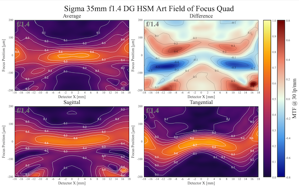
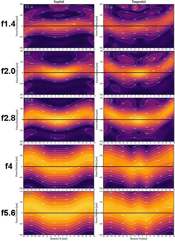
Sigma 35mm f1.4 Art
We’ll start with the Sigma lens. Here are the sagittal and tangential graphs as we go from f/1.4 to f/5.6. This is at a frequency of 30 lp/mm and I’ve drawn a black line across each graph at ‘best center focus’ so this is how the lens would be if you were point-focused on an object right in the center of your image.
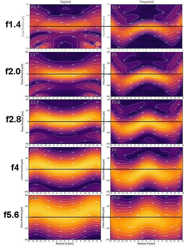
There’s a lot of interesting things to see in this graph. For starters, let’s compare the f/2.8 images to wide-open and f5.6. You can see here that the ‘sharp as it gets two stops down’ rule-of-thumb is true in the center, but not away from center. Also, look at how much the thickness of the yellow area changes between f/2.8 and f5.6. It’s very apparent why you really do want to be way stopped down for landscapes; f/2.8 isn’t enough.
Finally, even at f5.6, you can see the sagittal and tangential fields just barely overlap out at the edges, and you definitely would still see some astigmatism out there. The edges are still not as sharp as the center, although they’re pretty close.
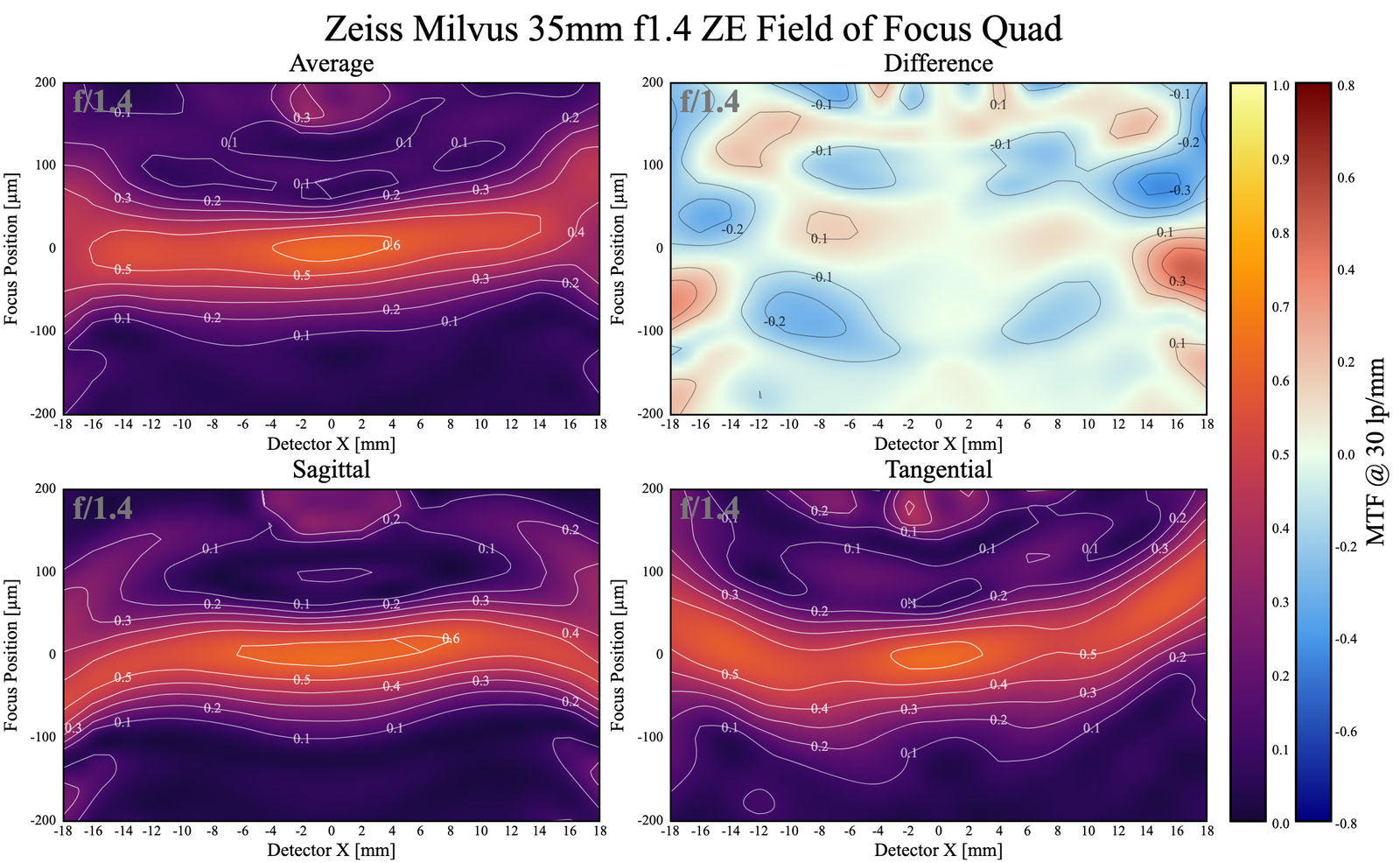
Zeiss Milvus 35mm f1.4
The Zeiss gives a much different picture than the Sigma. While the sagittal and tangential fields are of slightly different shapes, the overall curve is in the same direction. At the edges, they are maximally sharp at f/4, but the field curvature means they are sharp at a different focus plane than the center. If you took a landscape image with this lens the edges would be very close to center sharpness, but that sharpness would take place a bit closer to the photographer than the maximum sharpness at the center. This is the classic ‘curved field’.
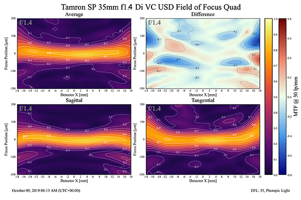
Tamron 35mm f1.4 SP
I figure by now you can imagine the center line I drew in the other two.
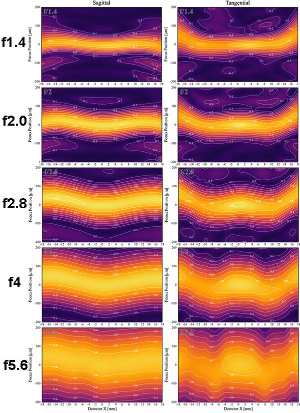
The Tamron gives us a slightly different pattern than either of the others. The fields overlap better than the Sigma, but with less curvature than the Zeiss. However, the tangential field never gets quite as sharp as the sagittal field. The end result is the field of focus, by f/5.6 is the same for the edges as the center, and there’s not as much astigmatism as the Sigma had. But the tangential plane, in the middle ranges, isn’t quite as sharp as the sagittal.
Let’s go back to that graph I showed you earlier in the 4-graph sets, the one that shows the average resolution combining sagittal and tangential at f5.6 for each lens. (Remember, these are single lenses, not an average of 10, so you see some irregularities. Because all lenses have them.)
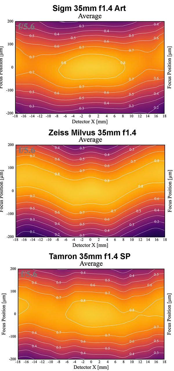
What we have are three really good lenses that at f5.6 should make everyone very happy. They’re basically identical in the center of the image. But away from center, there are differences that would be noticeable. The Sigma isn’t quite as sharp in the outer half. The Zeiss is sharpest in the outer half, but even at f5.6 the sharpness at the edges is in a different plane than the sharpness in the center. The Tamron is a pretty good middle point; less field curvature than the Zeiss, a bit better outer half sharpness than the Sigma (again, our sample lens here is a bit decentered).
Things would be a little better at f/8, although you might (or might not) be worried about diffraction softening starting to kick in.
Would all of this affect my lens choice? Probably not, there are more important things to consider. BUT, if I shot landscapes with a 35mm I might be concerned about the Sigma’s edges at f/5.6. (OK, I wouldn’t really, but if the difference was greater I might.) If I shot architecture, then I might prefer one of the two with flatter fields. If I shot landscapes, or group photos, I might want to set up my shots to minimize (or benefit from) the field curvature of the Zeiss.
So What Did We Learn Today?
My point in all this, is simply that even 3 lenses that are very similar; same focal length, superb image quality, expensive primes; have slightly different behavior stopped down. And hopefully, this made you curious as to how less expensive primes, or even worse zooms, will behave stopped down. Cause that’s what we’ll look at next.
Roger Cicala and Aaron Closz
Lensrentals.com
October, 2019

53 Comments
Jeremy Wright ·
So much fun information! and yes of course we want to see comparisons to F/1.8 or slower primes and a couple different zooms (hoping for at least a high level zoom and a kit zoom)
Roger Cicala ·
It’s on the way. Next week, I think.
Cato Hals ·
I hope you include the Tamron 35mm 1.8 Sp Vc
Ernest Green ·
Thanks! Always wondered how your 50 line pair test shows stopped down. Can’t wait to see more. Now curious though… you have Fujifilm lenses in the graphic… would you ever test Fujifilm lenses? Particularly their 23 1.4, 35 1.4, 23/2, 35/2, 90/2. There’s not really many out there that test them.
Roger Cicala ·
Right now I don’t have a mount to test them. One of these days probably.
Andreas Werle ·
Thanks Roger for sharing your data an the wonderful explanations.
I remember, that we find the beautiful shaped “middel sag” of the Zeiss 50 mm Milvus at f 4 also in the old Leica R 50mm Summicron at f 5.6 and in the Leica R 80 mm Summilux at f 2.8. So this might be due to field curvature. The similarity is astonishing anyway, because the lens design of the old Leica and the new Zeiss are – of course – completely different.
I also wonder about the improvement of center resolution in case of the Zeiss at f2.
The paragraph about “more geekier stuff” raises the question, whether there is an optimal combination of aperture and distance setting for a given subject at a certain distance, which might be interesting, when more high resolution cameras and lenses are available. But this is perhaps only important for studio photography.
Greetings Andy
Andreas Werle ·
Roger my head is spinning, when i start to think about this idea.
Put the camera on a tripod. Ahead of you is a cube, a three dimensional coordinate system in which you can place a tiny object in every position. When the camera takes a picture, you would ideally measure the distance to the object for correct focus (the lenght of a cord tied between the object and the film/sensor – or a vector pointing to the object). But this is not what the camera is doing. In Mirrorless cameras the sensor measures the contrast of the object and adjusts the distance setting of the lens. The camera does not know the real distance (also true for Dual-Pixel CMOS?). Now, if you stop down, the object runs out of focus because of field curvature and i dont know what.
Two possibilities can avoid this: either measure stopped down or know a correction factor. Ideally you would like to have a list of correction factors for every point in the cube and every aperture. A digital camera is a computer, so it can manage this – theoretically.
Things will perhaps become difficult if we imagine the requirements for eye detection autofocus: a moving object with changeing light, a video-camera and cine zoom lens, which is expected to be parfocal. 🙂
DC_Alan ·
Fascinating read. Thank you!
Calhoun Zabel ·
Roger, please don’t ever stop posting these geeky articles. They’re the reason I started reading this blog, and I check daily for new posts.
Even with all the caveats, and though it doesn’t help me pick lenses – the fact that you take the time to educate and share the very detailed data you collect is something that should be applauded.
Keep up the excellent work, I look forward to learning how poorly the zooms stack up to the primes!
Guido ·
Thanks! For years this is the most readworthy blog regarding lenses!
Vladimir Gorbunov ·
Thanks for another great article!
“there are many, many aberrations; you know the names of maybe 6 or 7; an optical designer is worried about dozens”
And then in the middle of his worries (presumably about 85/1.2 super-duper-lens) he’s interrupted by seniors: “Hey, give me collapsible pancake zoom for APS-C, with decent quality, optical stabilizer, and it shall be dirt cheap for bundling with camera! Quick!”
GulliNL ·
I can’t imagine the producers of these fine lenses wouldn’t know about focus plane vs curvature. Is it simply not possible because you don’t always have a fixed distance and width of a subject and therefore it is impossible to design a lens that would have everything you want in focus?
By the way, I’m quite curious now how a 10mm or wider would look on these charts. They should have a wide focus band right?
Brandon Dube ·
Because we look in image space, the width of those bands is tied only to F/#. The mapping into object space is inversely proportional (or so) to focal length.
umad?! ·
Thanks!
I did learn something and that’s why I was unhappy with multiple copies of the Sigma Art 35mm f/1.4 on the Fuji GFX cameras. 12mm away from center, where the Sigma seems to be by far the weakest, is just half way to the edge on the bigger center and is, where a lot of subjects are placed. I never was perfectly happy with the sharpness
Ivo de Man ·
Hi! Did you try the Tamron on GFX?
JP ·
To echo a few other commenters, thanks for continuing to share your exploits.
It may not be evident, because there’s no direct correlation data possible from a simple blog post, but my last two multi-thousand dollar rentals were through Lens Rentals because your team has earned my trust through these articles.
Daniel D. Teoli Jr ·
The only time I shoot 16 or 22 is if I need dof. I test all my lenses at the first 5 stops and make a note of the results. That is the range I tend to shoot in. Some lenses are acceptable wide open others are not. But I want to know upfront what to expect.
??? ·
please don’t ever stop posting these geeky articles.
Stephen ·
I wish the rez on the graphs was high enough that the legend was actually legible..
appliance5000 ·
Regarding diffraction. I think it relates to sensor size because perceived circle of confusion has to do with magnification. My unscientific rule of thumb is 5.6 for aps and 8 for FF (2x the area of most aps) is a nice conservative place to start considering the effects of diffusion. 8×10 lenses regularly have stops of f64, and that is useable because once again magnification is so much less for a given final image size.
For purposes of DOF I will go to f16 on my FF (with very good primes) and still be nicely sharp. Heck, my sometimes nice 17mm RMC only really works f11 and beyond .
Carleton Foxx ·
Thank you for admitting that. I was taught that viewers judge sharpness by comparing the relative blur or focus of objects in the frame—they can’t judge sharpness in a vacuum very well.
So even though you might get a little bit of diffraction it’s better to use f/16 and get the depth of field you need than to open up the lens and wind up with part of the image too soft to tell your story.
appliance5000 ·
That’s another point – though not what I was discussing. It also leads to the perception of lenses with a super sharp center but a drop off at the edges and corners.
Larry Templeton ·
I think diffraction limitations set in sooner for high MP cameras. I don’t remember the numbers, but it seemed that there’s somewhere around a full stop of early onset diffraction when comparing a 61MP FF sensor to a 24MP FF sensor.
Federico Ferreres ·
It doesn’t set sooner. But the higher MP camera can observe it earlier because it can see smaller detail. Actually, it’s not even relate to MP counts, but pixel pitch. How big is each photosite?
Larry Templeton ·
Okay, fair enough… Diffraction is observable sooner for high megapixel cameras. ?
I don’t think Sony improved upon the physical structure of the sensor in any meaningful way, apart from not losing anything over their latest 42MP design—which is admittedly an achievement when you consider the a7R IV’s 10fps capability, improved focusing abilities, etc.
Steven D. Keirstead ·
Actually diffraction is not related to the sensor or film grain size at all, and is the same for the given lens aperture. But a sensor with smaller photo sites more accurately captures the blur caused by diffraction (or defocusing). And a really good lens won’t produce a smooth Gaussian blur from a perfectly focused point light source but a diffraction pattern of an Airy disk surrounded by circles (point spread function). But you usually only see that in fine microscope lenses, not consumer-grade photo lenses.
l_d_allan ·
RC>> As we all know, expectations are a downpayment on disappointment, though.
Nice phrasing. Good writing!
Roger Cicala ·
Don’t forget, Hope is not a plan.
P. Jasinski ·
Roger, Thank you again. And again. The recent geek articles are the most informative and interesting photography gear related texts I’ve read in years!
I believe that (multi)million dollar project/donation for stopped down lens testing is closer than you might expect. I don’t have that kind of money, but I will gladly pay upfront whatever I can to support any project which results in so much information about lenses I use on a daily basis, not to mention the time it would save me if I didn’t have to figure these things out via trial and error.
John Gilbert ·
Roger good article. I need another wide angle lens so I am considering this Tamron and the Nikkor 16-34 f/4. The Nikkor is on sale and the cost isn’t the main factor for me, I want quality and sharpness. Which would you recommend?
Roger Cicala ·
For pure sharpness, the prime >>> than the zoom. But for convenience, the zoom wins handily from 16 to 30mm for certain.
Astro Landscapes ·
I’ve been writing an eBook on landscape photography and have been meaning to message you about a theory I have about how DOF and field curvature behaves. I suspect that the answer could be in this article… Yay!
Roger Cicala ·
If not this one, there’s a follow up coming next week that probably has it.
Astro Landscapes ·
Glad to hear it!!! Except then I won’t be able to call my information “secrets” that other photographers have never shared. Oh well.
Roger Cicala ·
Sure you can. Other than the 2 dozen folks that read this, no one knows.
Astro Landscapes ·
(insert crying emoji that you can’t tell if it’s happy crying or sad crying)
Neal G ·
I suppose if you’re taking a landscape photo at f1.4 there’s a good chance something in the photo is going to be out of focus and DOF will be as much limiting as the sharpness of the lens. Of course this could be overcome with focus stacking.
Another thing I often wonder about is how often does poor auto or manual focusing negate sharpness? Like, we photographers chase after the sharpest of the sharp, but then does something else just cancel that out on us?
Henry Winokur ·
Photographers who shoot for sharpness and then print on matte paper–that is the “something else” that cancels out “shooting for sharpness”.
Neal G ·
True as well!
Jim Kiefer ·
Found this on the fredmiranda archives from 2013: “unreasonable expectations are a down payment on disappointment” posted by none other than RCicala. Did you come up with this phrase? Like it. Really enjoy your blog posts.
Roger Cicala ·
I don’t even remember if that’s a me original, but I’ve been saying it for decades. I have a feeling one of my old professors used it, but that’s so long ago I can’t remember.
Scott Kirkpatrick ·
I loved this article. Especially since you stuck to just three lenses. Isn’t the big change from f/1.4 to 2.0 and beyond the classic split personality design strategy for fast lenses — showy with a center emphasis and blur at the sides wide open and then competent across (most of) the fields when stopped down? Ultimately you will never test every lens I own, so hopw to test for this kind of stuff at home…?
Roger Cicala ·
One thing I suggest is finding a grassy area, putting something in the center of the field to focus on, then taking images at various apertures. Take the images and run them through photoshop “find edges” filter and you’ll get a pretty nice picture of the field curvature.
iKonOkLasT ·
Roger, how does focus position translate to object-to-image plane distances? At first I thought positive focus values translated to longer object-to-sensor distances but it seems I may have that backward because in the example grass photo in the other article where you run a find edges filter, the focus field curves toward the camera, so for these lenses that have W-like focus fields to line up with such a curve (assuming field curvature generally curves towards the camera rather than away from the camera), the more positive focus position values translate to smaller object-to-image plane distances, correct?
Hunter45 ·
I am retired, so I can do the “year working for free” gig.
Lee Wooten ·
My question may be a bit on the edge of Roger’s main points, but here goes. I understand (I think) that the tests are conducted with the lens focused at infinity, and, consequently, focus distances for the center and the edges are the same. However, it is not clear to me, for a flat field of curvature, what the focus distance at the edges should be for closer subjects, that is, compared to the focus distance at the center. I realize that there most likely is no rule, and, even if there were, lenses will do whatever they do anyway. By way of example, if I had a perfectly flat field curvature for a wide-angle lens, and I want my portrait group to all be in perfect focus at say 10 ft, do I line them up in a straight line with the center subject at 10 ft or along a radius of 10 ft? Realistically, I just happy if the group lines up and tolerates my desire to take the photo. Stated another way, if I wanted to check the sharpness of a lens at 10 ft, should I use a straight or a 10-ft-radius curved target?
Oh, and thank you to Roger for the cultural reminder. I grew up in the South but have lived in colder climates for the last several decades, and I’d forgotten the lovely and polite dismissive of “That’s nice.” I’ve grown used to hearing the more straightforward “You are so full of [not a word used in polite southern circles].”
Lee Wooten ·
Oops. I just realized that my last comment applies to Roger’s follow-up posting (https://www.lensrentals.com.... My apologies for being out of context.
Gerard R ·
Roger: how would focus shift appear on these graphs?
Aditya ·
What a fantastic article! I really wanted the Zeiss for the way it renders landscapes, but, I was realistic. With a toddler at home, it was the Tamron that was ordered to handled all things. I have two MF lenses and that is more than 2 more than I can justify.
Wayne R Crauder ·
(For those of you who are new here, I don’t have the resources to do it. If someone wants to donate a million dollars or a year working for free, I can reconsider. )
And if a geeky old man had a year to donate knowing the process is probably boring, but the data mining would be fascinating, would you have the equipment available for the project?
Adam Palmer ·
These are my favorite lens articles anywhere on the internet
paul ·
- [ ] Binary option, Forex trading, Romance, ICO Scams, Online betting, Bitcoin, Phishing, exchange scams etc
- [ ] If in any case you have lost your hard earned money. Dont give up, I have a good news for you. Asset recovery is currently recovering funds for all victims. Service delivery is second to none. I obliged myself the priviledge to announce this to everyone. Hurry and contact on; info at Assetrefundteam at gmail dot com...for more inquiries and contact expert cryptographer kathinda wu on her personal direct line +1 (917) 336‑3071
Thank me later.
You can contact them on telegram also, https://t.me/assetrecoverynow
Dimy ·
Very nice, very few people with that much experience with measurements can reveal this insights.
And even less people are good enough to express these findings in a manner to make others understand publicly – thanks.