I’ve been doing a lot of technical things lately, writing up our repair data and investigating methods of reducing optical variation in lenses. So I thought I’d take a bit of a break and write a post about something fun. Human vision is always fun to me, since it’s an area where I can apply both my photography and medical experience.
Most of you probably know some of these things, but I bet most of you don’t know all of them. So I would recommend skimming along this rather long post to find the topics that interest you. Since it covers (among other things) carrots, advertising, Impressionist painting, evolution, optical illusions, and warship camouflage, there ought to be something of interest somewhere.
Carrots
Did your mother ever tell you to eat your carrots because it would improve your eyesight? You know that isn’t true, right? But did you know that this urban myth began as a government-sponsored disinformation program? Don’t get all politically hackled, it was back in the 1940’s. Great Britain had deployed radar-guided night fighters and knew Germany would notice a sudden increase in the number of planes shot down.
Great Britain decided to take care of two things at once: They needed to keep the Germans from finding out how good their radar system was and they were rationing almost every food imaginable and trying to get people to plant vegetable gardens. So they released a story that their leading night-fighter ace, John Cunningham, was nicknamed ‘Cat’s Eyes’ because of his amazing night vision that let him see German planes in the dark. Then they followed up by saying they’d discovered his night vision was so good because he ate massive quantities of carrots and they had started feeding carrots to all of their pilots with amazing results.
This not only fooled the Germans, it got British citizens planting carrots in their backyards so they could see at night during the blackouts. It also caused my mother to force feed me carrots as a child and I hate them to this very day.
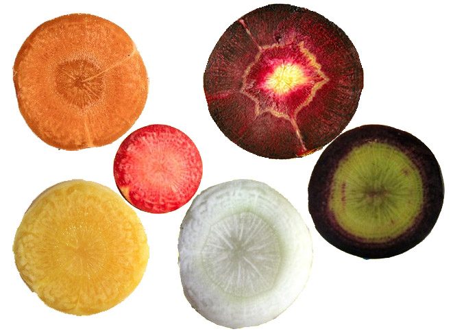
As an aside, did you know that carrots come in lots of colors besides orange? Actually, the original carrots were purple. Dutch breeders in the 1700s created the orange carrots we’re all used to. Makes you feel rather inadequate about that little team flag in your front yard, doesn’t it? When the Dutch want to display their team colors they create a whole new vegetable.
What has this to do with photography you ask? Well it provides a superb segue to talk about color vision, that’s what. OK, maybe not superb, but it’s decent. And I’ve been trying to work that carrot story into a blog post for months.
Color and Monochrome Vision
Pity Us Mammals
Most of the so-called ‘lower animals’ like birds, reptiles, insects, and fish have four types of cones cells and can distinguish far more colors than we can. There is some evidence that pigeons (AKA flying rats) actually have five types of color sensing cone cells, making them the color vision champion of the animal kingdom. They can even see into the ultraviolet spectrum. This probably explains why your pet pigeon isn’t too interested in your brightly colored photographs; he would find them dull and lifeless. (On the other hand, we humans don’t fly full speed into mirrored buildings, so I guess there’s always a trade-off.)
Almost all mammals either see in monochrome or dichrome. Dichrome mammals have two types of cones and can distinguish blue, green, and yellow—but not reds or oranges. Only primates and a few other mammals see three colors like we humans do.
So what happened to us? Early mammals were largely nocturnal and depended on scent and sound to find their meals (and to avoid becoming one). They didn’t need color vision, so they lost it – at least down to two types of color-sensing cone cells. Primates and a few other mammals (mostly tree living) gained a third, red-sensing cone, possibly because red and orange are the colors of many fruits that they eat.
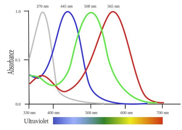
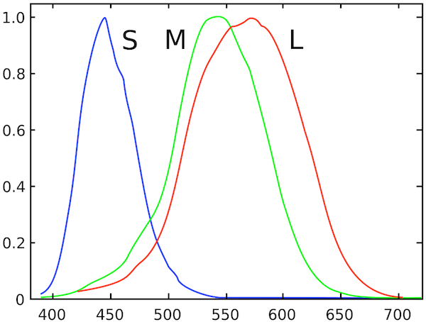
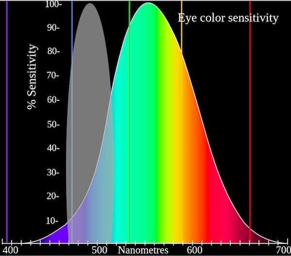
But the red cones we mammals have are actually mutated green cones (and the reason some of us are red-green colorblind is that we didn’t get the proper mutated gene). The graph below shows how the ‘red’ human cone is just a bit different from the ‘green’ cone, not spread out through the spectrum as nicely as the bird’s cones above. Our brains have to do a lot of processing with the information it receives for us to perceive color properly. All of this processing makes for some interesting side-effects and a lot of interesting art.
What Color is Grayscale?
In nice bright daylight, my cone cells are sensing all the colorful objects around me. Each type of cell is most sensitive, as you can see from the graph above, to certain wavelengths of light. If we sum all of this sensitivity together we’d find we’re most sensitive to greenish light, and least sensitive to red and blue. That’s nice – but you already knew that.
But what if I look at that same colorful scenery on a dim evening. All of the same wavelengths of light are still hitting my eye, but at much lower luminance. Now only the rod cells (what we think of as the black-and-white sensing cells) in my eye are working. Logic would suggest they should also be most sensitive to green light, but they aren’t. They’re more sensitive down in the blue area.
Does it make a difference? Actually it does, a little bit. For example if you put some red apples in a blue bowl, the fruit will look brighter than the bowl in daylight. In dim light, after your eyes have acclimated, the bowl will look brighter than the fruit. Yeah, I know this is pretty useless, but now when your wife asks if you’re reading that stupid photography blog again you can say “No! I’m doing science!” and threaten to show her what you’ve learned.
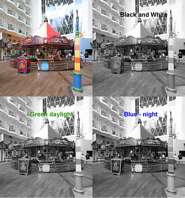
This principle can help a bit when we convert color images to black and white. Below are an image of a carousel in color, after a standard black-and-white conversion, and converted to black-and-white with green emphasized (like daylight vision) and blue emphasized (like night vision). They are slightly different.
Look at the stripes on the pole in the foreground or the trim on the ticket-taker’s booth. Default black-and-white conversion can lose some details that our actual vision would never lose. Playing around with Channel Mixer for your black-and-white conversions, starting with a green or blue emphasis, will often be more realistic than the standard ‘convert-to-grayscale’ conversion.
Vision Processing and Why I Like to Work in LAB
I promise not to go all neurophysiologist on you (those guys are geekier even then me, and can spend hours arguing over things like opponens-processing theory and close-area inhibition). But there are some interesting things about vision processing we can discuss without going there.
Visual information leaves the eye along the optic nerve and travels to the middle of the brain (the thalamus) for preliminary image processing and then to the back of the brain for more intensive processing. The anatomy and stuff aren’t particularly important for my purposes, so we’ll just skip over the 30,000 words it would take to describe them all. I will mention that “blob cells” and “interblob cells” are involved, just because I found those names awesome compared to Latin terms like Lateral Geniculate Nucleus, koniocellular neurons, and extrastriate cortex. Those latter terms can be useful, though. If you want to share the carrot story, for example, you’ll sound a lot smarter if you say something like, “I was reading about vision processing in the Lateral Geniculate Nucleus and koniocellular neurons yesterday, and discovered that carrots aren’t really good for your eyes.”
Anyway, the bottom line (well, one of the bottom lines) is the brain separates out visual information into two different major streams.
- The first stream (called the dorsal or ‘where’ stream) processes images in monochrome. It detects luminance and high resolution, has binocular vision with depth perception, locates objects in 3 dimensions and tells us how they are moving (or not moving).
- The second stream (called the ventral, or ‘what’ stream) processes the color and shape of objects (it’s very sensitive to edges) and connects with other centers of the brain that identify objects. The ‘what’ stream is actually of much lower resolution than the ‘where’ stream.
People who suffer damage to these areas of their brain have very strange problems. When the ‘where’ system is damaged, for example, the person may find it impossible to cross a street — they can see a car coming but have no idea how far away it is or how fast it is travelling. When the ‘what’ system is damaged people may no longer see colors or may not recognize objects. They might describe the parts of a person’s face (blue eyes, thick eyebrows, large nose) but not be able to recognize that person is their brother. (If you find this kind of thing interesting, I highly recommend “The Man Who Mistook His Wife for a Hat, and Other Tales” by Oliver Sacks.)
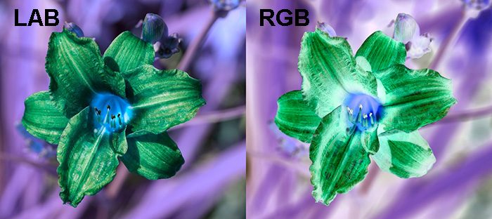
What does this have to do with why I like to work in the LAB colorspace (as opposed to the standard RGB) when I’m playing in Photoshop? One reason is because LAB separates an image much like the brain does, into a high resolution monochrome image (the Luminance channel of LAB) and two lower-resolution color channels (the A and B channels of LAB).
For those of you who aren’t familiar with it, let me show you a quick example. The image below shows a flower, with the Luminance channel and combined A and B channels separated out below it.
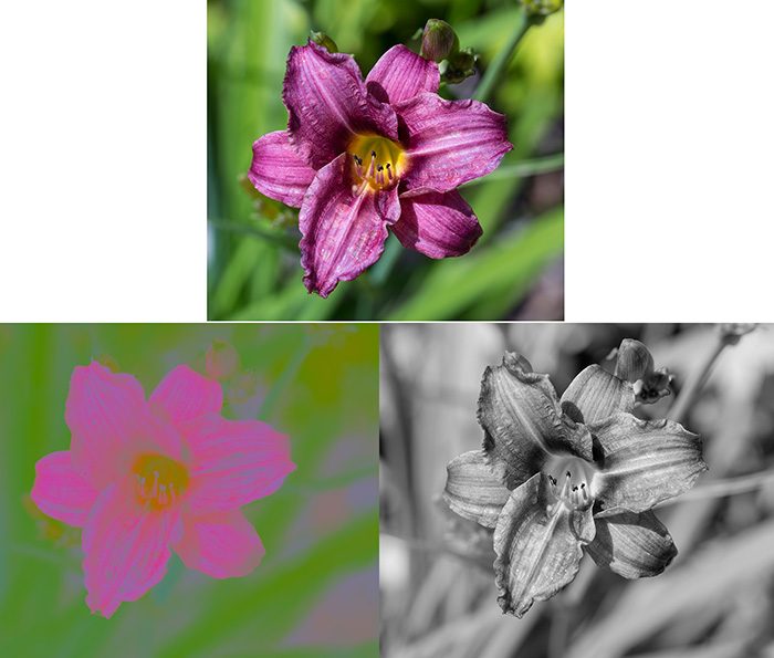
If you haven’t worked in LAB before, or haven’t studied color theory in art school, you might be shocked at how little information the two color channels seem to contain compared to the luminance channel. Now you understand why some video codecs (and jpg for that matter) can compress the hell out of the color information without affecting the image all that much. You also understand why those rare neurologic conditions that cause loss of luminance perception but retained color perception, leave their victims nearly blind. (Human vision isn’t quite like this; our color vision emphasizes edges, but it’s similar.)
Just in case you think that color information isn’t important in everyday life, though, try to identify 10 of the fruits in this black-and-white image.
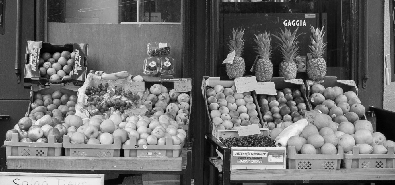
Yeah, you were pretty lost after pineapple, weren’t you? Adding that low resolution color makes an impressive difference, doesn’t it? It also is a good example of why primates, who loves them some fruit, had an advantage with color vision over the monochrome mammals.
Fun in LAB
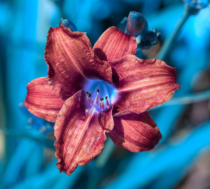
While the LAB color space in Photoshop isn’t necessarily better than the the RGB most people work in, it lets you do some things you could never do in RGB because you can basically manipulate the heck out of the color channels. For example, if I invert the flower photo from above in RGB I get the image on the right, while if I invert the color channels in LAB I get the image on the left. Pretty different.
Or I could just invert the B channel and get this. Just the ticket if I want to make everything look like a scene from “Avatar”.
Or if you like oversaturated colors, you can do it to a huge degree in LAB because you can manipulate the heck out of those color channels without adding noise or blowing out highlights or shadows. Accomplishing the same thing in RGB would cause all kinds of artifacts in your image.
Why would you want to do any of this? I don’t know. But there are things that can be done much more easily in LAB. Restoring unrecoverable blown highlights, sharpening images that have chroma noise (or reducing chroma noise), artificially coloring images, and a number of other things are easy as pie in LAB. Of course, there are other things that are easier in RGB. I think.
Fun with Luminance and Color
Those of you with fine art degrees already know most of this section, but those of us who aren’t so trained may find it interesting.
(Note: all of the images below depend on your computer’s monitor settings and your own visual perception. You may not see the effects I describe.)
Equiluminant Colors
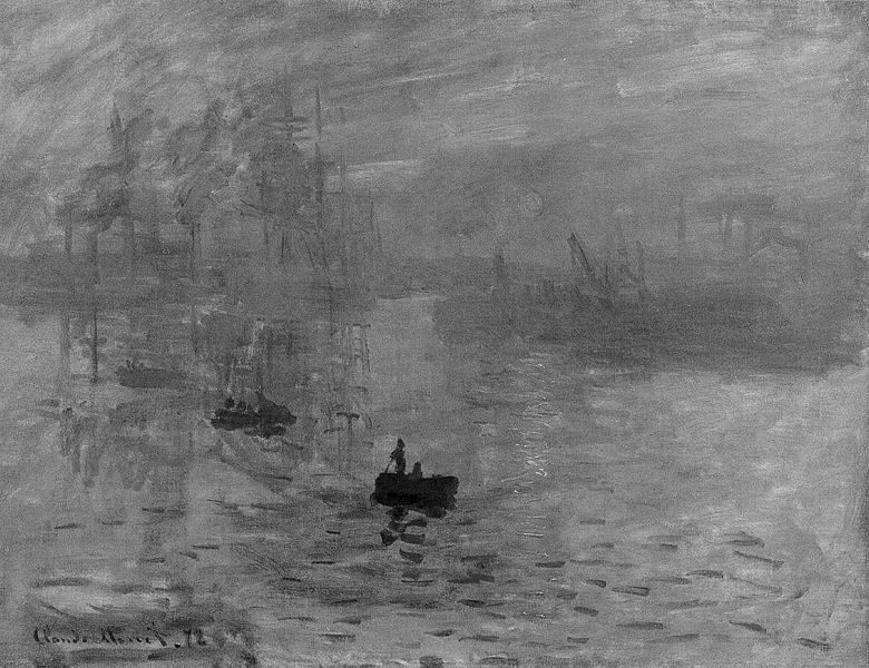
Painters have taken advantage of the fact that the position and motion sensing parts of vision processing work on the luminance of the image, while object recognition depends more on color and shape, for a long time. A classic example is Monet’s “Impression, Sunrise“.
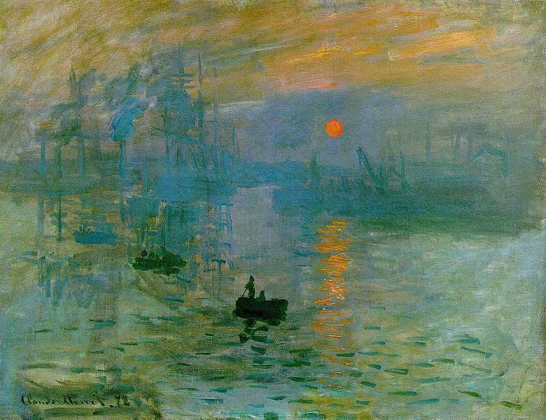
The sun is very dramatic. A lot of people, if they look at the picture for a while, see the sun seem to twinkle or vibrate a bit. If you look at the luminance of the image you can see why: the sun is nearly equiluminant with the sky around it. The position sensing part of the brain doesn’t have good data to say exactly where the sun is, but the object sensing part of the brain sees it very clearly.
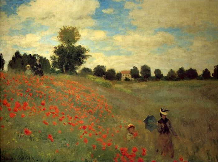
A lot of impressionist artists used this technique, although Monet was the master at it. His “Wild Poppies Near Argenteuil” does exactly the same thing with the poppies in the image, making them seem to almost move in a breeze. (I’ll let you do the grayscale on this one.)
One other nice technique here is that the bright red flowers in the foreground aren’t quite equiluminant so they grab the eye, while the background, equiluminant flowers emphasize the sensation of distance.
I know most of you don’t plan on painting anytime soon, but you can use this technique to modify a photograph of sunsets, flowers, or other colorful objects, using a ‘lighten’ or ‘darken’ brush to move the Luminance more towards neutral, and perhaps boosting the color channels a bit. A hint, though: only work in areas of mid-luminance. You’ll get color artifacts if you do it in areas of shadow or highlight.
Equiluminance for Fun and Profit
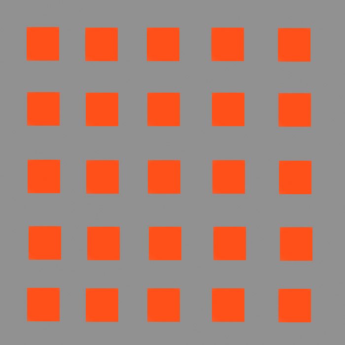
Equiluminance is one of the simple techniques used in optical illusions. The boxes below, for example, are color only, the luminance of both the orange squares and the gray background is 50%. The orange squares are square, but depending upon exactly how your brain processes things, they may have a halo or edges around them, may appear tilted, or jittery.
The image is just hard to look at (try looking at the second square in the second row and moving to the 4th square in the fifth row). Eye movement is controlled by the part of the brain that senses luminance and with no luminance to grab on to, it has trouble controlling where to send your eyes as you look around the square.
Now why on earth would anyone want to make something that’s so difficult to look at? One reason is because they want to sell you stuff. In the example below, the text is equiluminant and therefore quite difficult to read. So guess what we curious humans do when confronted by difficult to read text? We read it slowly. One. Word. At. A. Time. And that makes us more likely to retain the message. If it is a screaming, black-and-white headline our brains would immediately recognize it and discount it.

Generally an advertiser isn’t this blatant. They’d put the equiluminant text in with some graphic art, or perhaps even as part of a photograph. Or they use other tricks like different colored or different sized letters, putting the text on curved lines. But advertisers know if we don’t immediately recognize text we’ll spend a few seconds figuring out what it says. Every time.
Luminance Shading and 3-D
I mentioned earlier that the ‘Where’ system that is responsible for locating objects in space is monochromatic and luminance dependent, while the ‘What’ system that helps recognize objects recognizes colors and edges. If you look at the circles below, two have a bit of 3-D effect while the one on the right appears perfectly flat.
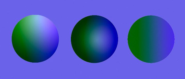
You probably won’t be a bit surprised to find that luminance has a lot to do with the 3-D effect, with the two balls on the left having luminance changes, while the one on the right has none, as shown in their Luminance channel below.
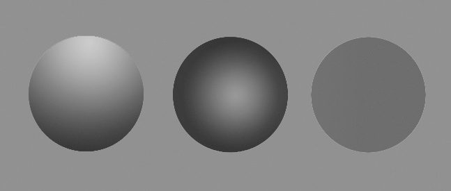
If I show you the two color channels, you’ll see the three balls are identical as far as color goes. (In fact, the way I made the drawing was to draw a ball using a blue-green color gradient, copy it three times, make black-white gradients in just the Luminance channel.)
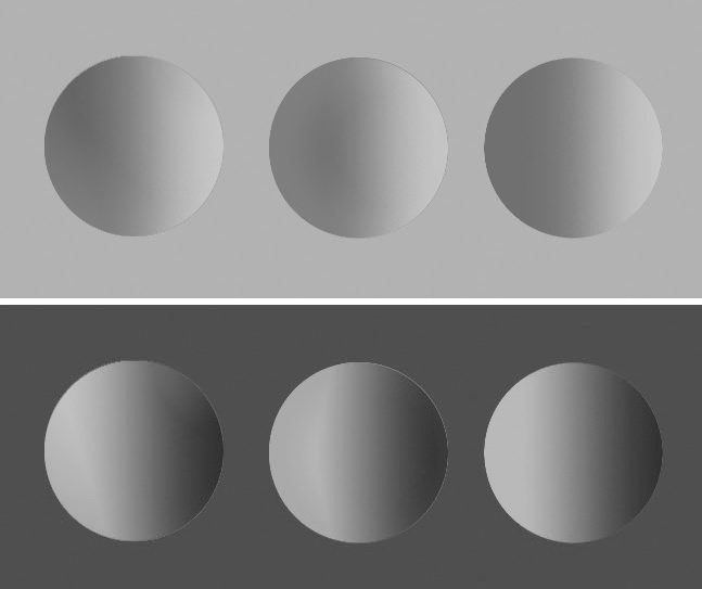
The take away message is you can’t give objects a 3-D look with color, it’s entirely a luminance thing. (Shading a color from light to dark is entirely a luminance thing, too. The color doesn’t change, simply the amount of luminance of the color.) There are many other factors, such as perspective, shading, and haze that go into depth perception, but this aspect of an object’s 3-D shape is basically luminance.
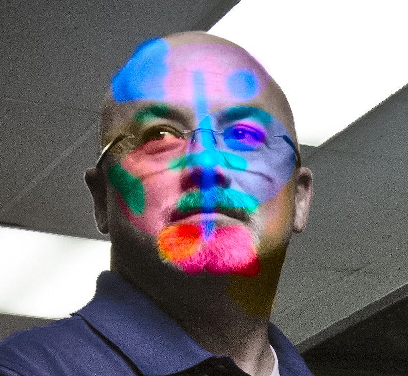
For the same reason, a bizarrely colored face with unchanged luminance, is simply a bizarrely colored face. We have no trouble recognizing what it is or even who it is.
If you paint something with huge differences in luminance, though, it becomes difficult to recognize. That’s the main concept of “dazzle camouflage” used on ships since World War II (and as recently as 2013 on the USS Freedom). Dazzle doesn’t particularly hide the ship (or other object), it makes it difficult to tell what the object is, and how it is moving.

There’s a million other fun things that separating color and luminance do to our vision. And there’s a lot more than just color and luminance to visual processing. But this little bit, hopefully, provided a ‘fun fact’ or two you didn’t already know.
Roger Cicala
Lensrentals.com
August, 2013

51 Comments
James Scholz ·
Roger, I always look forward to your columns and for me this is one of your best! Thanks so much for all your sharing.
Michael Maddox ·
In photoshop when working with RGB try duplicating the image layer Command-J on the mac and convert the upper layer to Gray Scale either using an adjustment layer or for better visualization set the blending mode to luminance and use the Black & White in adjustments Command Option Shift-B This allows one to adjust the luminance of the colors as they are mapped to black and white. Playing with the curves on the luminance along with the luminance allows some really spectacular tonal changes. Remember all power corrupts so everybody should have some.
Mike in Flossmoor
jrapdx ·
Excellent overview of a very complex topic. And thanks for the beautiful Monet examples–he indeed used color astonishingly well.
Such brilliance leads me to wonder what role varying levels of color discrimination ability influence the style and esthetic (let alone gear and technical) choices made by photographers (and other artists). It’s not a subject that’s gotten a lot of study but it sure seems likely that relative ability to distinguish colors would have a major impact on artists’ work and its success.
According to some research, gender is a probable factor. Studies show among people with normal color vision, women in general, have better color discrimination than men. Since females have 2 “X” chromosomes (where genes for red/green pigments are located), if each X encodes for a slightly different pigment spectral sensitivity, then a women could have a retina containing 4 color pigments, whereas men (who have only 1 “X”) would be limited to 3 pigments.
A study of retinas examined post-mortem showed such pattern in ~50% of women, but most curiously, in 8% of men as well (a mystery unexplained by the genetic factors that apply to females, but not males).
Of course, the 4 vs. 3 pigment idea is not “proven” in humans, but it is intriguing. It remains highly speculative in regard to artists, though potentially could contribute to enabling photographer/artists to make best possible choices optimizing the quality of their work and productivity as well.
Your readers might be interested in an on-line test of color discrimination ability, available at: http://www.xrite.com/online-color-test-challenge
Obviously, it’s not at all a definitive test (since monitors, etc., vary a great deal). But it is rather challenging, maybe entertaining, and probably informative.
Roger Cicala ·
JRA – Thank you for that link – most fun. It was especially interesting to me because I have a mild deficit in my “where” system from an old concussion injury. My color perception on that test was perfect. It makes me wonder if that’s one of the attractions of photography for me because I’ve always enjoyed the color aspect of it more than anything else.
Roger
Samuel H ·
Color me amused 🙂
Ed Okie ·
Roger, beyond your normal skills as an excellent writer (clarity, readability) the writing of this “fun piece about color and human vision” as it relates to photography… I’m inclined to suggest it is your best-ever column. Thought provoking, interesting and informative. Demonstrated elements of writing success delivered in spades.
Roger Cicala ·
Thank you, Ed. Whenever I do something different like this I’m quite certain, right after I hit ‘publish’, that nobody will like it.
bluto ·
Cool stuff, made me see how color deficency affects my vision (I tend to rely more on luminencense than color). Which also explains why I don’t really care for impressionism. I didn’t even see the sun, until I tracked it back from the much brighter reflection on the water.
SoulNibbler ·
I’ve really always enjoyed decoupling the L or V channel in post (I wish more RAW processors made it simple to do) but I normally use HSV or HSL color spaces so that I can use curves on the S channel. I read somewhere the the shift to LAB from HSL(V) made the images less noisy or more stable. Have you come across that anywhere in your research?
Also as an open source asside: one of the nice things about the Gimp is that there is a decompose and recompose tool in the color menu that lets you easily split the image into a number of different mappings (as layers) and preview the results. Now if only we had floating point color in the Gimp.
Richard ·
Holy Moly Roger, I’ve had to lie down in a darkened room with a cold wet flannel over my head after looking at those orange squares…
Great article as always, fascinating stuff.
and @jrapdx: thanks for that great addition.
David ·
This is why I’m having my students read Albers when we start color photography.
Per Engberg ·
Thanks from Denmark for yet another great post.
Samuel H ·
I like this color game even better (though at first understanding and using the UI is the biggest challenge, not matching the actual colors):
http://color.method.ac/
Tim ·
I found this book when I started using PhotoShop, and I’ve never turned back:
http://www.amazon.com/Photoshop-LAB-Color-Adventures-Colorspace/dp/0321356780
Thanks for another great article.
Roger Cicala ·
Tim, my favorite Photoshop book, thank you for linking that. I’ve had it around for a decade, I think.
Ben ·
Is there something wrong with me if nothing happened with that grey box with the orange squares? Just looked like orange squares, no shimmering, no eye crossing when looking from point to point.
Roger Cicala ·
Hi Ben,
You probably just are superior to us earthlings 🙂
But if your monitor or your eyes are a little different (could be either, but I’d bet on monitor) the computer’s conversion of the color space I used probably put some luminance contrast into the image. It jitters horribly for me on my desktop monitor on on a Macbook Pro, but on an iBook 13″ in the tech room it doesn’t move at all. But you might also go to the link jrapdx gave us: that’s a fun program and one of the people who works here just found out they have a huge color deficit.
ginsbu ·
Very enjoyable post, thanks!
Ben (another one) ·
Roger, great article. This makes me really curious about the field of computer vision…something I know very little about. I wonder if object recognition algorithms are designed to mimic human vision/processing or if they use entirely different principals. Now, I have even more reading to do!
bluto ·
Ben,
I had no problems with it either, you may want to get a color blindness test.
Tony Wong ·
Awesome article, as usual, Roger!
However, I think Mantis Shrimp have Pigeons beat for having the best eyes in the animal kingdom.
This page has some neat information on Mantis Shrimp vision:
http://science.tumblr.com/post/48036499588/extraordinary-vision-polychromacity-polarization-in
They can see into the UV wavelength, and see polarized light (circular and linear) and have up 16 different photoreceptor classes.
Nqina Dlamini ·
Loved it. I’ve never used LAB (or even heard of it). Thanks for the illuminating article.
Randy Schwartz ·
Man, can you write! BTW: I learned I was mildly daltonian when applying for a job at IBM- I had to match colored wires- they were mostly grey to me. lol I also learned I couldn’t write very well either. So, I became a physician and actually had to practice! (Although finding those eosinophils under the microscope was quite difficult.) Thankfully, there are physicians like you who make photography all the more enjoyable.
Really enjoy your blog.
Roger Cicala ·
Randy, I took almost the opposite path. I wanted to be a scientist but learned I couldn’t see higher mathematics, so medical school it was. I could see the eosinophils, as long as someone else did the gram stain 🙂
Randy Schwartz ·
Yes, Roger, the math physicians use to show things are “statistically significant” is certainly lower math. 😉 I’ll do your gram stains anytime you want…just keep writing your excellent articles.
John Leslie ·
I really enjoyed that, many thanks.
Roger Cicala ·
My apologies, Tom, your comment was originally deleted by a spam filter, so I’m pasting it under my name.
TomH
tomh@mailinator.com
Submitted on 2013/08/13 at 8:03 AM
Ben,
I wouldn’t worry too much about the orange squares test, as I’ve had my color vision tested as very good and have no problems when looking at it (and I tried viewing it on multiple calibrated monitors). The blue-on-green text is very hard for me to focus on though, and really messes with my depth perception.
Tony,
One of my favorite comics shows that the Mantis Shrimp’s special abilities don’t end with vision:
[url]http://theoatmeal.com/comics/mantis_shrimp[/url]
Roger,
Great article! Thank you.
Marek K Nowak ·
> It also is a good example of why primates, who loves them some fruit […]
This abuse of the English language makes me cringe.
Siegfried ·
Roger,
I never thought anything could be as interesting, sexy and alluring as lens striptease, but this post of yours does make it. It surpasses. All those recent days – before that recent lens data post – that I had been checking your blog for a new post and saw none were worth it.
Thanks a lot,
Zig
Roger Cicala ·
Thank you, Zig. The lens repair thing took me about 30 hours – I was completely burnt out by the end.
Things may be a bit slow for another couple of weeks. I’ve got to do some traveling, searching for the rumored Holy Grail of optical adjustment. If the rumors are true, though, I’ll really have some exciting stuff later.
Roger
Pat M ·
Roger –
As others have said, perhaps your best yet! Very fascinating insights into many things I had no idea about. Interesting to see how Monet used color and luminance to amazing effect in his work.
It’s enlightening to now know why all those old (was it MySpace?) pages with their obnoxious color combinations were so painful to try to read, and how so many optical color illusions are done.
I know I say this almost every time I comment, but by all means keep these articles coming!
-Pat
Burton Randol ·
Some of the issues discussed in this article may suggest reasons for the persistent attraction of black and white photography, as well as for the long-term place and allure of monochromatic drawing in the history of art.
Samuel H ·
Just to bring you down a bit: very good, but definitely not your best yet, if you ask me. You set the bar very high with the series on history of lens designs. And your best yet is this one:
http://wordpress.lensrentals.com/2009/06/it-takes-more-than-skill
Lots of love
andres w ·
Hi Roger, can I process the color in LAB and later save the image in RGB modus for printing? Thanks
Roger Cicala ·
Andres – of course. You flip to lab, when you finish up just flip back to RGB and save.
Richard S ·
Great post, Roger. I really appreciate the insertion, clandestinely, the evolutionary biology of color vision. Now if we could get an article from you on the vestigial organs of cameras and lenses (not that I know they exist, but I figure that if they do, you would be the one to know).
Roger Cicala ·
LMAO, Richard. Maybe it would be better to create the phylogenetic tree of camera evolution.
Fritz ·
Thanks. This is great article and I learned a lot from reading it several times. But one remark continues to intrigue me:
How would going to LAB help me to restore unrecoverable highlights?
Since I am just struggling with an important image suffering from this defect, any enlightenment would be greatly appreciated.
Roger Cicala ·
Fritz, not restore, rather repair. The technique is covered very thoroughly by Dan Margulis in his excellent books and posts on working in LAB. Basically you convert the image to LAB, color in the blown highlights with the appropriate color (not changing luminance) and convert back to RGB. During the conversion photoshop will slightly pull those highlights back from pure white and make them the appropriate hue and saturation. You can then fine tune it there. It sounds a bit lame in words but it often takes an image from “obviously blown” to “a bit overexposed”. You won’t recover detail (since there’s no luminance data) but it does amazing things with low-detail blowout, especially in portraiture.
Ruy ·
Roger,
I think carrot relation to good vision is cause carrot is rich in vitamin A besides antioxidants. There is a worldwide belief carrot is good to eyes in vitamin A depleted person as a source of that vitamin. When we think on carrot we think in vitamin A rich food. The cattle (bulls at least) recognize red color as red, I think. Does the bull have red cone? I think is very hard to talk about the true colors animals actually see based only in the presence of certain types of cones in the retina. That is largely an inference made by scientists based on cone wavelength but not a true brain recovery of the image actually seen in the brain. Did you ask your dog if it recognize red color? You did a good stuff as always.
Roger Cicala ·
Ruy,
Actually they have done a lot of research with animals to see if they actually sense given color ranges. Just like color blind tests with equiluminance, it’s fairly easy to do. And while carrots are rich in vitamin A and beta keratene, unless you have a deficit of either one there’s no chance of them improving your vision.
Fritz ·
Thanks a lot for your patient explanation.
Tim ·
Sadly – for what it says about me – Dan Margulis’s book has been on the night table next to my bed for years.
NancyP ·
Deer don’t see red or orange well, which is why hunters’ safety patches are bright orange.
Birds see laundry whitener (optical brightening agent, OBA) very well – the usual laundry whitener is a fluorescent chemical, with excitation and emission in the long UV range, that binds to cellulose (cotton fiber). There is an old-fashioned birding taboo against wearing white shirts, possibly because the shirts look neon-bright to the birds. I haven’t had that problem, I avoid laundry soap with whiteners. By the way, the laundry OBA fluorescent chemical Calcofluor White is used in medical diagnosis of fungi and parasites containing cellulose, chitin, or other polysaccharide in their cell walls or shells. Instant Pneumocystis diagnosis! (Yes, I am a pathologist.)
Optical brightening agents are also of direct interest to photographers who make prints. Some paper types have OBAs, some do not. OBAs tend to fade with continued UV exposure and exposure to air (oxidation). Your color print may look dingy in 10 years or 50 years, even if the pigments or dyes are stable. Many fine arts printers prefer paper types without OBAs, simply because their behavior over time is more predictable. Generally one can find out which paper types use OBAs by querying the paper manufacturer.
NancyP ·
More favorite optical trivia about organisms:
f/stop of eye: human, ~f/3.2 (f/2.1 if one considers refraction of the aqueous/vitreous); owl, ~f/1.1; cat, ~f/0.9; ogre-faced net-casting spider Deinopus sp., largest pair of eyes, ~f/0.58. Yes, spiders have 8 (or rarely 6) eyes, and different pairs of eyes have different sensitivities and functions (polarized light, simple light/dark, motion detection, etc).
Eyeshine: not just limited to cats and other mammals. Wolf spiders have lovely sparkling white eyeshine – a Missouri forest floor can look like fairyland.
http://australianmuseum.net.au/How-spiders-see-the-world
http://www.popphoto.com/news/2012/06/how-to-calculate-f-stop-human-eye
alek ·
Roger,
I’m a long-time fan of your blog and while you have hit many Home-runs with your fascinating posts, this one is outa the park – great job!
On a related, but tangential note since you mention him, it may interest you to know that Monet had cataracts and it is believed his ability to see ultraviolet after having them removed influenced his painting.
As someone who also had “UV super-vision” (more an oddity than a true super-power … plus I would not look good in tights), I don’t find this surprising – here’s my writeup – http://www.komar.org/faq/colorado-cataract-surgery-crystalens/ultra-violet-color-glow/
If nothing else, check out my links to Dr. Klaus Schmitt’s blog about UV photography at http://photographyoftheinvisibleworld.blogspot.com/ – some wild stuff … and you would especially appreciate the challenge of photography UV – http://photographyoftheinvisibleworld.blogspot.com/2011/01/simple-tutorial-for-reflected-uv.html
Interesting reference to Mantis Shrimps – some humans also have a extra color channel – Google “Tetrachromacy” for more about that.
Your blog is on my daily read list, but I’ve been travelling for a couple of days, so that’s why the delayed response – keep up the great writing!
alek
Doug Gorsline ·
“When the Dutch want to display their team colors they create a whole new vegetable.”
Bonus points have been awarded for the egregious yet obscure House of Orange allusion.
Andrew ·
Thank you! Another well-written, well-researched, well-illustrated and fascinating article!
MikaA ·
Roger, this is a great easy to read guide to human vision!
Having been building and designing all sorts of optical instruments for almost ten years, you indeed could get there something I didn’t know: the ruse of night vision carrots and how the vision tends to send details to monochrome channel.
Orange squares on grey background have always been difficult for me, eyes are constantly looking and focusing for something that they cannot find in there. There are other color combinations that do this too. I wonder what is the effect of micro-saccades here?
Finn K ·
Roger,
There is even more to the carrot story. This third of September died my former professor Georges Valdeyron at the age of 99. He was among a group of scientists who published fake paper on the effect of carrots on vision, in the radar story. On the other hand I remember reading that the pilots were not so happy with the scientists. They were fed lots and lots of carrots and ended up giving the carrots to the pig of the base. And although the carrots were eaten by the pig, the scientists kept demonstrating that the pilots’ night vision improved.
I also remember telling this story to my late father. And he told me that in the Swedish tradition, when he was young (before WW2), they fed carrots to the horses that they made work at night.
So basically, the carrot story is a nice story, but, as often, there are several sides to the story.
I should add, I have no written source available confirming anything I stated above!
Ron Miller ·
Lots of really great info on color. Thanks much!