Geek Articles
Things You Didn’t Want to Know About Zoom Lenses
The intersection (perhaps collision is a better word) of art and science is interesting. The scientist says “your impression is not as important as my facts.” The artists say “my impression is all that matters.” Imaging is that way. The photographer or videographer getting the look he wants from a piece of equipment is all that really matters; it’s the ultimate bottom line. So I completely understand when the artist tells me that all testing in the world doesn’t influence his choice of equipment at all. I accept when he or she says a lens is perfect for them. That’s the bottom line.
While I defer to the person taking the shots when they tell me what equipment works for them, I still don’t believe that general ignorance and disinformation is a good thing. With that in mind I’m going to address something I see repeated online all the damn time that just sets my scientific teeth on edge: This zoom is just as good as a prime. (And its corollary, I want a great copy of this zoom.)
To do this, we’re going to do science, which means I have to show you my testing methods and what they mean. (If we weren’t going to do science, I’d just say this one rates 82.7 and this one 79.2 using our special rating system you can’t understand, and the article could be really short like our editors want. Editors hate me pretty much).
It’s going to start with some MTF graphs, which I know a lot of people don’t understand and don’t want to learn, but that part will be mercifully brief, and then there will be pictures. So hang in there for a screen or two. To help make it easier, I’m also going to use our new experimental subliminal text feature to give you subconscious encouragement – you won’t even notice you’re getting positive messages to your subconscious, you’ll just have a feeling of well-being and accomplishment.
Here Comes the Sciencey Stuff, But Without Any Math, so It Isn’t Bad
You can handle this, I promise.
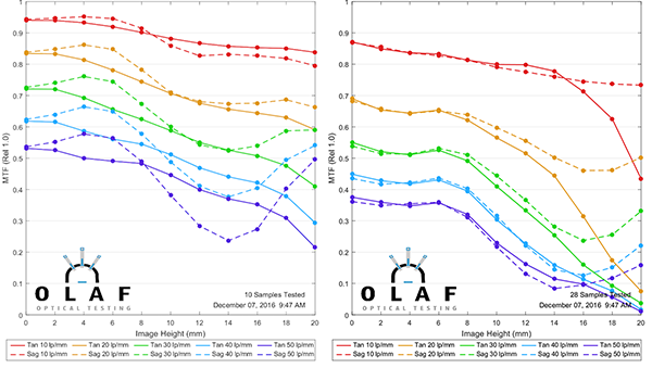
OK, most of you have seen MTF charts. Even if you don’t understand them, you’ve got a general idea that higher is better. And you probably compared one lens to another on at least that basis. The MTF charts you’re used to seeing, show the average of a lot of different lenses (if Zeiss, Leica, or I made them), or a computer generated best-case scenario (if anyone else made them). They show what half of the lens should perform like from the center (left side) to the edge of the image (right side).
If I show the MTF graphs for two different lenses, like this, you’d be able to conclude that the one on the left has better resolution than the one on the right. You could actually find lots of other things if you speak MTF, but I won’t push it. We’ll stick with higher is sharper for this.
Olaf Optical Testing, 2016
But that’s either an idealized computer generation or the average of lots of lenses. What if we actually test one single copy of the lens? Well the first thing you’d notice is now we show both sides of the lens; the center is now in the center instead of on the left side. The second thing you’d notice is one side is a bit different than the other. Because when you manufacture something, it’s never perfect. So here’s an MTF of one of the lenses that went into the average above on the left.
Olaf Optical Testing, 2016
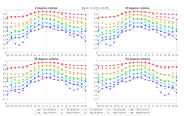
The left side is a little different than the right side, isn’t it? But wait, if one side is different than the other, what about top-to-bottom? Or corner-to-corner? So if we really want to test a lens, we have to do it several times, rotating it, so we test the different quadrants. So here’s that same lens, tested at four rotations.
Olaf Optical Testing, 2016
Hang on; we’re almost done with this part. Not much longer. You can do it!!
That’s four rotations. I could show you 8 and 12 rotations, but the charts would be really small, and you’re already really bored. You’re probably thinking “can’t you just tell me it’s a 79.2/100 instead of all this?”
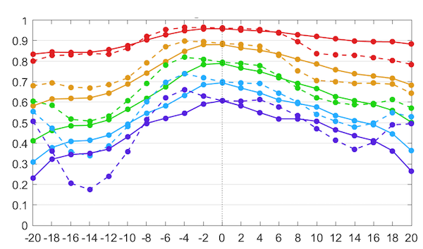
So how about instead of that we just make a picture showing you how the MTFs map out around the surface of the lens. Below is a map of the sagittal MTF with blue showing where the lens is sharpest, yellow a bit less sharp, and red (there isn’t any here) not very sharp.
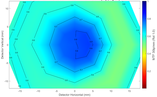
Olaf Optical Testing, 2017
That’s a lot more intuitive, isn’t it? You can see this lens is well centered (highest MTF in the middle) and just a tiny bit softer on the right side than the left. I’ll show you later, but you would not notice that tiny bit of softer on an at-home test. The MTF bench is more sensitive than any camera (so far).
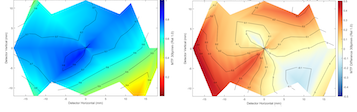
We can also look at maps for other things. Below, for example, is the astigmatism map of the same lens.
Look at the lovely colors. You feel relaxed and at peace. The MTFey stuff is over now.
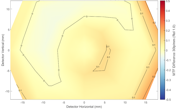
You can see there’s a bit more astigmatism at the far edge on the right with this lens. My point in all this is that the maps are an easy way to evaluate a single copy of a lens at a glance. I’m going to show you a bunch of these pictures, so I wanted you to know how we got them.
So Can We Really See This in a Photo
Well, I did say that the bench is more sensitive than your camera. Subtle differences the bench may see are going to be masked by the other variables a photo has – lighting, focus, framing, and on-and-on. But big differences are going to be obvious. How big? Well, let’s look at maps for two copies of a lens, one of which is excellent, one of which is not. (It’s actually not awful, the only failing area on this lens is the red part at the bottom.) If you shot with it, you’d probably say it was an OK lens, or maybe a little soft. If you shot with the other one, you would say it was special.
(The map for this lens appears cut-off compared to the one above. That’s just because this lens has a built-in baffle to reduce light reflection, so its image is kind of rectangular, like a sensor, rather than round like the one above.)
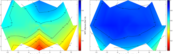
Olaf Optical Testing, 2017
I know you like pretty photographs to make comparisons on, but a scenic shot has too many variables, and we’re trying to be all scientific. So you’ll have to make do with test chart photographs.
First let’s compare the top center area, which was excellent on the right lens and OK on the left one. To fit 100% crops in this God-forsaken blog platform, I’ll have to put them on top of each other, so the right lens is on top, the left on the bottom. These are unsharpened from RAW images of our high-resolution test charts taken with a 36-megapixel camera. The difference would be a bit more impressive at higher resolution, a bit less at a lower resolution, but this is sufficient for our purposes.
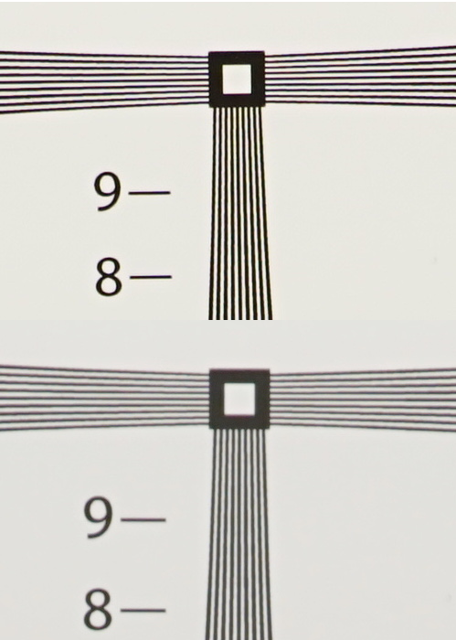
Lensrentals.com, 2017
I can see a difference; I suspect you can too. Remember test charts are more sensitive than a photograph. If I reshot this as a jpg with in-camera sharpening the difference would be smaller. If you took actual pictures of things instead of lines, you would probably notice a slight difference if you compared the two lenses side-by-side. But if you just had bought the left-hand lens you probably wouldn’t be screaming the top is soft, especially after you did some post processing and posted it as an 800-pixel jpg online.
Now let’s look at the bottom left quadrant. Again, the right lens is on top and the left on the bottom.

Lensrentals.com, 2016
The difference is greater now. You probably can notice that this lower corner probably isn’t OK. The tangential test lines (the ones going top left to bottom right) are really gray-on-gray, and so detail is being lost. OK, enough of this. My only point is that the MTF maps we’re using do reflect real-world images.
So What? Are We Getting to the Part About Zooms Yet?
Almost, my patient friends. And this won’t take long to show you now that we’ve gotten the concepts out of the way.
A lot of people are aware that while a zoom can be as sharp as a prime in the center of the image, it rarely is in the corners.
Few people, though, think about that fact that zooms are far more complex than primes. Where a prime usually has 6 to 12 elements, zooms often have around 20. And while primes have a single group moving to focus, zooms have moving focusing, zoom elements moving (sometimes several zoom elements), and possibly a compensating element. Increased complexity causes increased variability.
So let’s take a look at MTF Maps for a group of good prime lenses. Here are 9 actual lenses, tested just like the ones we showed you above. I’ll go ahead and tell you (because someone will notice) these are f/2.8 primes; no f/1.4 prime could resolve 30 line pairs this well. I’ll also add that one of these lenses had been dropped on rental but ‘suffered no apparent damage.’ Want to guess which one?
Blue is the soothing color of razor sharp images.
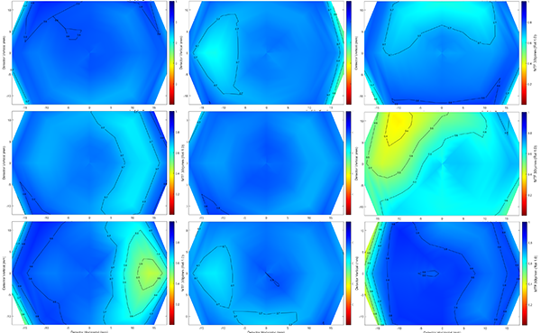
Olaf Optical Testing, 2016
You probably guessed that the center lens on the right looks bad on a test chart (it does when compared to the others). If you look carefully, you can see the lower left lens has an area that’s a tiny bit soft, and you could notice that if you looked closely enough. The others all perform identically; the small differences we see on the bench aren’t apparent even on the highest resolution test charts.
If you ask me to pick you out a really good copy from this set of lenses, I will send you any of the three diagonal from top left to lower right. (Just so we get it out of the way, if you wonder what it costs for me to test 9 lenses and pick you out the best one then you can’t afford it.) But if I sent you one of the other three with no yellow in them, I’m confident you could not tell the difference in photographs.
Here Are the Zooms
Now let’s look at maps for several copies of a good, $2,000 zoom lens. You probably have already guessed that a good zoom is going to be more variable than the good prime. You probably tried to avoid thinking about the fact that we also have to look at several focal lengths. Everyone likes to think ‘good copy — bad copy’ like they would with a prime, but it doesn’t exactly work out that way with a zoom.
So here’s a set of eight 70-200mm f/2.8 zooms tested the same way, but with each one tested at three focal lengths.
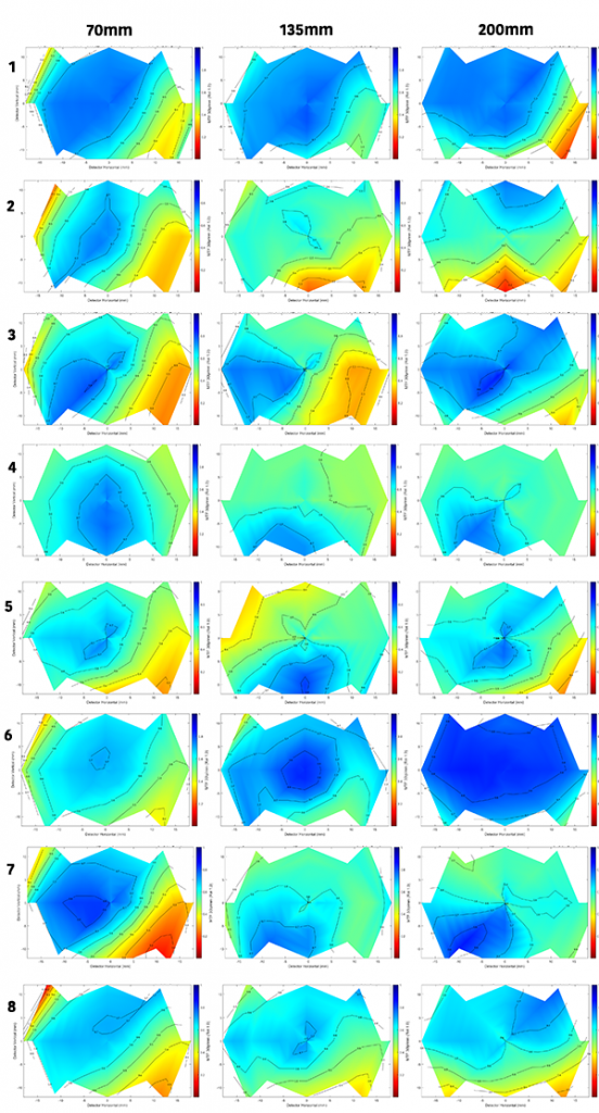
Olaf Optical Testing, 2016
I told you in the title that you didn’t want to know. But it will be OK. Breathe.
First, let me assure you this isn’t peculiar to this particular lens, to this zoom range, or anything else. We’ve tested thousands of zoom lenses. This is how they are with very few exceptions. Some are sharper overall. Some have a tendency to do better at one end or the other. Good performance of a copy at one focal length doesn’t particularly predict good performance at a different focal length. I will add, though, that terrible at one focal length does predict really bad at others.
Remember, this is an optical bench, and it makes small differences seem big. As you remember from before, the yellowy-green areas will look a bit soft on the test chart, but won’t scream at you in a real photo. Red areas might scream at you, though. I’m comfortable that most of you who looked carefully would notice that #7 at 70mm is not as good on one side as the other. Still, the red areas we see above are at an edge or side and might never be noticed by a sports shooter or portrait photographer who usually centers the subject.
The point here is a good copy of a typical zoom will be a little tilted this way at one focal length, maybe a tiny bit decentered at another, then tilted a different way at the other end. Or some variation on the theme. If you look carefully, you’ll notice it.
For example, if you had both #6 and #4 and compared them side by side; there’s no doubt you’d like #6 better at 200mm. But if you just got #4 you’d probably say it was okay. The owner of #6 is going to say the lens is clearly sharper at 200mm than at 70mm, the owner of #4 would that it’s actually a little sharper at 70mm. The people who own #1 and #8 would get online and tell both of those folks that they were obviously bad photographers because the lens seems about the same throughout the zoom range. The owner of #8 would probably be happy with his copy unless he went out shooting with the owner of #1.
Before you get too analytical about all this, remember this is just the sagittal graph. We’d also look at the tangential graphs (or the astigmatism graph which would show us the difference between sagittal and tangential). For example, looking just at the maps above, #3 looks like one of the better copies at 200mm, but if you look at its astigmatism graph, it’s one of the worst at that focal length.
Olaf Optical Testing, 2017
Don’t get me wrong. Zooms don’t suck. They’re excellent and very practical lenses. If you knew all the compromises that go into making one, you’d be as amazed as I am that they can make them that good for those prices. Let me add that if forum warriors posted 800 or 1200 pixel-wide images online, you’d probably barely be able to tell the difference between the primes and zooms, much less the differences between the zooms.
My point simply is that zooms vary more than primes in general, and a given copy of a zoom will vary at different focal lengths. The laws of physics and manufacturing tolerances told us it would be this way. Put more variables into a lens, and the lens varies more. Can they still be very good? Absolutely. Can they be as good as the best primes? Nope. On the other hand, the best primes don’t zoom worth a damn. Horses for courses.
So What Does It Mean?
There are no stupid questions. But there are stupid comments on forums. I will try not to make those.
For practical photography not much really, other than just to make you more aware of reality. Here are the few takeaway messages for photographers:
- A great zoom is not as good as a good prime at comparable apertures, but it’s plenty good, especially in the center of the image.
- Zooms have more variation, and most copies of a given zoom will vary at different focal lengths. If someone asks me for the best copy of a zoom, my first response would always be ‘at which focal length?’ In this case, the sharpest copy at 200mm is not the sharpest at 70mm.
But for measurebating, there is a very pertinent point that needs to be made: Measurebating zooms is a fool’s errand. These differences may not be huge in your photographs, but they are very significant on a test. The reviewer who got lens #6 is going to have different conclusions and present you with different numbers than the reviewer who tested #1 or #8.
Some reviewer somewhere tested a single copy of a zoom lens and gave it their highest rating ever. Some people actually argued online about that, and then asked my opinion about that argument. So I wrote this post to explain why I thought it was all meaningless. When someone compresses something as complex as the multi-focal length performance of a zoom lens into a single number after testing a single copy, I don’t really care if their number is 3.1415926, 2.718281828 or 1.61803398; it doesn’t have any scientific value at all. Unless the rating is 42. Then it would have a meaning.
That was really funny. You should laugh now. And eat Avocados.
Roger Cicala and Aaron Closz
Lensrentals.com
February, 2017
Author: Roger Cicala
I’m Roger and I am the founder of Lensrentals.com. Hailed as one of the optic nerds here, I enjoy shooting collimated light through 30X microscope objectives in my spare time. When I do take real pictures I like using something different: a Medium format, or Pentax K1, or a Sony RX1R.
-
Tord55
-
Beaverman33
-
Roger Cicala
-
Brandon Dube
-
Beaverman33
-
Patrick Chase
-
Brandon Dube
-
Patrick Chase
-
Patrick Chase
-
Brandon Dube
-
Patrick Chase
-
Brandon Dube
-
Patrick Chase
-
Patrick Chase
-
Carleton Foxx
-
Michael Clark
-
showmeyourpics
-
Kevin Shorter
-
Carleton Foxx
-
Patrick Chase
-
Brandon Dube
-
Dave New
-
Dave New
-
showmeyourpics
-
Dave New
-
Dave New
-
Roger Cicala
-
Paul Lackey
-
Paul M
-
elkhornsun
