Equipment
Just the Lenses: The 70-200mm f/4 Comparison
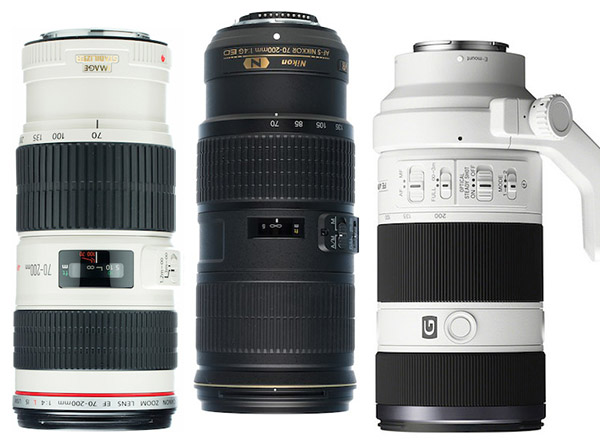
There is a very good reason that we haven’t gotten around to testing one of the most commonly used zoom lenses until just now. We forgot. I was testing the Sony FE 70-200mm f/4 G OSS lens because we had just torn one down, I was impressed by the construction, and I wanted to see if the copy-to-copy variation was improved compared to other Sony lenses. So I tested it, went to pull up the Nikon 70-200mm f/4 and Canon 70-200mm f/4 lenses for comparison, and was a bit shocked to find we hadn’t ever tested them. So I guess this lets you know that I was primarily interested in the Sony lens and that I expected it to have less variation than the Sony FE 24-70mm F/4 lens.
I should also mention that you shouldn’t go searching for our MTF and variance results on the Sony 24-70mm f/4. We tried to test it some time ago. The results were so weird and testing so difficult that we’ve never published them. Please don’t replace ‘weird’ with ‘bad’ when you quote this. It’s not what I said. We have had quite a learning curve when we started testing Sony FE lenses on an optical bench that isn’t designed for them. There is a variation in distortion from copy-to-copy with certain Sony zooms, like the FE 24-70mm f/4, that freaks out our automated testing.
But Wait, There’s More Fact Stuff
Before we get to presenting the data, I need to make you aware that the data is different. We have spent several months revamping the algorithms we use to present the variance data so THIS VARIANCE GRAPH AND DATA ARE DIFFERENT FROM WHAT WE’VE USED BEFORE. If you actually read this far you should have two questions: How is it different now, and why don’t you change all the previous data to match?
I’ll answer the second question here. We will redo all of the previous graphs to match the new methods, but it is waiting for some smart academic type people to give us more feedback on statistical significance so we aren’t 100% certain this is the final method yet. Also, redoing the data takes time and I don’t have a lot of that, so it may wait until our summer intern starts.
Please remember, this is not a consumer-oriented review site generating content so you’ll click on our ads and stuff and make me rich. It’s a ‘hey, you guys want to see what I’m interested in this month?’ site. I have ADD; my interests bounce all over the place. Right now I’m fascinated with investigating the new electromagnetic and piezoelectric linear autofocus systems, so I’m doing mostly that. MTF work is a bit on the back burner until the intern starts in May.
As to the first question, how the variance graphs are different, I wrote an addendum at the end of this post on how we are making this measurement more meaningful and scientific. I really encourage any of you who are interested to read that. For those who don’t like science, JUST BE AWARE THE VARIANCE GRAPHS IN THIS ARTICLE ARE DIFFERENT THAN THE ONES IN PREVIOUS ARTICLES. We can compare these three lens’s variance to each other, but not directly to the previous tests. The MTF values, though, are completely comparable to previous articles.
OK, Lets See Some Tests
MTF
First, let me repeat that there have been no changes in the MTF measurements so feel free to compare these to other lenses we’ve done.
As usual, we measured the MTF at three focusing distances: 70mm, 135mm, and 200mm. Please note that for the Sony lens measurements at the far right side of the graphs, which is furthest from the center, should be taken with a grain of salt. This is nothing wrong with the lenses, rather it’s a limitation of our measuring ability. The Sony mount has a light baffle that blocks a lot of the edge measurements, so while the value is an average of 80 measured points, the very last point only shows the average of 30 measurements on the Sony MTF.
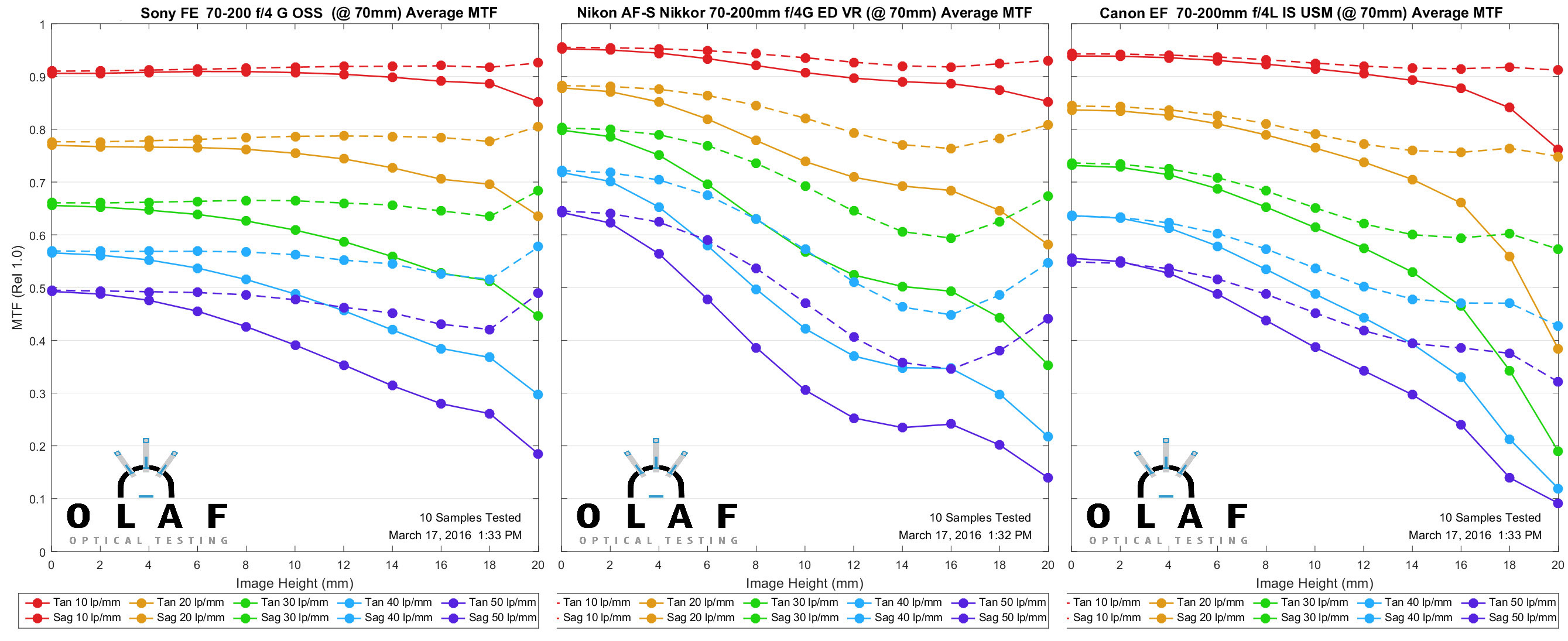
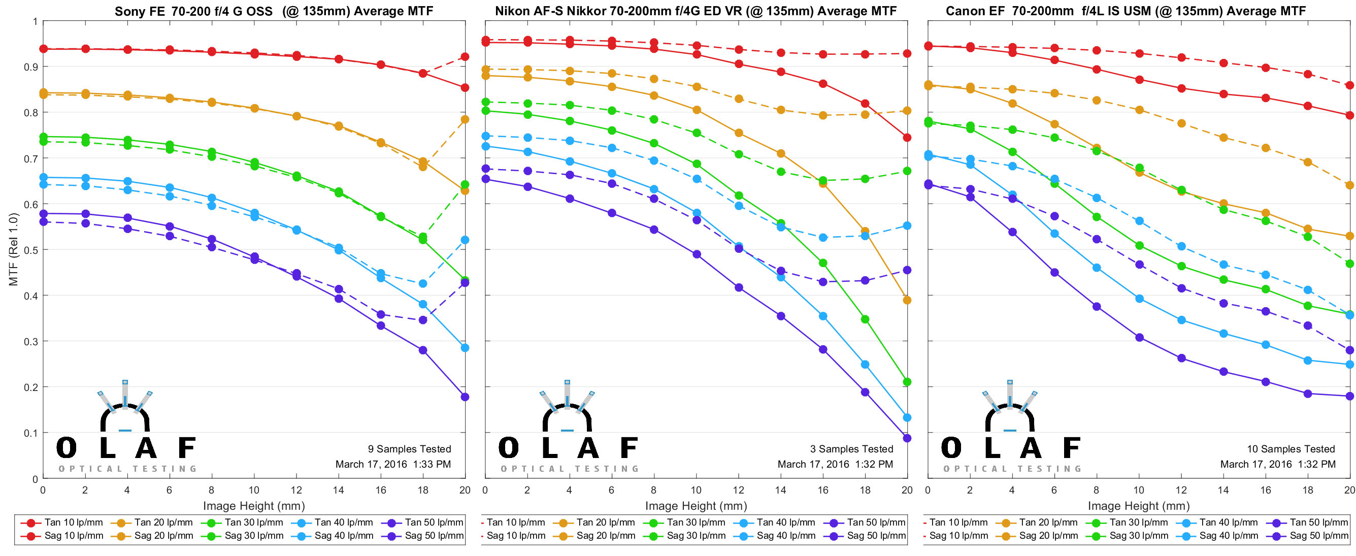
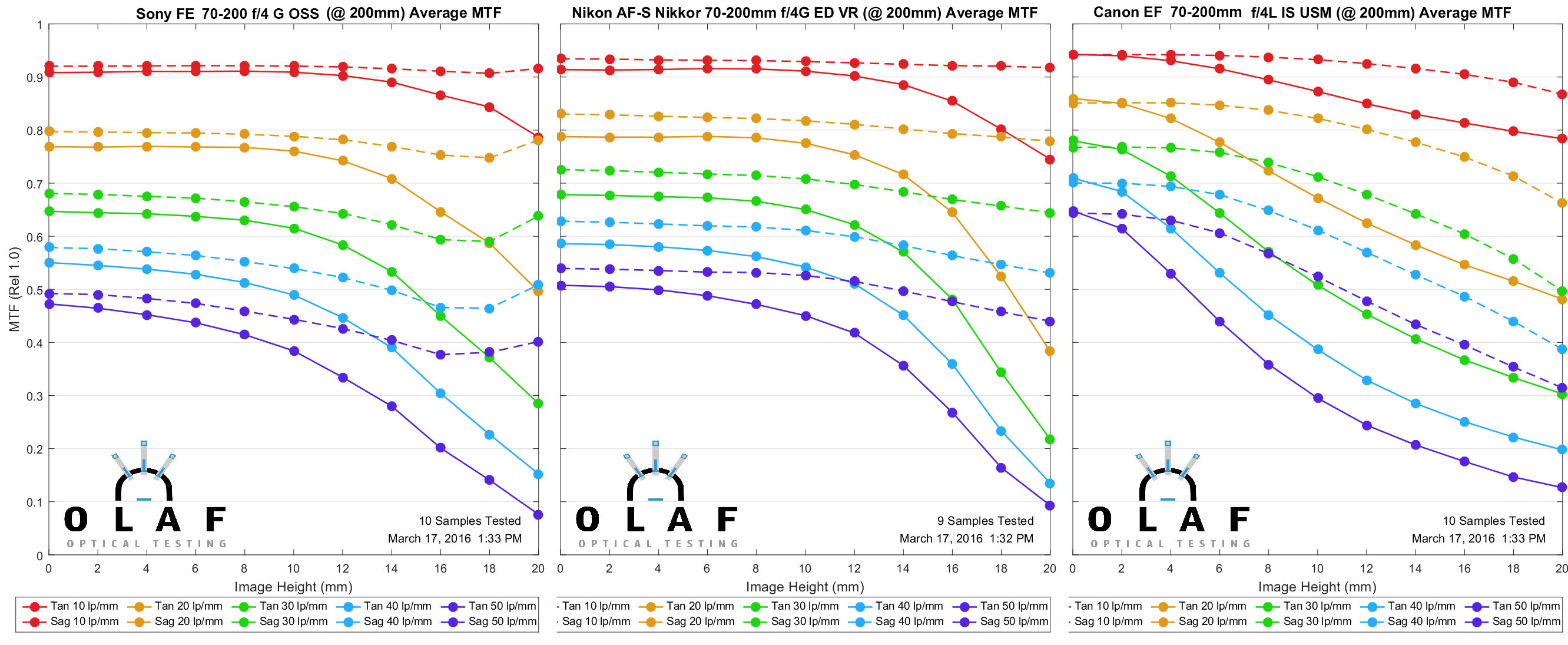
All three lenses really do pretty well. The Canon 70-200mm f/4 IS is an older design (2006 release, but based largely on a 1999 design) than the Sony 70-200mm f/4 (2015) and the Nikon 70-200 f/4 VR (2012). Particularly with stabilization systems, that’s a big gap.
Of course, everyone jumps on center sharpness first and the Sony certainly lags a bit at the middle and higher frequencies. Right in the center the Canon and Nikon have similar resolution with the Nikon slightly better at the wide end and the Canon slightly better at 200mm.
Away from the center, though, things are a bit different. At 70mm both the Nikon and Canon fall off a little bit like most zooms do, while the Sony remains amazingly flat across the entire field. In the outer half of the field, the Sony is roughly as good as the other two lenses.
Again at 135mm the Canon and Nikon are clearly a bit better in the center of the image, particularly at higher resolutions. In the outer half of the image, though, things aren’t so much better or worse, but rather just different. The Sony doesn’t resolve quite as well as the Nikon and Canon, but its lack of astigmatism is really pretty amazing for a zoom. I would expect you’d notice a different ‘look’ to the images shot with the 3 different brands shot at 135mm that in this case was as much about the lens as the sensor.
At 200mm the Canon again has the best center resolution at higher frequencies, the Nikon holds its resolution further from the center, catching the Canon less than halfway to the edge of the image. The Sony is much like the Nikon as far as maintaining its sharpness towards the edge although it doesn’t resolve quite as well as the Nikon at 200mm.
From an MTF curve standpoint, my overall take is these are three really good zooms. The Sony doesn’t have quite the absolute resolution of the others, but this seems to be a conscious decision to go for a smooth, even look, rather than obtain the highest possible center resolution. This is very similar to Nikon’s design philosophy with their recently released 24-70 f/2.8 VR lens.
Sample Variation
With the variation graphs, remember that a large area along the left side indicates variation in center sharpness between copies. If the variation gets wider the further you go to the right it there’s a larger variation in the edges of the lens. Our new algorithms also include variation within the lens so if a lens is sharper on one side than the other, that shows as a variation. Also, as with the MTF charts, it’s probably best to ignore the far right 20mm measurement on the Sony lenses. A variation appears to decrease for that lens there, but that’s just a reflection of fewer measurements at 20mm.
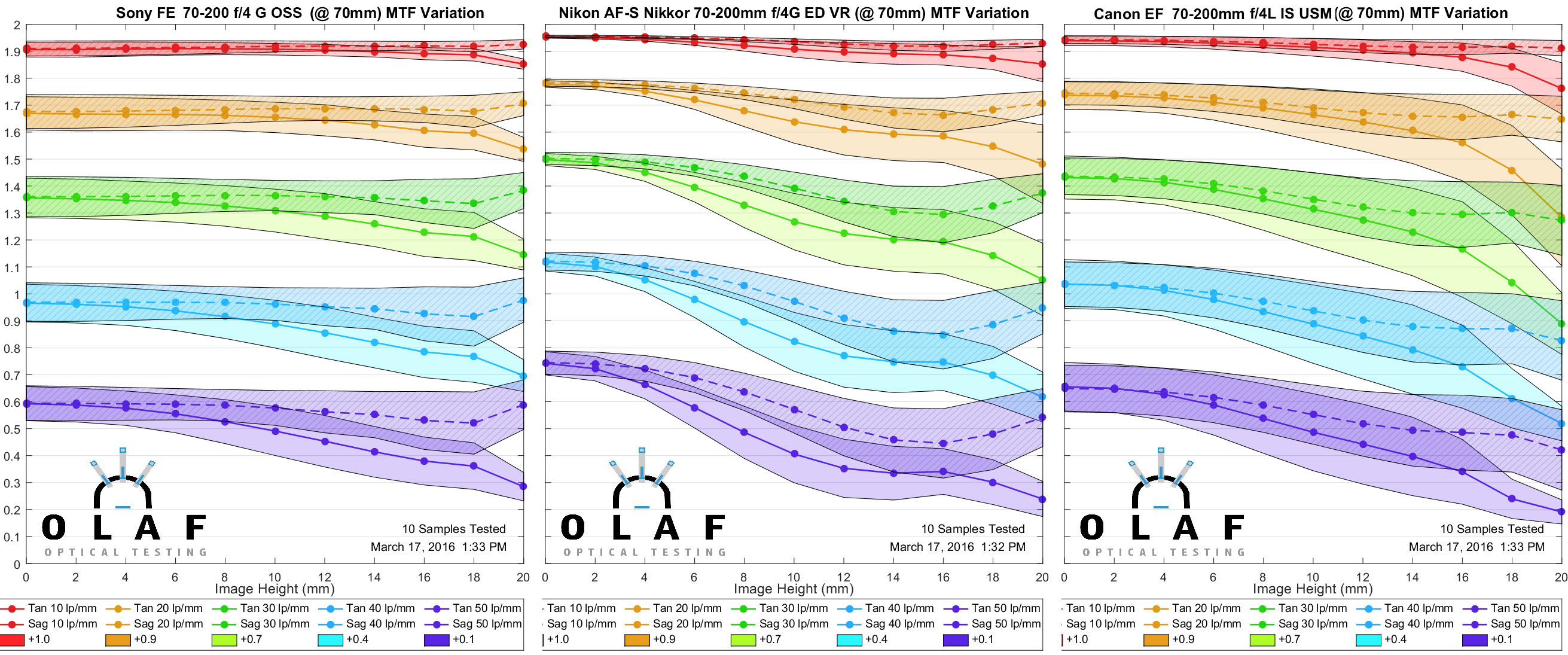
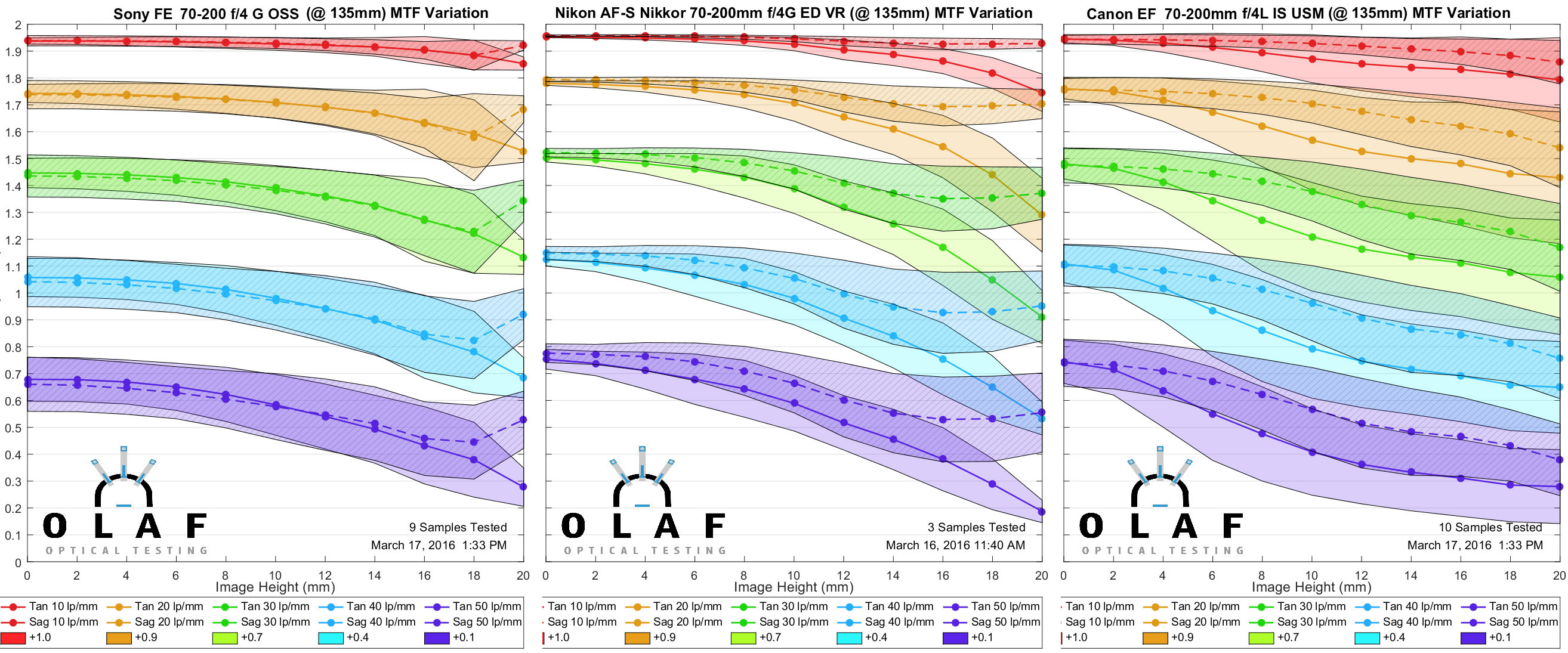
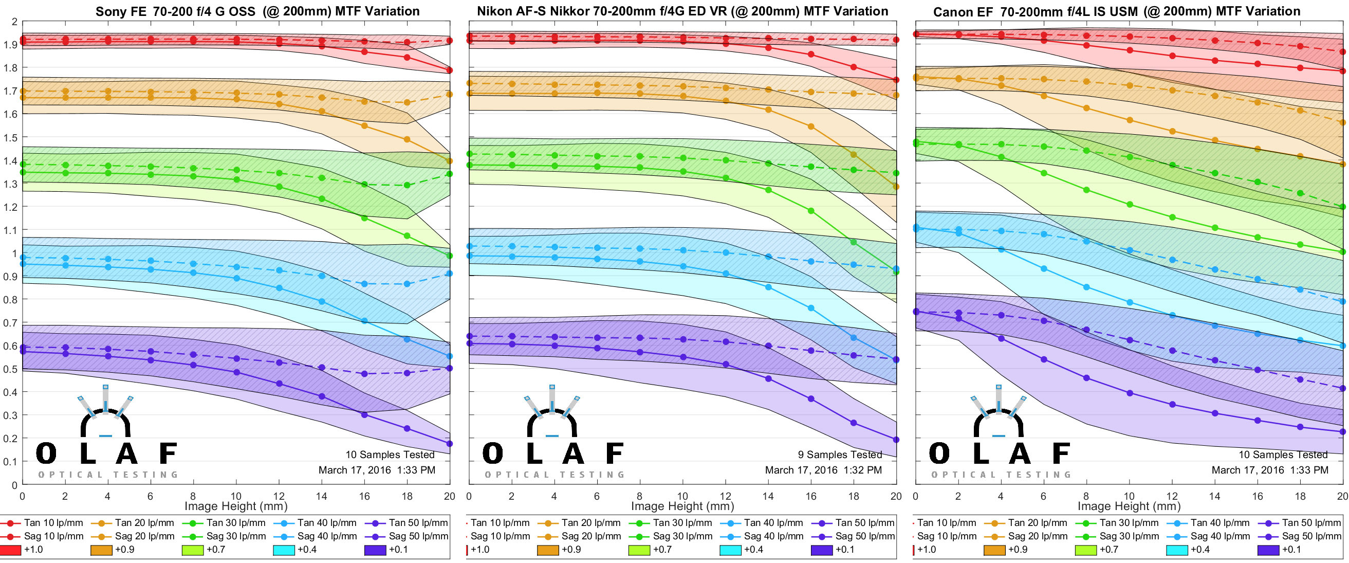
The variation for all these lenses is pretty reasonable – we expect zooms to vary more than primes and to have different amounts of variation at different focal lengths. The Nikon has a bit less variation than the Canon and the Sony at 70mm and 135mm, particularly in center sharpness. At 200mm, there is really no difference between the three. I don’t want to make any major generalizations here. I think it’s clear that the Sony lens is very similar to the Canon and Nikon as far as sample variation, which is a much better performance than we’ve seen with some other FE lenses.
Changes in Testing Methods: This Part is Important, Really
We previously were using the averages for each lens sample to calculate the standard deviation. This folds eight measurements taken from a single copy at each image height into 1 number, then compares the copies. This works well for what we had planned on – it tells you the difference between the various copies. BUT it has a downside we hadn’t thought of. If each copy varies within itself (the left side is softer than the right one, the top softer than the bottom on the other, for example) the averaging hides that inconsistency.
The new formula now uses every number as measured to calculate the variance and standard deviation. The result is that for 10 sample lenses, each point on the variance graph is the standard deviation of 80 numbers instead of the standard deviation of 10. For decent-to-good lenses, like most of the 50mm primes, there is hardly any change in the variance. For very bad lenses, like most of the wide-aperture, wide-angle primes and most zooms, the difference can be quite dramatic.
We also reduced the plot size to 1 Standard Deviation instead of 1.5 Standard Deviations, just to make the graphs more readable.
The consistency number is no longer printed on the charts – we felt it was not accurate enough to really summarize the variance. It was meant to be a ‘look more closely guideline’ but was being abused. Simplified numbers are nice and all; we understand everyone likes them. But the loss of accurate description caused by oversimplification becomes counterproductive.
The variance number wasn’t as useless as a ‘lens score’ but it still got abused so much we’re going to stop it until we are comfortable it accurately reflects total variation in a meaningful way. Right now it only reflects variation between samples at 30 lp/mm for overall sharpness and doesn’t take into account variations within a lens. So if every copy is tilted, the old variance score didn’t reflect that.
The graphs themselves are easy to compare and give much more useful information.
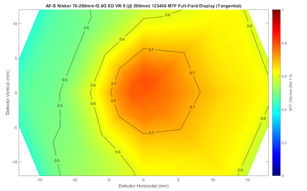
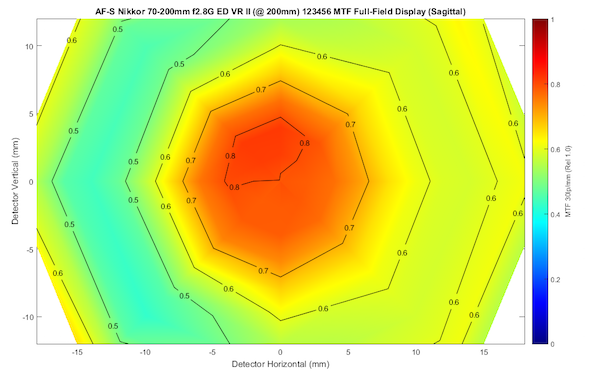
We’re still fine-tuning graph presentation and having people smarter than us give input on our calculation algorithms. Some of the stuff we’re working on might be pretty cool. For example, we’re considering showing a full-field MTF graph for each copy, not just a line but an actual image of the MTF as it appears throughout the field of the lens (extrapolating between the 84 measurements we make on each lens, of course).
OlafOpticalTesting, 2016
OlafOpticalTesting, 2016
This will, I hope, give us an intuitive way to demonstrate how the copies we test vary, a way to show how adjustments change a given copy, and even eventually a way to show someone how their lens compares to the average of all copies of a given lens.
There are several other things going on, but bottom line is that this is still a work in progress. What we’re trying to do has never been done before, at least that we know of. We’re beta testing as we go. If it isn’t changing over time, then we aren’t improving it. As for the old data that’s already published, it’s all accurate, but it isn’t showing you everything we’d like to show you.
Roger Cicala, Aaron Closz, and Brandon Dube
Lensrentals.com
March, 2016
Author: Roger Cicala
I’m Roger and I am the founder of Lensrentals.com. Hailed as one of the optic nerds here, I enjoy shooting collimated light through 30X microscope objectives in my spare time. When I do take real pictures I like using something different: a Medium format, or Pentax K1, or a Sony RX1R.
-
Stanislaw Zolczynski
-
hywelphillips
-
Sean T
-
Steve Simon
-
Pieter Cronje
-
Brandon Dube
-
Wam
-
Roger Cicala
-
Junz Inc
-
Brandon Dube
-
Pieter Cronje
-
speedy fisher
-
Roger Cicala
-
Roger Cicala
-
speedy fisher
-
Y.A.
-
Brandon Dube
-
Brandon Dube
-
Chris Cheng
-
Roger Cicala
-
Brandon Dube
-
Ilya Zakharevich
-
Ilya Zakharevich
-
Chris Cheng
-
Y.A.
-
Andre Yew
-
Zach Sutton Photography
-
Roger Cicala
-
John Dillworth
-
Kenneth Younger III
