Geek Articles
Fun with Field of Focus Part 1
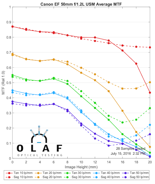
I’ve mentioned in some other posts that our optical tools can do a lot more than just test a lens’ MTF. For most of the last two years, though, testing MTF is what we’ve been doing. We may not seem all that busy, but we’ve assembled what is probably the world’s largest database of current camera lenses; approximately 1,500,000 measurements on 1750 copies of 330 different lenses from 15 manufacturers.
Recently, though, we’ve started exploring some of the other testing available to us. Partly that’s because we’re geeks and like doing this stuff, and partly because we’re looking for more and better ways to test lenses. One of the things we’ve been doing a lot lately is looking at field-of-focus curves. There is a LOT of information in field-of-focus MTF testing, enough that makes it worth doing them even though each takes a lot longer than a standard MTF test.
This is an introductory article – one where we’re showing you what we’re finding out as we’re finding it out. If you already understand all about field vs focus graphs you won’t get much here. But if you don’t, this should be a nice, painless introduction to some of the new testing we’re doing.
OlafOpticalTesting, 2016
OlafOpticalTesting, 2016
So What Are Those Amazingly Gorgeous Graphs, Anyway?
Officially, they’re called an MTF vs Field vs Focus graph and gorgeous part comes from software written by uber interns Markus and Brandon. They’re fairly intuitive, but also have a lot more information in them than you might realize so let’s talk about what they are and how they are made.
The Field
Let’s start with a regular MTF graph. Many of you have seen them. Many of you don’t really understand them, but that’s OK. The MTF vs Field vs Focus graph are actually simpler in many ways and you don’t really need to speak MTF to appreciate them. So read along for a second.
OlafOpticalTesting, 2016
Notice the regular MTF graph above goes from 0mm of image height to 20mm along the horizontal axis. Image height isn’t a good word for us photographers. It really should read ‘distance from center toward the side of the sensor’. The center is “0”, one edge is “20”.
The raw data the optical bench gives us actually goes from -20mm to +20mm, that is from one side of the sensor to the other, like the graph below. To make that graph above, we actually average all the measurements from both sides of center and and plot them as though it was showing one side (from center to edge). The actual information that comes from the optical bench puts the center in the middle and shows both sides, like this.
OlafOpticalTesting, 2016
So, the takeaway here is “Field” is from one side of the camera sensor to the other. The field is also called ‘Image Height’ by Geeks who measure stuff in labs, so in the graphs ‘field’ or ‘image height’ both mean distance away from the center of the image.
Focus
When we make an MTF curve like those above, we set the lens to infinity focus and lock the focus ring in that position. (Locked is a technical term meaning ‘stuck some gaffer tape on the focus ring’.) The Optical bench then fine-tunes focus, determining the exact focus position at which the MTF is highest at the center of the lens. It’s very accurate, measuring focus in 5 micron increments. (In case you don’t know, the infinity mark on a photo lens means ‘around infinity’. On a Cinema lens it should be accurate, but still might not be 5 microns of focus accurate.) Once the optical bench has determined the best focus, it measures the MTF from one side of the lens to the other, remaining at that ‘best for the center of the lens’ focus position.
In photographic terms, if you used center-point autofocus on a fence at right angles to you, the MTF curve would show you how sharp that fence would be from one side of the image to the other. People might look at that photograph, though, and say “Halfway from center, the grass in front of the fence is in better focus than the fence, and at the edges the grass behind the fence is in better focus.” That’s commonly called field curvature, but probably better described as plane-of-focus curvature.
Another related comment is “If I used the left sided autofocus point, wouldn’t the MTF (OK, they’d say sharpness, but I’m being all technical here) be better for that part of the fence? The answer is probably yes. But if you do that, probably the center would not be as sharp. Because the best focus at that part of the fence may well not be the best focus for the center of the fence.
When we do a Field vs Focus the optical bench is set differently. At each point, it measures and records the MTF over-and-over as the focus is slowly changed through an 600 micron range. (These graphs are labeled from 0.6 to -0.6, which is incorrect, it should be 0.3, but I’m not going to remake all the graphs since it’s not really important for this article.) At each focus point the MTF is recorded. So the vertical axis of the graph of MTF vs focus position. The 0,0 point in the center of the graph is best center focus. As you go from left to right across the image, you can see that the best focus can be in front of, or behind, where the best focus point at the center of the image.
OlafOpticalTesting, 2016
This is why MTF vs. Field vs. Focus is in many ways a better test than just MTF. For every point across the image, it shows you where the best focus is located and what the best possible MTF is at that location.
We’re measuring our curves at f/5.6 so the focus range is rather thick. This is mostly because it smooths out the graphs and shows the shape of the field well. Wide open, many lenses get so soft off axis that it’s harder to see the shape of the field. And f/5.6 gives us a ‘common aperture’ that all lenses can reach so the graphs will be similar.
The MTF Part
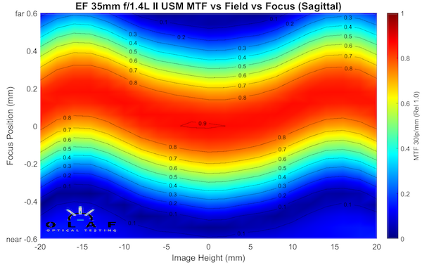
In these graphs, MTF is represented as a color, with red as the highest (sharpest) and blue as the lowest. There’s a key on the right side and some outlines around each area on the graph showing you the MTF to the nearest 0.1. So you know the red area in the graph above is an MTF of > 0.8 for example, orange is 0.7 to 0.8, etc.
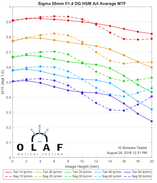
We lose some MTF information, though, compared to a standard MTF graph. It’s a fair trade for the new information we get, but still there is some loss. One thing you may have noticed in the graph above, the curves are done at 30 lp/mm. The standard MTF graph shows us MTF at multiple frequencies, but for this graph we have to chose one of those. The curves are very, very similar at all frequencies, though, so this isn’t too much of a loss.
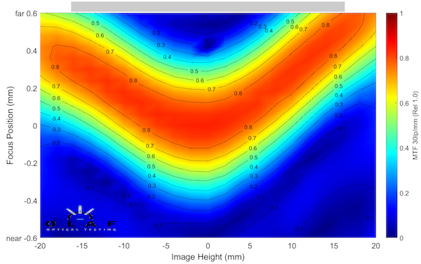
One other thing some of you probably noticed; the graph above was for just the sagittal component of the MTF. We can’t plot both the sagittal and tangential curves on this graph like we can a regular MTF graph. (If you don’t understand sagittal, tangential, and astigmatism very well, I recommend this excellent article by Paul van Walree). So we have to make two graphs for each lens; one sagittal and one tangential.
OlafOpticalTesting, 2016
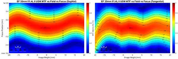
The example above is for an individual copy of the Canon 35mm f/1.4 Mk II lens and it shows a couple of important things. First, the curvature of the sagittal and tangential planes are different: the sagittal plane has a wide M-shaped curve, while the tangential is (overall) rather flat. So there is some astigmatism in this lens, although not much. Second, the tangential curve isn’t quite symmetrical, it’s a little different on the left than the right. This is a copy variation effect. This copy is a bit decentered, although not enough that you can tell it on anything other than an optical bench.
So How is This Useful?
Actually, I’m going to take up several blog posts talking about we might use these. But lets start with one: knowing a lens’ field of focus curve can be helpful when ‘choosing’ or ‘using’. Let’s say I’m considering buying a 50mm wide-aperture prime lens. Or let’s say I already have one and want to get the very most out of it.
Knowing what the field of focus looks like can help me choose the best 50mm for the kind of photography we do. If I already have one, it can help us frame a shot for the strength of my lens. Not many of you have considered it, because you don’t have a handy reference for field-of-focus curves. (Some of the best photographers figure it out when they add a new lens to their bag, though.)
One important thing to note: When our field of focus curve is moving towards the top of the graph, the focus curve of your image is moving towards the camera. Think of the camera as sitting a couple of inches above the graph and focused down toward the center of the graph. The field of best focus in the graph would then look like the field of focus would from the camera. I’ll give you an example later.
Let’s look at the field curvatures for some 50mm lenses. I’ll make a few comments as we go and then some overall comments after.
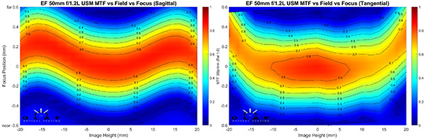
Canon 50mm f/1.2
OlafOpticalTesting, 2016
One thing that should be apparent is the tangential field for this lens is generally not as sharp as the sagittal field, even stopped down to f/5.6. Another is that the fields are entirely different shapes (they are for most lenses). It should be intuitive that out near the edges this lens will be astigmatic. Well, maybe not at f/16, but did you actually buy a wide-aperture prime to shoot at f/16? The field curve is a good demonstration of why the MTF curve has marked astigmatism at the edges.
OlafOpticalTesting, 2016
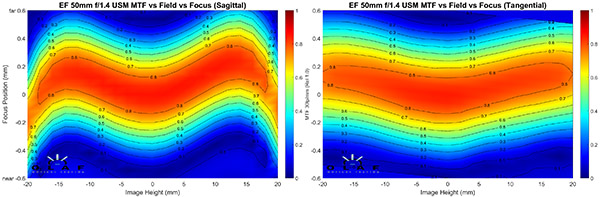
Canon 50mm f/1.4
OlafOpticalTesting, 2016
The inexpensive 50mm Canon has a more extreme sagittal “M” than the f/1.2 lens did, but the tangential field is quite flat. We would expect this lens to have some astigmatism in the 10mm to 15mm off axis area (the middle third of the image) even stopped down, but that it would have less astigmatism near the edge. Also you can see that the tangential and sagittal fields are more evenly sharp in this lens.
And I guess this is a good example of why you don’t spend an extra thousand dollars for f/1.2 if you plan to shoot at f/5.6.
Sigma 50mm f/1.4 Art
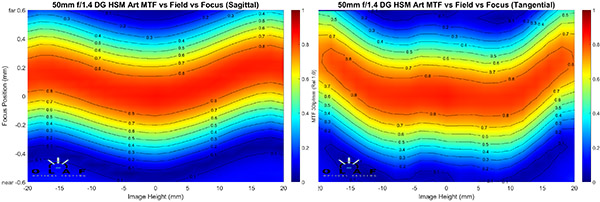
OlafOpticalTesting, 2016
The Sigma has a very slight M curve in the sagittal field, and a fair U curve in the tangential field. The designer has actually used this effect to cross the astigmatisms back-and-forth so there’s never a lot of astigmatism, as you can see on the standard MTF curve.
OlafOpticalTesting, 2016
Also notice how the sharpness (at f/5.6 remember) stays good out to the very edge of the image. One point that is apparent here, and useful to know if you’re shooting landscapes and architecture: in the middle third of the image (from about 10mm to 15mm from the center of the sensor) both fields are curving in the same direction. So a two dimensional subject, like the fence I talked about above, or the test chart you’re shooting in the basement is going to focus in a slightly different plane than the center.
Sony FE 50mm f/1.4 ZA
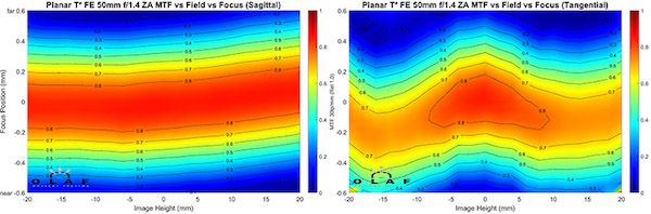
OlafOpticalTesting, 2016
When the Sony Planar T 50mm f/1.4 ZA was first released, people commented that it had a different look than other 50mm lenses they were shooting with. The field curvature shows part of the reason why (and also why this is not just a Zeiss remake). The sagittal plane of the Sony is extremely flat; the most supine of any 50mm lens. The tangential plane has a different curve than the others (and like the Canon 50mm f/1.2 is not quite as sharp as the sagittal plane). This is part of the different ‘look’ of the lens. It also tends to make the field of focus flatter than the other 50mm lenses.
Zeiss 50mm f/2 Makro Planar
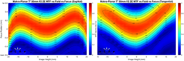
OlafOpticalTesting, 2016
The Zeiss Makro Planar f/2 has a more accentuated curve, with pronounced sagittal “M” and tangential “U” curves. You’ll see in subsequent posts that this sort of a Zeiss look; a lot of their primes have similar curves. Actually if you overlay the two curves in your mind, you realize that out to 15mm (3/4 of the way from center to edge), the curves are almost identical, meaning there’s very little asigmatism until you get in the outer 1/4 of the image.
For those who can’t overlay the curves in their mind, I’ll do it for you. Here’s a simple image where I put the two field curves over each other, then used the Photoshop difference filter. That dark area in the center is where there is virtually no astigmatism.
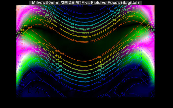
On the other hand, the curve of that dark area shows how the field of focus curves in your shot, too. Remember, though, this is the field of focus at infinity. This is a Makro lens so it has a much flatter field at close distances. Non-macro lenses usually don’t change their field of focus all that much at closer range.
Zeiss Otus 55mm f/1.4
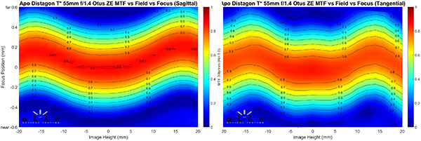
OlafOpticalTesting, 2016
The Otus is a unique lens and I think the field of focus curves show another way that it’s special that the standard MTF chart doesn’t show. Although not exactly the same, it should be readily apparent that the sagittal and tangential fields for this lens have very similar curves. It’s the only 50mm we’ve seen that is this way, although the Sony and Sigma lenses were to some degree.
Nikkor 50mm f/1.4 AF-S G
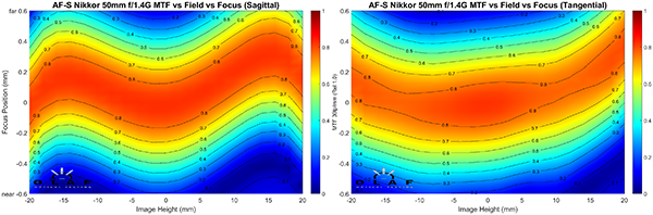
OlafOpticalTesting, 2016
You will probably notice the very slight tilt in the copy of the Nikkor 50mm. Please ignore it, it’s not significant for today’s discussion. This lens has a fairly typical sagittal plane curve, similar to the Canon or Zeiss 50mm lenses, and a tangential field that has a bit of a U curve. You should be recognizing this pattern as fairly typical for 50mm lenses. That isn’t surprising since almost all of 50mm lenses have a double-gauss core design; we’d expect most of them to be somewhat similar.
So Why Do We Care?
Well, for several reasons, I think, only some of which are apparent from this introductory post. I’ll be doing several posts about this over the next week showing you some other things we’re using field curvatures to look at.
Knowing the field vs focus curve of a lens can sometimes help you as you frame a shot, or even choose a focus point. You can certainly see how using an outer focus point for several of these lenses will put the center off focus, or how if you focus-recompose you may get some unexpected change in focus. Having an idea of how the field of focus of your lens is shaped can be quite useful.
Let’s do that example I promised earlier. Here’s a repeat of the summary graph I made of the two fields for the Milvus 50mm f/2 lens.
In theory, for a shot at distance we would expect the field of best focus to curve towards the photographer a bit as you go from center towards the edge, then get kind of astigmatic and softer at the very edge. Our lab graph, because it’s magnified, is going to curve more than a photograph would, but the pattern should be similar. So I took a Milvus out to a hill behind our office and lined up shots from a position nearly parallel to the slope.
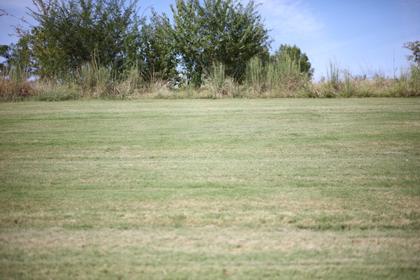
Then I took f/2 shots at a couple of different focused distances on the slope (the tall grass was almost at infinity focus), and ran Photoshop’s find edges filter to find the areas of sharpest focus (grass is nice for this because it becomes just a dark area when you downsize the image).
First image:
Focused a few feet back
Focused on the tall grass at the top of the hill.
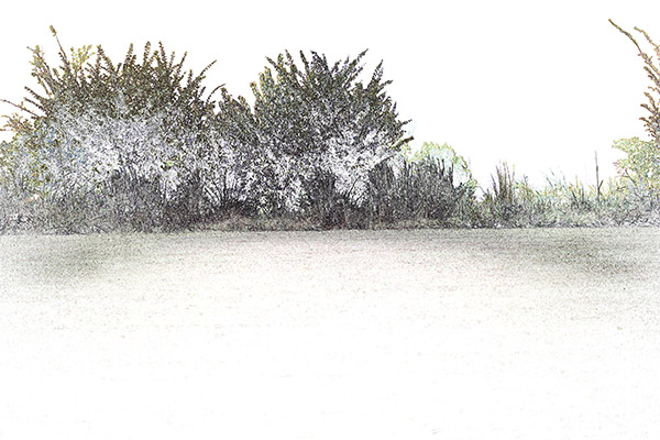
The curvature of the field of focus seems pretty obvious and agrees with what I expected from the lab results. Depending on what you’re going to shoot, knowing this might be useful when choosing a lens. (You can quickly correct for distortion in post processing, but it’s harder to correct for out-of-focus areas.)
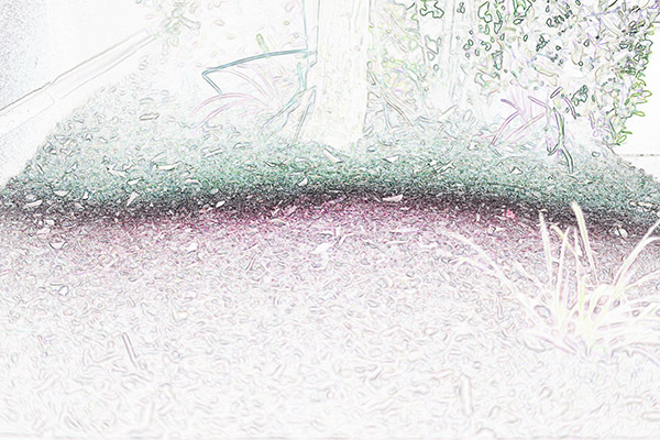
Oh, and remember I mentioned that the 50mm Makro has less field curvature when close, and almost none at macro distances? Here’s the same treatment on a shot of some mulch at about 2 meters distance. There are some other variables here, but I think the field looks flatter, although not as flat as it would at true macro range.
If you’re in the market for a 50mm lens and want to shoot a lot of architecture, than a curved field like the Zeiss 50mm Makro might not be your best choice (yes, I know it wouldn’t be your best option for lots of reasons other than this). It should also be pretty obvious, though, that you can take your lenses out and do just what I did above to get a good idea of what the field of focus curve looks like for any of the. All you really need is a grassy field, or a mulch bed, and Photoshop.
That might not give you as clear a picture of astigmatism as the lab graphs do, though. Astigmatism has quite an effect on bokeh, so knowing where areas of inevitable astigmatism are might help you frame or crop your shots.
Of course, you might not care a bit. Our next post will simply be putting up the field curvatures for a number of prime lenses of different focal lengths, giving you a resource for that. If people find them useful, we’ll start posting more of them. If nobody cares, we’ll just make framed prints of them to decorate the office.
There are other interesting things we are trying to do with field curvature, though, and I’ll get to those in later posts. First among these is adding field curvature to our screening tests. The curves I showed you today are hand picked to be nice and fairly level. In a later post I’ll show you how sample variation causes tilts of the field. It’s an interesting explanation for what many people call decentering. Once you see it, you’ll be able to test for it at home, BTW. But be patient for a bit. Doing this stuff takes time.
Roger Cicala, Aaron Closz, Markus Rothaker, and Brandon Dube
Lensrentals.com
September, 2016
Author: Roger Cicala
I’m Roger and I am the founder of Lensrentals.com. Hailed as one of the optic nerds here, I enjoy shooting collimated light through 30X microscope objectives in my spare time. When I do take real pictures I like using something different: a Medium format, or Pentax K1, or a Sony RX1R.
