How To's
A Conversation About Color Calibration
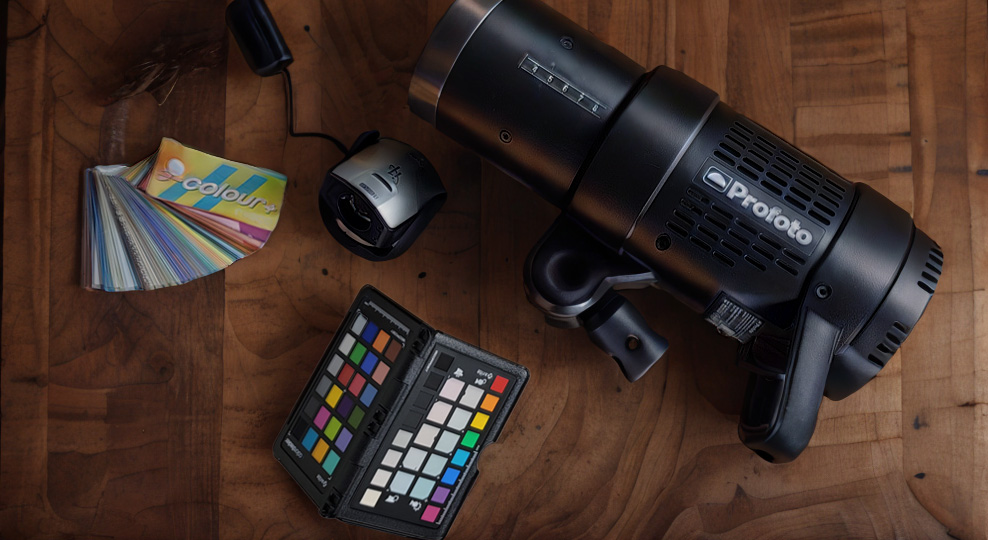
I recently worked with a retoucher, as I needed help with some pesky skin texture that my normal retouching techniques weren’t working on. Following that help, the retoucher asked how I was able to get great skin tones straight from the camera (she’s one of the few who actually sees the RAW images from my standard workflow), and I didn’t have an answer for her. So I started looking at my workflow and decided it might be worth sharing some tips on my color calibration process. I believe that a good workflow is the first step to elevating your work and abilities to create, so let’s dive in…starting with the monitor.
What is Monitor Calibration?
Monitor calibration is the process of aligning your monitor’s colors with a standard set by the RGB color model. All monitors are products of mass manufacturing, which means tolerances will sometimes be loose in exchange for lower manufacturing costs. So quite often, a brand new monitor might be a little too bright, maybe too warm or cool, or have a slight green hue to it. These are realities regardless of the brand or price of the monitor (though higher-tier brands will often be calibrated from the factory). Calibrating your monitor is simply the process of adjusting your screen so that it most accurately aligns with the RGB standard.
This process is done with a monitor calibration system – a special calibration camera (or colorimeter) that works in tandem with software to ensure that the reds, greens, and blues align with a color standard. A monitor’s color can adjust over time, so they recommend you calibrate your monitor once a month (though I find once every few months is a reasonable timeline). But ultimately, calibrating your monitor can help assure your colors are accurate, and that your monitor isn’t too bright or dark.
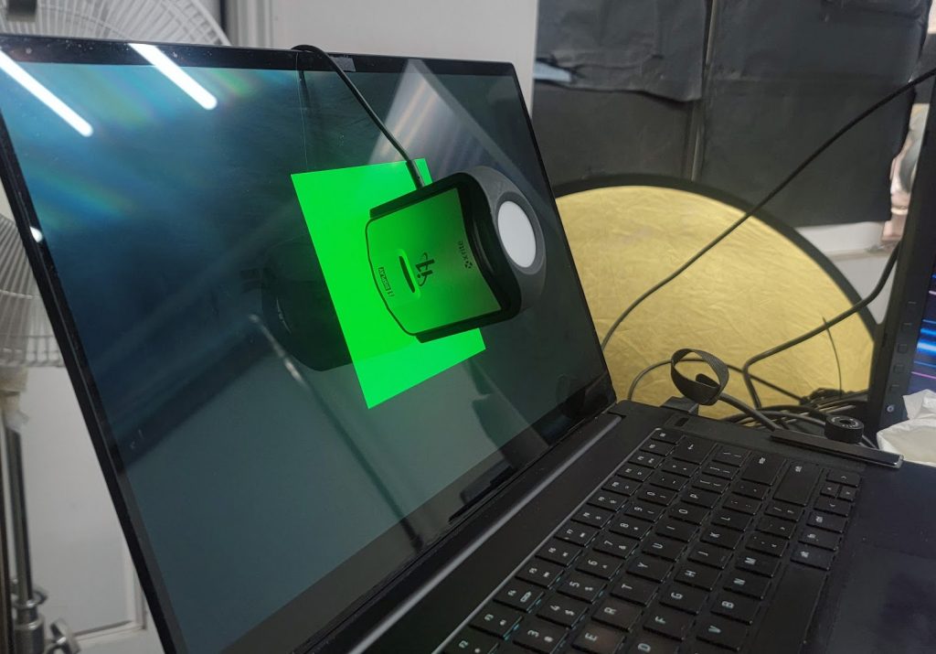
I won’t explain how to calibrate your monitor in this article, as there are several guides online that can do it. But you will need a calibration tool and some software to read the colorimeter and guarantee accurate colors.
Why Calibrate Your Monitor?
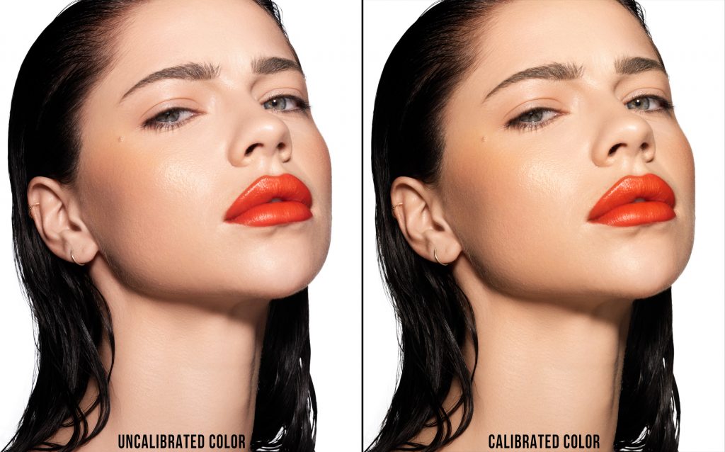
A common argument against calibrating your monitor is “Well if my client doesn’t have a calibrated monitor, why should I calibrate?” and the answer is simply to set a standard for your work, and play into the law of averages. By calibrating your monitor, you’re ensuring you have a baseline for your color and brightness – and working from a color-calibrated monitor will make sure your work looks accurate on most monitors. Sure, the office monitor might be a little warm, and your iPhone screen might be way too bright – but by having a color-accurate monitor, you’re assuring that your colors are as accurate as they can be to the largest swatch of people.
Color Balancing Your Lights
Another workflow I’ve grown accustomed to is calibrating my lights as well. Perhaps calibration isn’t the correct word for this process – I get accurate white balance readouts on all my lights and tape those readouts to the light unit themselves. I’ve written in the past about using a color checker at the start of every shoot, but I’ve found having an understanding of my light’s color balance is immensely helpful as well, especially when working in a frequent environment. Let me explain…
I have over a dozen different studio strobes that I use for different purposes – many of which are decades old, and bought on the used market. Because I live in Los Angeles and Profoto Pro Heads are in abundance here, I have a lot of different lights with different bulb styles, different domes, and different usage levels, so my color balance of each light can have a +/- of 500K easily between each light. And while someone might say to just go ahead and replace all of the bulbs with new ones, that would cost a couple hundred dollars each, totaling a couple thousand dollars. Additionally, I like the diversity that one of my lights is quite a bit warmer than others, and differentiation between strobes isn’t exactly an anomaly.
If you’ve ever looked at the spec sheet of a new studio strobe, you’ve likely seen the white balance of the bulb in the technical specs sheet. More often than not, you’ll see something to the effect of a light daylight balanced with a +/- sway of 100-200K. This is because the white balance of a flash tube can changed by several factors – power output, age of bulb, modifiers attached, etc etc. By knowing your studio strobe’s exact white balance (or an average based on power setting if you want to get pedantic).
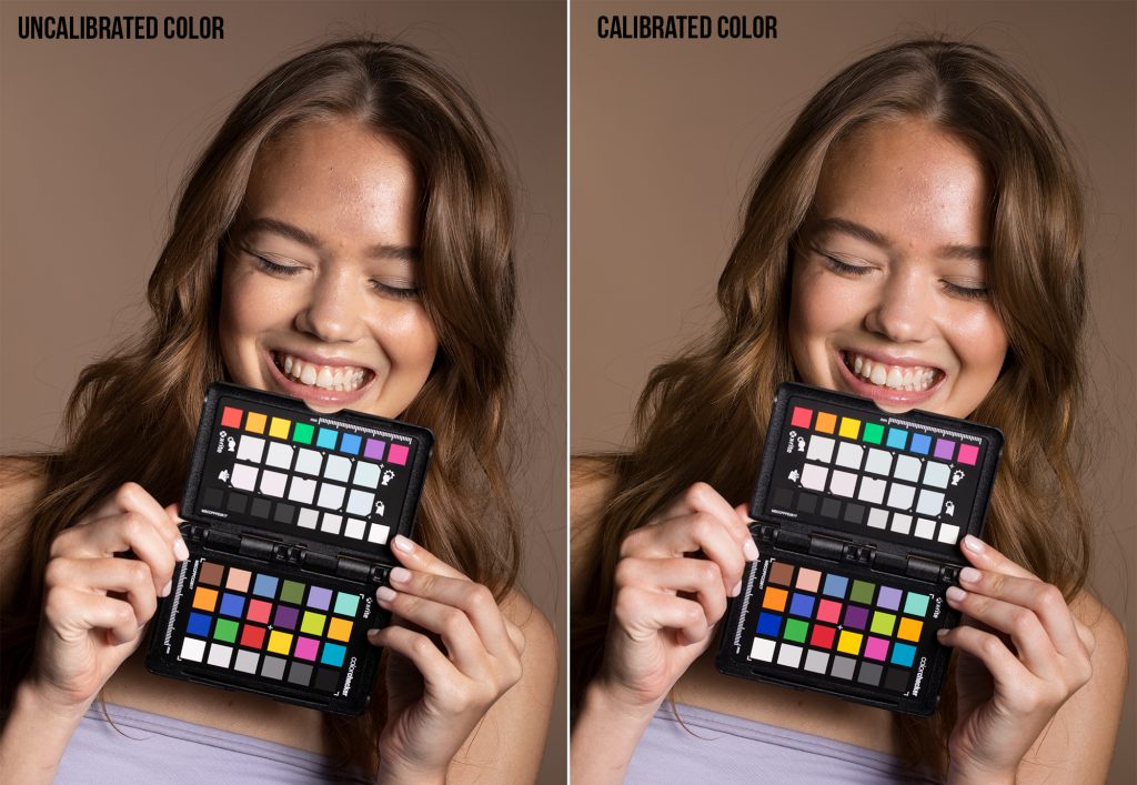
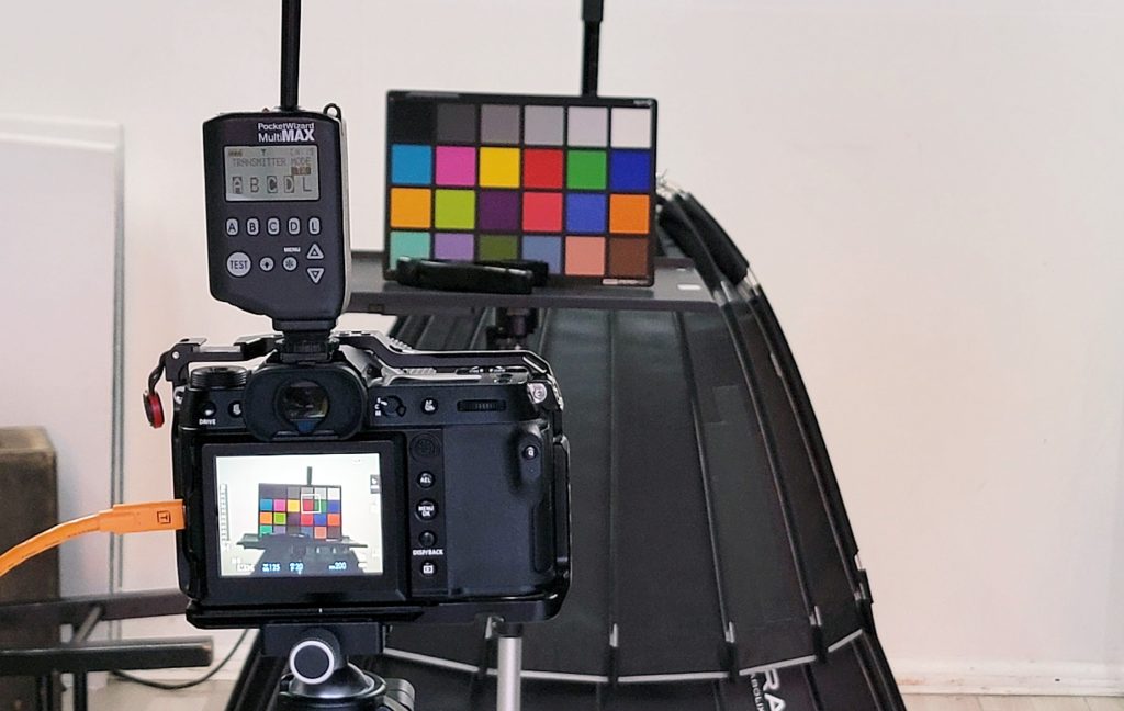
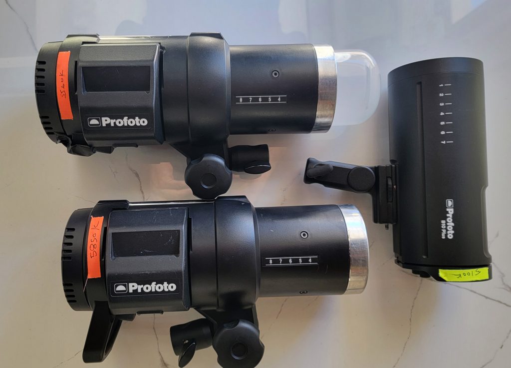
I’ve spoken about using a color card before each shoot, and I stand by that method as the best practice you can build to ensure you get accurate colors, but in addition to that, I check the color balance of my lights every few months to make sure when I’m mixing strobes, I’m not getting off colors. The process is pretty simple – I go through each of my lights, firing them at ~50% power (or my most frequently used power setting depending on the output) with no modifier on them, and get a color balance reading of each off of a white balance card 3ft away. I then use a label maker and stick that Kelvin readout to the side of the strobe. This way, if I’m bringing in an additional light or two, I can make sure I’m choosing one that has a similar color balance as the others on the field.
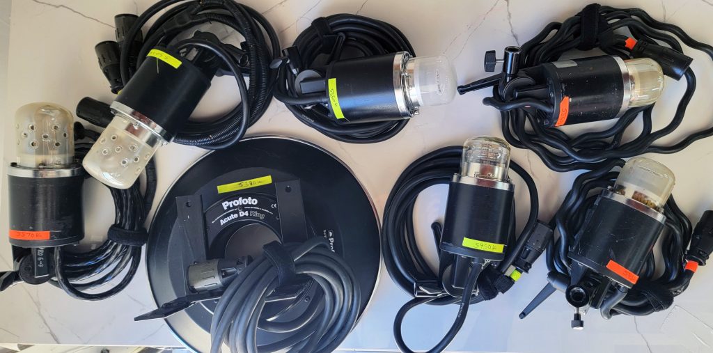
If your strobes are fairly modern, you’ll likely see only slight sways in the white balance of the light. But if you’ve got older lights, or are mixing and matching brands, you might see some pretty significant color sways from one light to the next. Below is a breakdown of the difference in white balance based on each strobe tested.
| Strobe | White Balance |
|---|---|
| Profoto B10 Plus | 5100K |
| Profoto Acute D4 Ring Flash | 5380K |
| Profoto Pro Head (Frosted) | 5450K |
| Profoto Acute D4 Head (Clear Glass) | 5450K |
| Profoto Acute Twin Head | 5500K |
| Profoto Acute D4 Head (Frosted) | 5550K |
| Profoto Pro Head (Yellow Coloration) | 5560K |
| Profoto B1 (Dome Head) | 5560K |
| Profoto Pro Twin Head | 5570K |
| Profoto B1 | 5850K |
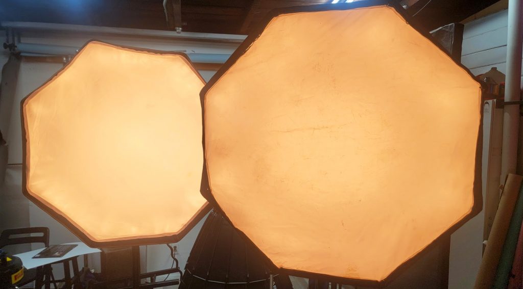
As you can see from my tests, I’m having a white balance sway of 750K, despite using only a single brand of lights. If you mix those brands, you may see even larger sways of white balance. But light modifiers and their condition will also have adverse effects on your color balance – so as tedious as it is, it might be wise to test those older light modifiers, especially if they have some strong discoloration from the inner or outer baffle. To test this point, I took two octoboxes and tested their color balance using a strobe (The Pro Head measured at 5450K if you’re interested). The Profoto 3ft Octobox, which is only a couple of months old measured a white balance of 5240K. The second variable is a PCB 4ft Octobox that is over 15 years old and has endured a lot of use and abuse in those 15 years. To my surprise, the PCB Octobox gave a white balance reading of 4750K – a sway of nearly 500K despite using the same strobe at the same setting.
Have you done some color calibration on your monitor or lights lately? Feel free to chime in using the comments below. As always, LensRentals.com offers a nice selection of calibration toolsif you’re looking to up your color accuracy game.
