Often times, we’re digging through our always evolving inventory to find exciting products to talk about and share our experiences with said product. While it’s easy to focus our attention on the latest lens offering from the Sigma Art Series, or something like the RED Ranger, sometimes it’s important to talk about various products that don’t get all the press that the major releases will receive. So today, we’re going to be focusing on color, and in particular, the X-Rite ColorChecker Passport.
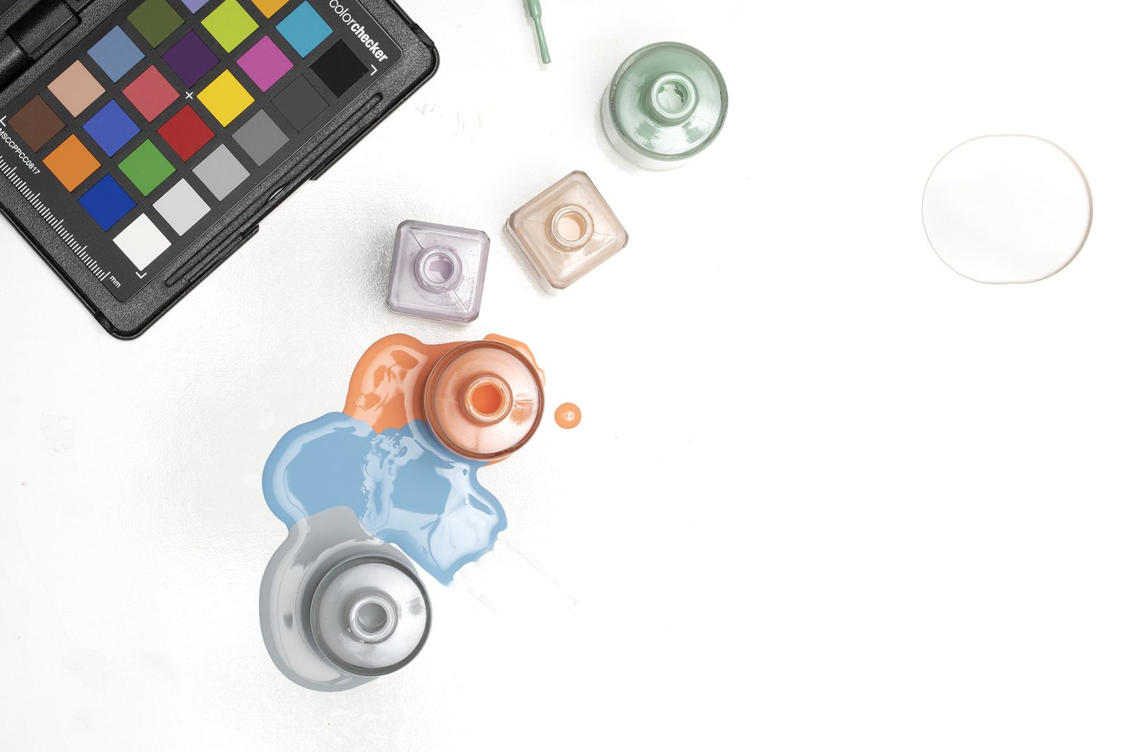
What an X-Rite ColorChecker is, is a series of color swatches that are used to, in a sense, calibrate the color within your images to the most accurate degree. While these tools are incredibly common in video productions (as multiple cameras need to match color), they are considered a specialty tool when in the photography studio. And there are multiple reasons why you may want to use a ColorChecker system for your next photo shoot.
- When you’re photographing something that needs precise accuracy in color.
- When you’re using multiple cameras and need each camera’s colors to match perfectly.
- When you’re developing a neutral point in color, before you start your post production and color grading.
- Finding an accurate white balance in complicated & mixed lighting situations
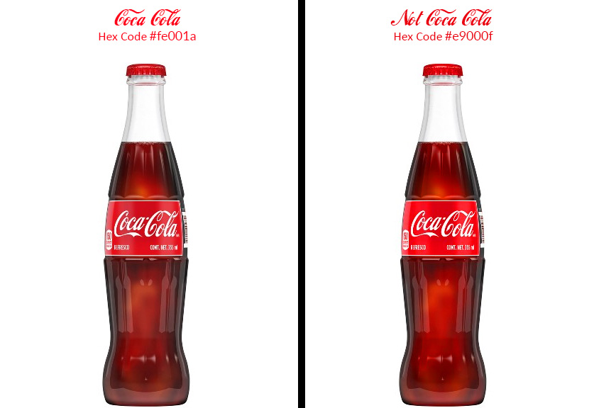
Perhaps the most important use of a ColorChecker comes with product photography. Many major brands have pinpoint colors that they use for their branding and require those colors to be perfectly accurate in all of their marketing materials. Coca Cola, for example, uses the iconic red color in all of its marketing (Hex Code #fe001a), whereas brands like Tiffany actually have a trademark on their iconic “Tiffany Blue” (Hex Code #0abab5). These colors are a major part of their brand awareness, and when having their products photographed, they need to make sure they’re hitting those colors with pinpoint accuracy.
And while most of us probably aren’t shooting the next global campaign for Tiffany’s or Coca Cola (kudos to you if you are), these principles still apply regardless of the brand you’re working with. A color’s representation in the camera can vary drastically based on white balance, lighting, and even the camera and lenses you use, so a ColorChecker tool is an asset when trying to represent the color you’re photographing.

How to use a ColorChecker
Now that we have a basic understanding of the importance of a ColorChecker in certain scenarios, let’s talk about how to use one. Generally, people use a ColorChecker one of two different ways – to just set a custom, accurate white balance or for full-color adjustment.
Using a ColorChecker to set White Balance
If you’re looking to get an accurate reading of your white balance settings, and don’t need the precision of absolute color accuracy, a ColorChecker is a really quick and easy tool to use to assure you have an accurate white balance. Simply take a photo of the ColorChecker with the grey card within the frame, and use that grey space to select a custom white balance. If you’re doing this in the camera, it’s as simple as going through your menu to select custom white balance, and selecting the image. If done correctly, all images going forward will use that custom white balance (Assuming you have your White Balance set to ‘Custom’). If you’re tethering to a computer, all you need to do is take a photo with the grey card in frame, and using the White Balance eyedropper tool and selecting the grey card. Assure that you have the settings applied to sequential images, and your white balance should be set.
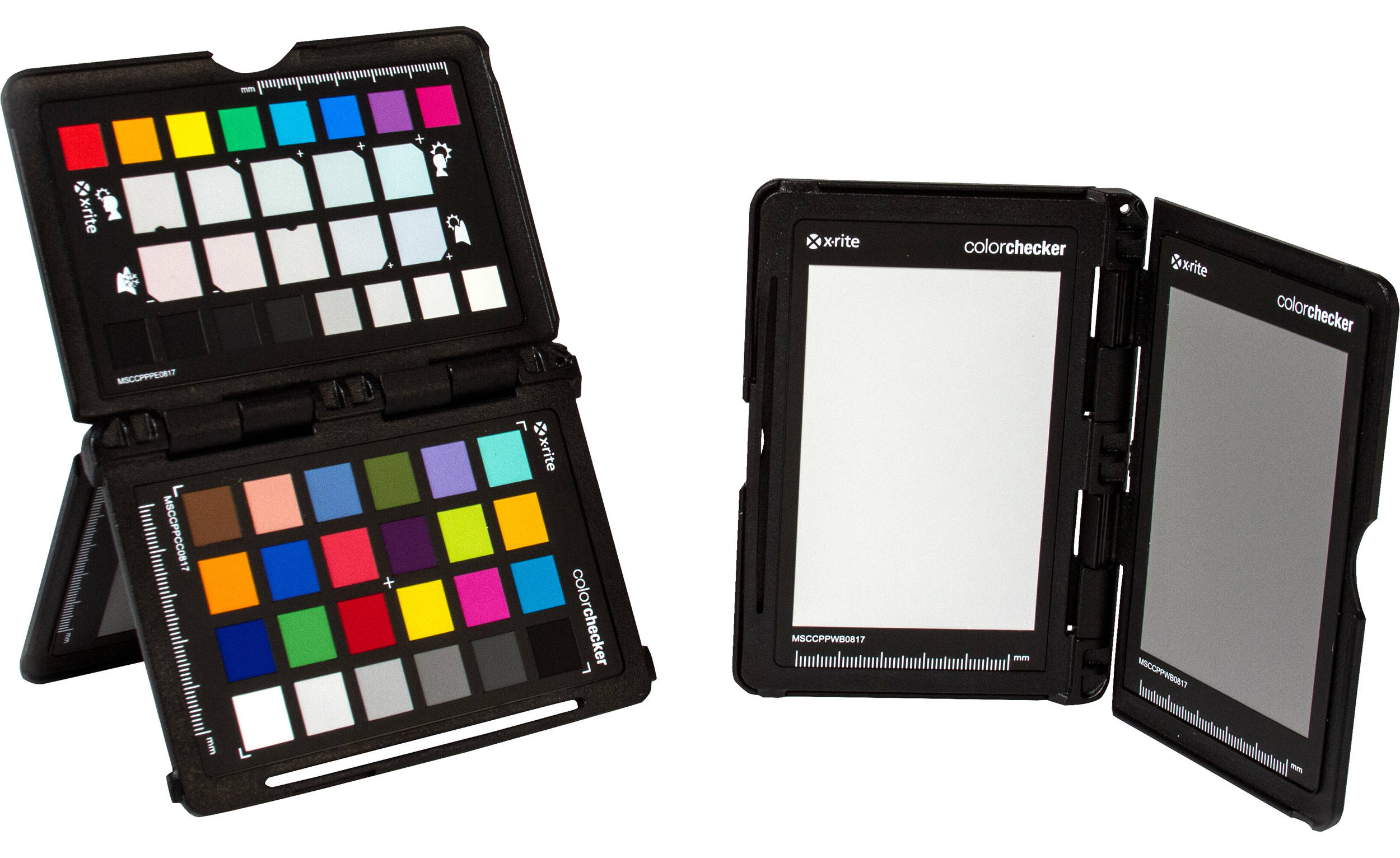
With a ColorChecker Passport, there are two ways to set the White Balance – with the large grey card, or using the grey scale on the color grid portion of the ColorChecker Passport. Of these two options, I prefer the latter, as it gives you color correction options later in the editing process. Each checker is designed to be a neutral grey color, so which one you select is dependent on your exposure.
Using a ColorChecker to set ICC Color Profile
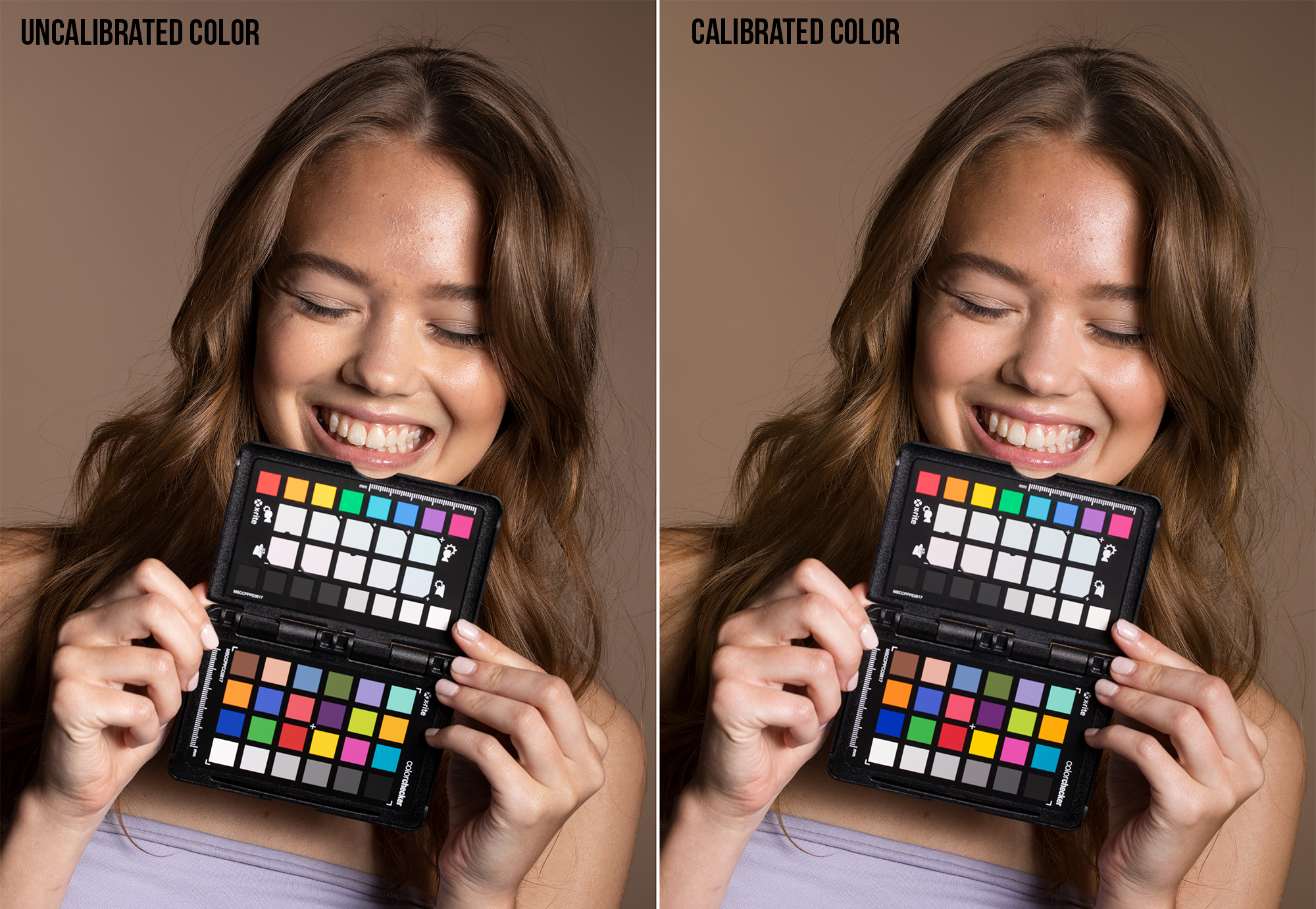
The most useful tool when using a ColorChecker, is using it to set an ICC profile to use for your images. An ICC profile is a set of data the characterizes the color input of an image. In simple terms, its a profile used to assure accurate color rendering across the entire platform – from photographing to monitor display to printing. While this may seem nerdy and unnecessary to some (and depending on what you’re working on, it can be), it is exceptionally important when working on commercial projects that require accurate color. When photographing an image, your tool for capturing an accurate ICC profile is a ColorChecker system.
To create a custom ICC profile, all you need to do is put the ColorChecker grid in the frame, and snap a photo. You can then use this image as your reference file later in the editing process (or use it immediately if you’re tethering). You’ll want to take one of these photos with each new set or lighting setup to assure accurate reference files across the board.
The easiest way to use these files, is to later take that image, convert it to a DNG, and then process it using the ColorChecker Camera Calibration software from X-Rite. The system itself is pretty automated, just drop the image with the ColorChecker in frame, and it will autodetect it. From there, create the new profile (I’d recommend giving it a custom name), and the hard work will be done.
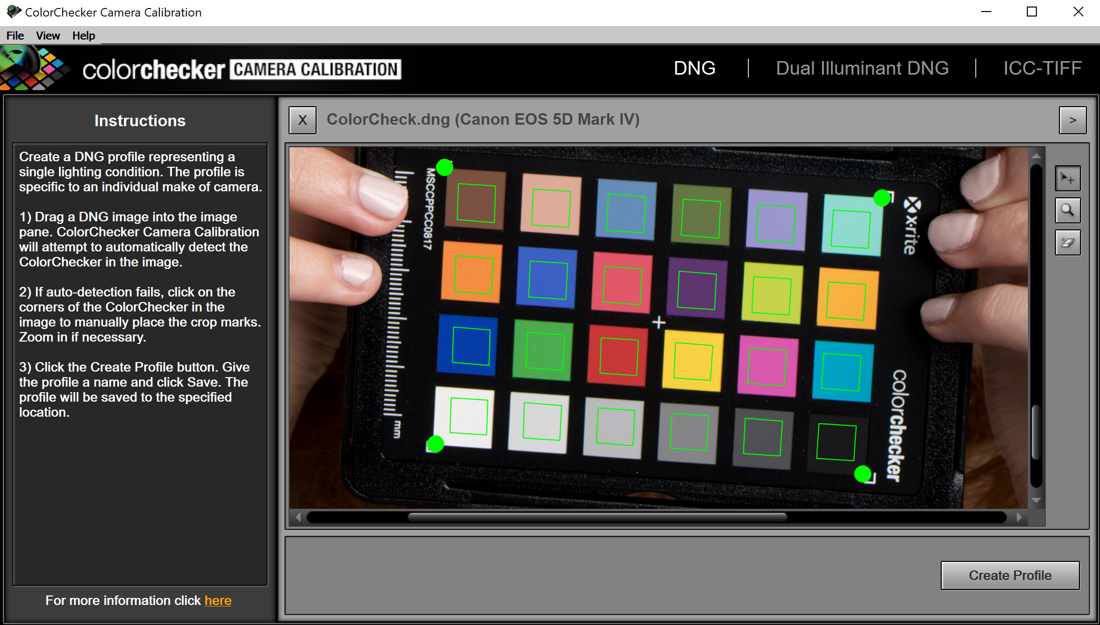
Then load up your favorite RAW processing software, and select the camera profile you had made with the ColorChecker software. From there, apply those same settings across all the images from the set. While the changes and adjustments to color (should be) pretty subtle, you’ll typically find you’ll get richer colors and more consistent contrast throughout the image.
This is just an introduction to how to use a ColorChecker Passport to get accurate color read out from your images. This is the most basic way of assuring accurate colors from your images, and recent tools with Capture One and X-Rite allow you do make these adjustments automatically within their software. Hopefully, this article was able to provide you with a basic insight on how to get an accurate color readout using a ColorChecker, and if you want to learn more about what you can do with a ColorChecker, X-Rite has put together an extensive manual going over the features.

26 Comments
Baconator ·
Very looking forward to read next: How to Use Random capital Letters in The Titles of My articles by Zach Sutton 😉
Zach Sutton Photography ·
https://capitalizemytitle.com/
😉
Baconator ·
Ha-ha you fixed it 🙂 Great website BTW, thanks for sharing. Love the AIT case, but no idea what it is though…
Zach Sutton Photography ·
Don’t sell me short now…I only fixed one letter’s case. It’ was 95% of the way there already (I was working off of memory on how headlines need to be written).
Either way, thanks for reading, and the next article recommendation ?
Chris Knight ·
Curious the workflow for video production, in FCP or Davinci Resolve but even more importantly, getting color profiles into the camera. When shooting in high compression formats, color calibration can be critical to avoiding compression noise. I’ve used gray and white targets for in-camera calibration but would be nice to get more accurate color curves in-camera.
DrJon ·
I use it on Resolve and it's very simple... just make sure you pick the colorchecker type you used... :-)
The short version is at 4:44 on here:
https://www.youtube.com/wat...
Although you can do a lot of cleverer things, like using the patches with a Vectorscope, see here:
https://www.youtube.com/wat...
Disney Font Generator ·
Evercross Evo8e
EVERCROSS EVO8E Electric Scooter with the option of adjustable height, so one can easily adjust the size of this electric scooter. This feature is really beneficial for the taller ones. So overall, it’s a unique and rare feature you‘ll find in electric scooters. This function sure adds more value and customer appeal to this one.
DrJon ·
I did reply, but it had YouTube links and got zapped. It may reappear at some point…
Also depends on what features your camera offers (the video ColorChecker is a good idea for in-camera stuff, especially if it has waveforms or a scope).
DrJon ·
In the meantime, the slightly edited version…
I use it on Resolve and it’s very simple… just make sure you pick the colorchecker type you used… 🙂
The short version is at 4:44 on here:
watch?v=onom8tpiof8
Although you can do a lot of cleverer things, like using the patches with a Vectorscope, see here:
watch?v=yNSRrIf8rY8
Disney Font Generator ·
Font Changer
Font Changer I hope you guys know about font generators or changers. If not let’s know font changer is a website tool and app available online to change your text to cool fonts.
These font generators have already been added and developed font styles mostly which are highly used and well known. And it‘ll be a fantastic way to create the best and cool text without a single penny. Here we also have the best font generator suggestions for you guys.
Showbox apk
Erik Rakovský ·
“High compression” is not equal to “highly color distorted”. Video compression methods are highly sophisticated and with the right settings and bitrate available, PSNR is somewhere below 60-70 dB, i.e. invisible.
There are many misconceptions about (video) compression, but from the ancient MPEG-2, the goal always was to get as much fidelity as possible with contemporary hardware. I would say the most of these misconceptions were around H.263/DivX and almost all of them are nonsenses.
For your information, MPEG-4 (H.264) is much better for retaining high frequencies (details, both luminance/color) than “less compressed” formats like Avid DNxHD/HR or Apple ProRes.
However I am not surprised at all. There are dumbasses even in really BIG media houses demanding for example I-frame codecs for the footage delivery (it is always less effective than normal, P and B frames containing stream, only advantage is that it is less hardware demanding during edits).
DrJon ·
As far as I’m aware the only Raw tools supporting it are Lightroom, where it’s very easy, plus DXO Photolab2 and Capture One Pro 12, where it’s a little more involved.
I keep one in each of my main camera bags (video one in the bag with the GH5) but do have a habit of making the colours correct and then going off and doing something I like more with them… 😉
T N Args ·
Darktable
RawTherapee
DrJon ·
Thanks, I’d missed those. Although the Darktable approach I saw (using Argyll) looks way too much work.
# WLM ·
> As far as I'm aware the only Raw tools supporting it are Lightroom
as a public service, for those who are actually interested how stuff works, because Zach's article is not at the level of their lens posting, not even close
https://forum.luminous-land...
http://www.lumariver.com/lr...
and (university server might be down at the moment - but google cache helps or wait till server will be up) :: https://www.ludd.ltu.se/~to... + https://www.ludd.ltu.se/~to...
Disney Font Generator ·
ShowBox apk is the best one out there! With a massive selection of movies and TV shows, it’s perfect for anyone who loves to watch films. And with new releases being added, you’ll never run out of things to watch.
Showbox apk
Ben Rubinstein ·
As a repro photog, ‘perfect’ is a rather optimistic claim for a profile made with a handheld 24 patch chart and uneven lighting.
Zach Sutton Photography ·
If it’s something that needs even more color accuracy, I’ll use this color checker below. But generally speaking, the laws of diminishing return kind of apply here.
https://uploads.disquscdn.com/images/a482e6ea12fb632463e9f532d0a6c6ef1018a89e91cfc26561ab57a5a5d79feb.jpg
Ben Rubinstein ·
The word ‘perfect’ is inaccurate and should not have been used. You’re claiming a level of results which even the Digital SG chart cannot achieve.
GuyWith ·
You bring up an interesting point. What is the next step up When you need better color accuracy? What is your workflow for repro work?
And how close to perfect is it possible to get?
Luka Koprivica ·
Does it really matter? It’s all art… It’s important it’s accurate to the agreed degree, beyond that it’s impossible.
SpecialMan ·
It’s not really about accuracy so much as it is about consistency. When you have known values it’s easy to alter them to get the look you want. If you have to reinvent all your colors from scratch each and every time you will waste hours and hours pushing sliders around when you could otherwise be productive
Long P Vo ·
The CCSG does have more gamut volume but EXTREMELY hard to capture and profile due to it being glossy and hence glare, if whatever you shoot is color critical, I’d suggest stay away from the those free bundled software, they just add way too much saturation. Look into Lumariver PD, not cheap but best out of the bunch.
Times new roman font generator ·
Hi thanks for helpful information use this tool times new roman font generator create simple text to beautiful and more attractive your fonts use in texts, comments, description and posts.
Time New Roman Font Generator
Disney Font Generator ·
Hi thanks for helpful information use this tool times new roman font generator create simple text to beautiful and more attractive your fonts use in texts, comments, description and posts.
times new roman font generator
Disney Font Generator ·
Disney font generator
In the vast world of design and creativity, fonts play a significant role in conveying emotions, themes, and branding. One font that has captivated hearts for generations is the iconic Disney font. Synonymous with magic, imagination, and childhood memories, the Disney font instantly transports us to a world of fairy tales and dreams. Now, with the advent of technology, enthusiasts and designers alike can bring a touch of Disney magic to their projects with the Disney font generator.
Disney font generator
Retro Font Generator