If you’ve been a frequent reader of this blog, you’ve probably heard me tiptoe around color theory, and say that I’m not going to go into it further; as a post on color theory deserves a book or several college courses and not something a few paragraphs can do justice. However, it is a frequent topic in my workflow process and concepts that I think about during every moment of a photoshoot, so I decided it needed more than some slight tiptoeing. So let’s talk about basic color theory, and how it should apply to your photography and video projects.
What is Color Theory?
Color theory is the study of how colors work together and how those colors affect our emotions and overall perceptions. It can be as complex as telling a story through the use of colors that evoke emotions, or as simple as finding colors that complement and harmonize with each other to make for a visually compelling image.
First documented by Sir Isaac Newton, the color theory was born from the “invention” of the color wheel in 1666. Understanding that the visualization of color is human perception and not something quantifiable, Newton categorized colors into three groups – Primary Colors, Secondary Colors, and Tertiary Colors (the mixing of equal parts of primary and secondary colors).
The Three Properties of Color
Every color has three properties that makeup what they are – hue, value, and saturation. These three values will correlate to over 16 million different color options, and cover everything you see in the visual spectrum.
Hue
Hue is the specific color on the color wheel. Think of hue as a basic categorization of color – Red, Blue, Green, etc etc.
Value
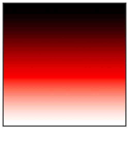
Value is the color’s relative lightness or darkness on the greyscale. Value is what helps distinguish contrast, and is the adjustment of a color on a grayscale to determine how light or dark it is.
Saturation
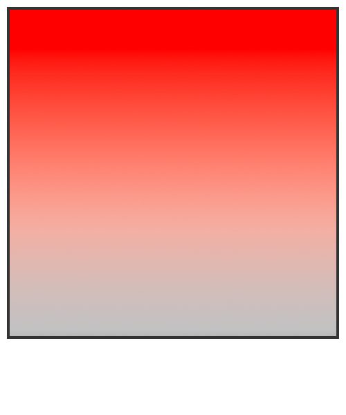
Saturation (also referred to as chroma) determines the vividness of color, ranging from complete saturation, to complete desaturation (greyscale).
These three properties of color make up the 16+ million different colors available in the color spectrum. Before we even touch on complementary, compound, and triad colors, we must first understand the properties that adjust with each color shift on the spectrum.
Once you have a good grasp of this, you’ll find that retouching becomes easier. Instead of thinking of skin texture as something physical, think of it as blotches of a color, with varying differences in hue, value, and saturation. To normalize skin tones, you want to maintain the hue and saturation, while adjusting the value properties of the skin. Implementing this way of thinking can help deduce what needs to be fixed in problematic areas and yield better results.
Color Harmony
When it comes to applying colors to a branding or image, an important aspect of that is ‘color harmony’. Color harmony is the concept that geometric relationships within the color wheel can create more harmonious color combinations. There are a number of different techniques that can be applied to color harmony, but before we cover a few of those, let’s look at a standard color wheel.
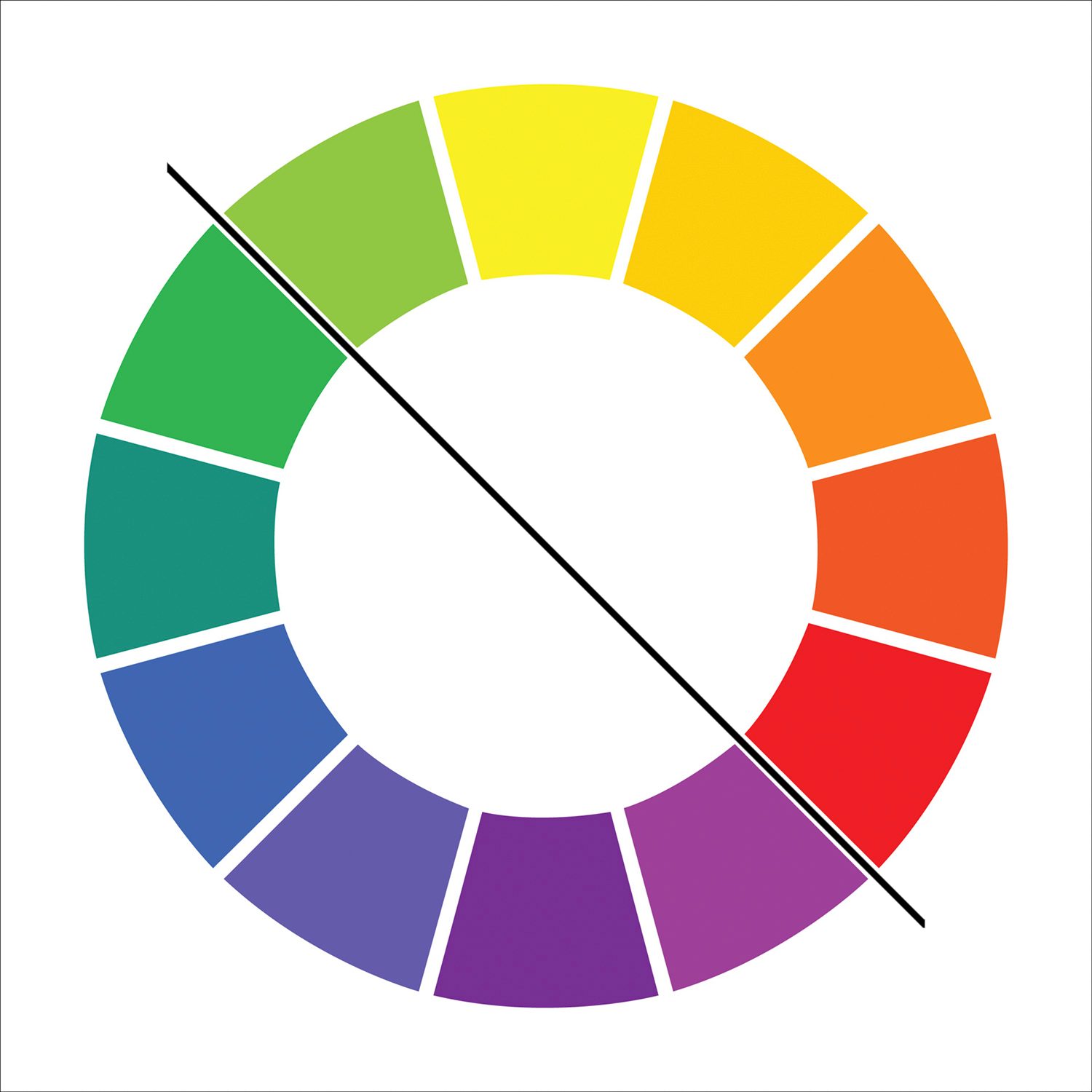
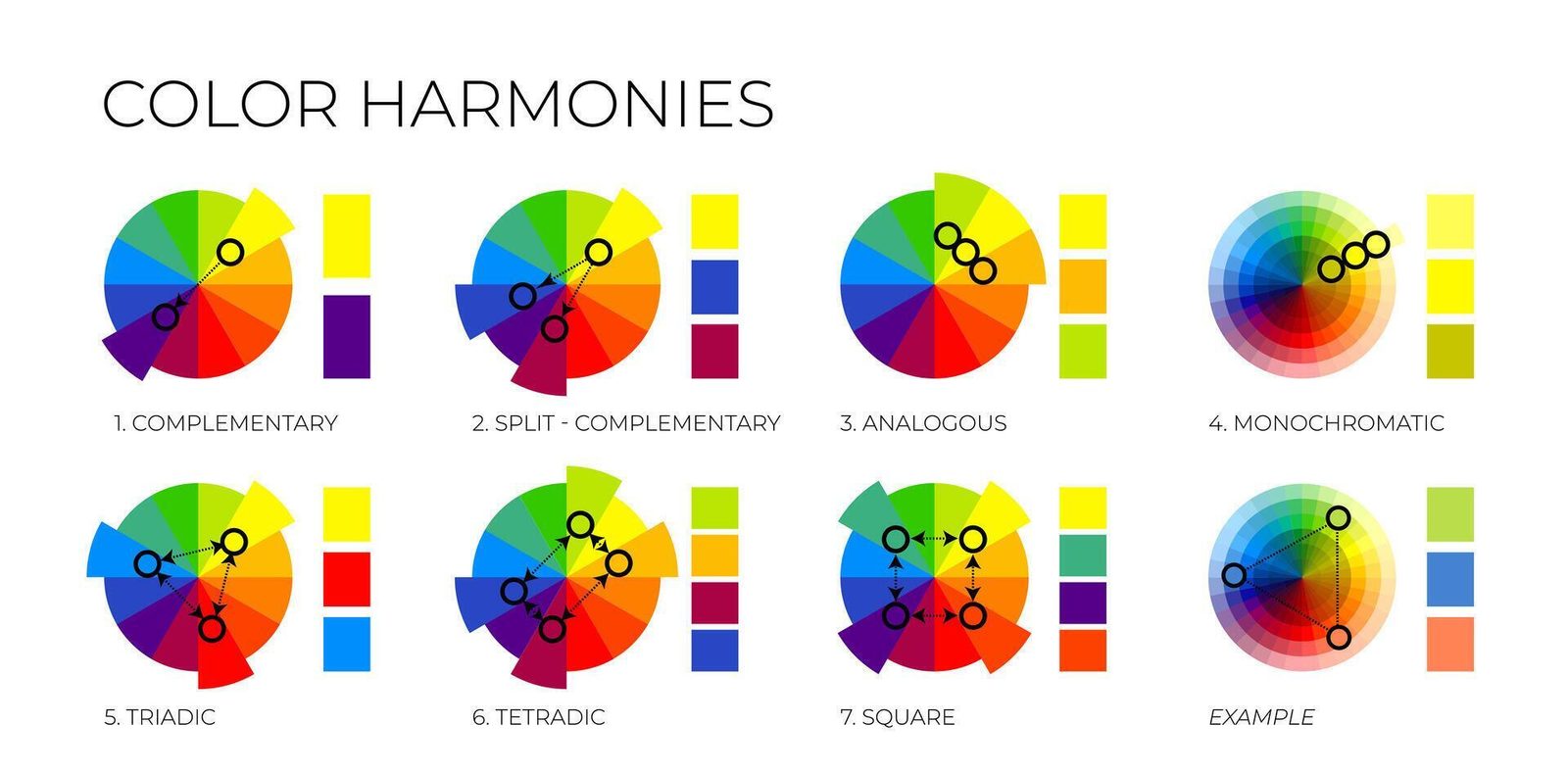
This is a standard color wheel, and using this gradient, we can identify different color harmonies that help build a cohesive branding and identity. Color harmonies can be found by drawing specific geometric shapes on the color wheel, you find which colors complement each other best. There are several different color harmony rules, but for this piece, we’re going to focus on the most common different color harmonies used in design and art.
Complementary Colors
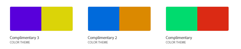
Complementary colors (also referred to as direct harmony) is the process of pairing your key color with a color on the opposite side of the color wheel. Examples of this color harmony are pairing blue with orange, red with green, and yellow with purple. Likely the most common type of color harmony, complementary colors can pack a visual punch, and deliver a cohesive image or branding.
Split Complementary Harmony
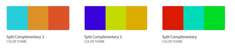
Split Complementary is very similar to complementary color harmony but involves adding a third color into the mix and splitting the accent color. This is used to create a visual interest, without being overbearing which complementary colors can be.
Analogous Harmony
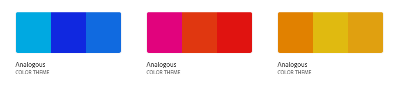
Analogous is the use of three colors located side by side with each other on the color week. This can be used to develop a theme in the work, but can easily come off as overbearing if not careful.
Triadic Harmony
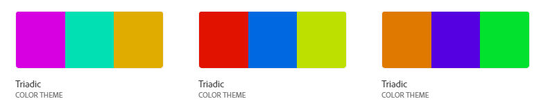
Triadic harmony is the use of three colors 120 degrees apart from each other on the color wheel – creating an equilateral triangle. Triadic is a great way to create contrast between colors and quickly make a visually appealing design while having a broad range of colors.
Those are the four most common uses of color harmony but are by no means the only way that color can be used to create a cohesive design. Suppose you’re looking to experiment with color theory further. In that case, I cannot recommend the website Adobe Color enough – as it helps create harmonious palettes and is the starting point for millions of creatives looking to tell a story with color.
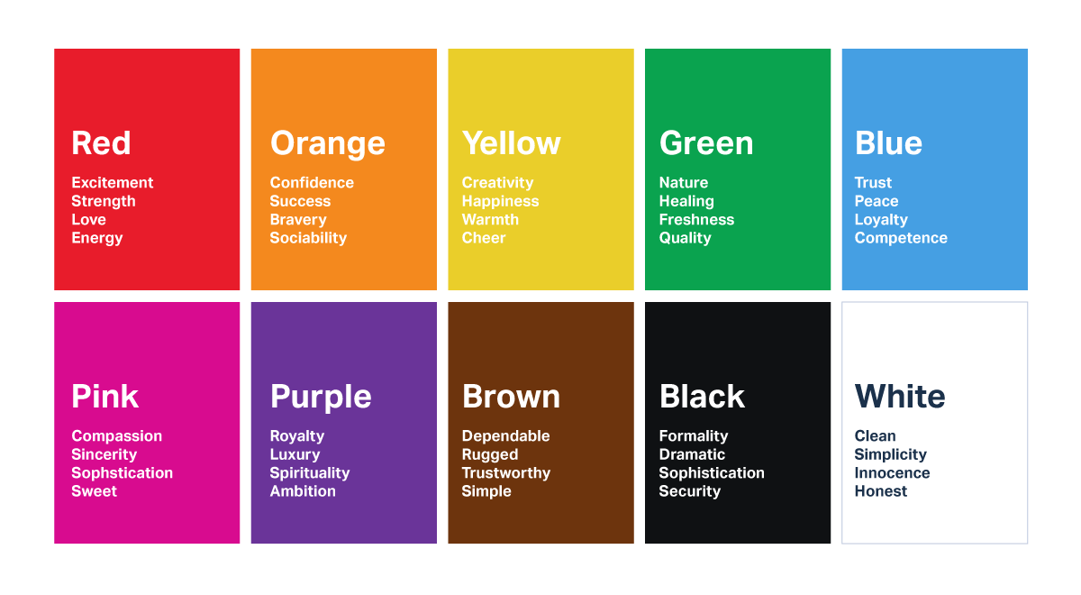
How Colors Evoke Emotion
Colors can have an immense effect on the moods they project. There is a reason that color is often used to describe a specific mood – green with envy, tickled pink, and true blue to name a few. With all art, your goal should be to invoke a specific feeling or mood with with work you create, and color palettes can help with that. While I won’t go into deep details with this (unless of course, you would like a part two on this topic), but below is a good list of colors, and some of the moods they convey.
And that is a basic rundown of color theory and how you should select colors to fit the work you’re creating. Additionally, check out this article that discusses how camera sensors determine color, and this article goes over the importance of color calibration. Is this a topic you’d like to see more of? Feel free to chime in using the comments below.

2 Comments
JiF ·
Complimentary???
Zach Sutton Photography ·
Fixed, thank you. Grammarly went rouge on me and I didn’t catch it.