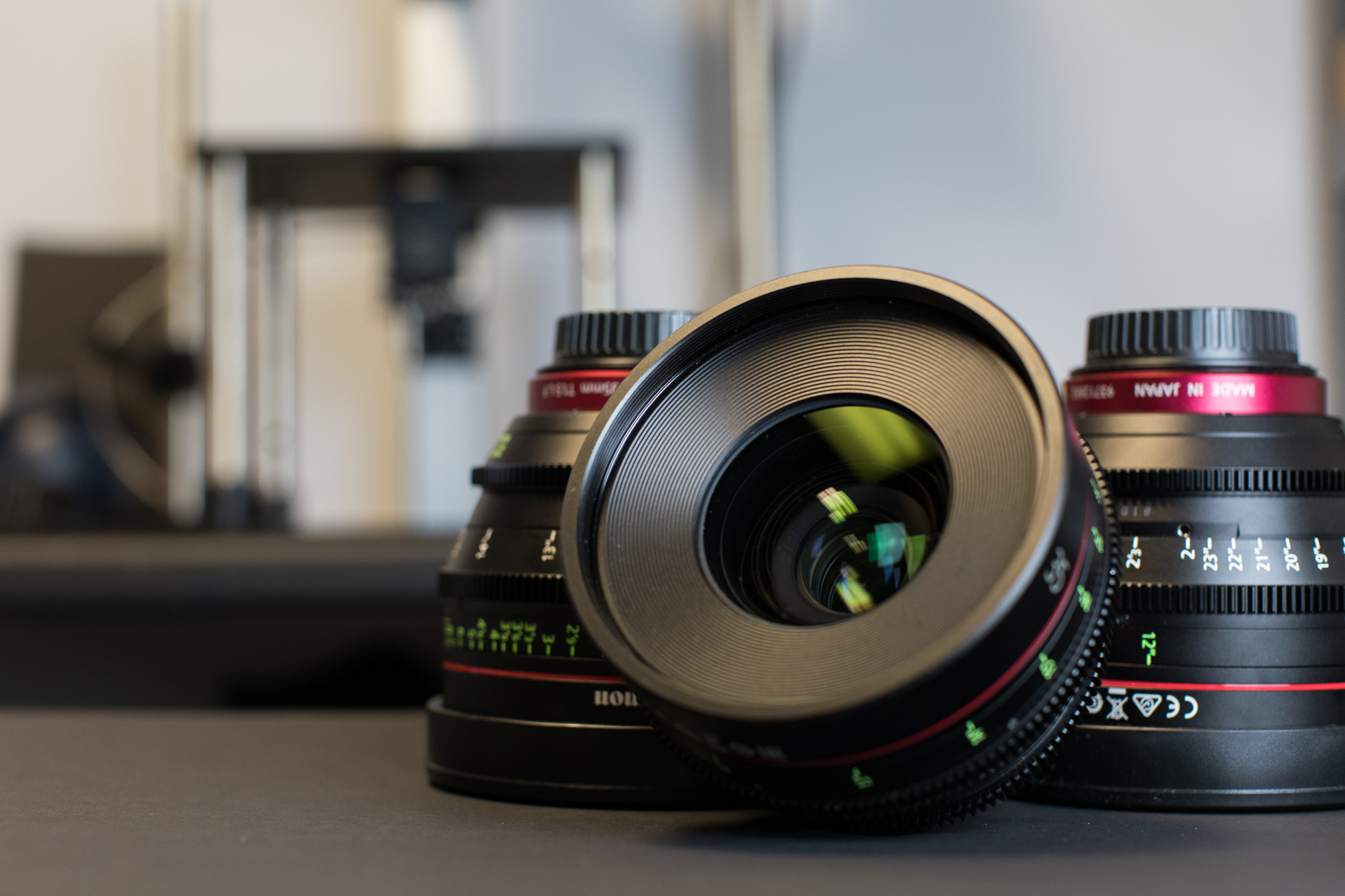
Geek Articles
Looking at Cine Lens Color Shifts Using Spectrometry
Please Note: This is brand-new stuff that we’re publicly experimenting with. We post it because it’s fun and interesting and we usually get pertinent comments and criticisms that help us refine what we’re doing. For those of you who don’t science much, please remember we’re still testing and improving this process. What we’ll look at today is interesting information. It isn’t an absolute fact, at least not yet.
In our last article, we introduced the methodology behind our spectrometry testing. We continue to fine tune that and gather data to explore the process. Most of today’s article will be about color casts in various cinema lenses, but before we get there, I need to do a bit more background. If you’re one of those people who doesn’t care much about methodology, you can skip the first section. Yes, we will think less of you, but you can.
Fine-Tuning the Spectrometry
Determining the Range
We mentioned in the first article that while we got readings from 350nm to 850nm (IR to UV) the data got noisy at both extremes and we didn’t trust it. On the other hand, we really would like to know where the ‘UV dip’ occurred if possible, and if the IR transmission was accurate.
Olaf Optical Testing, 2018
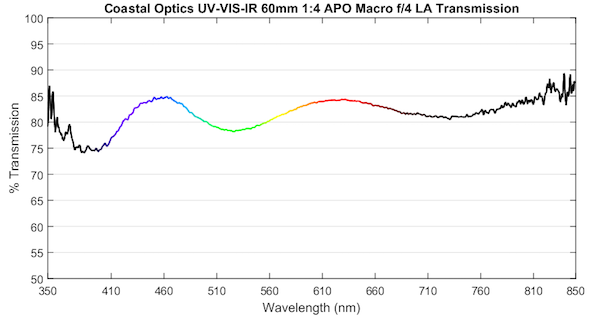
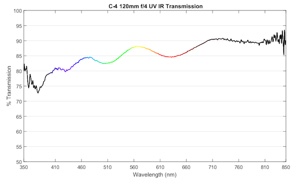
We did have access to a couple of lenses that we knew should have broader spectrum transmission than standard lenses: the Coastal Optics 60mm f/4 UV-VIS-IR Macro and the C-4 Optics 120mm f/4.5 Macro UV-IR Apochromat medium format lens prototype (don’t ask, it’s a long story).
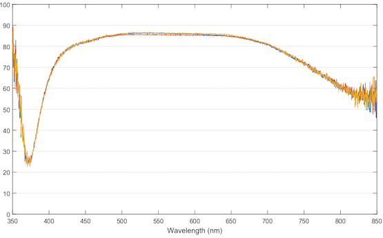
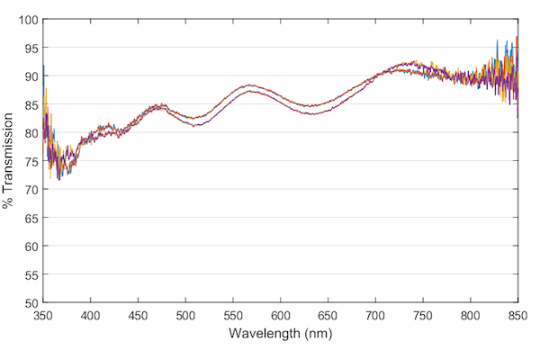
Running these through our spectrometer gave some interesting results. First among these is that the spectra reading doesn’t drop like a rock at 400nm, which is what it did, to some degree, in almost all of the standard lenses we’d tested.
Olaf Optical Testing, 2018
Olaf Optical Testing, 2018
You probably noticed that the spectrum looks wavy, not smooth like most spectra. This isn’t unexpected; broad-spectrum coatings (right) generally do not have as smooth a spectra as visible light coatings (left).
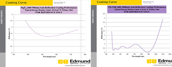
From Edmund Optics https://www.edmundoptics.com/resources/application-notes/optics/anti-reflection-coatings/
That the transmission in these two lenses doesn’t nosedive at 400nm the way most of our visible light lenses do, made us somewhat comfortable that we were getting some data in the near UV range. But the increased noise of amplification is quite evident, even more so when we superimpose multiple copy-runs.
Olaf Optical Testing, 2018
We decided, therefore, that we would show a range of 375nm to 750nm in our graphs, eliminating the noisiest regions. Notice that we change the graph color to black outside the visible spectrum. The data at the edges is noisier and possibly a bit inaccurate. But it’s still reasonably close to reality so we’ll continue to show it.
Olaf Optical Testing, 2018
Of course, like any process, as I finished writing this we got more information. Emmet Rad was kind enough to do some statistical analysis on our spectra and found that the accurate range should be 385nm to 750nm. The graphs were already made at 375nm, though, and I’m not going to replot them all.
Comparing Spectrograms
We mentioned in the previous article that our spectra are relative, not absolute. Our equipment has to be calibrated at each aperture size, so the calibration for 35mm T 1.5 lenses (about a 23mm opening) is different than for 85mm T 2.1 lenses (about a 40mm opening).
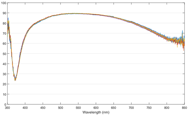
Our primary purpose is to see if all the (for example) Canon 85mm f/1.2L II lenses look the same and it works great for that. If we look at ten copies of any single lens, the graphs basically overlay.
Ten copies of a single lens. Olaf Optical Testing, 2018
But if we look at two different lenses, they may be a bit higher or lower on the graph, like these two different Canon CN-E lenses.
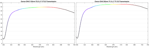
Olaf Optical Testing, 2018
Those curves look pretty similar, but it’s a bit hard to compare them side-by-side. If we overlay one on the other and shift it along the Y axis, so they’re at the same level, it’s easier to compare them. I’m removing the numbers from the Y-axis to remind you that the absolute transmission is not real, we’re simply looking at the relative shape of the spectra. We can see that both of these lenses transmit red and yellow light better than blue and violet.
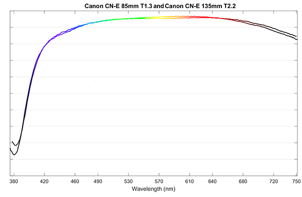
Olaf Optical Testing, 2018
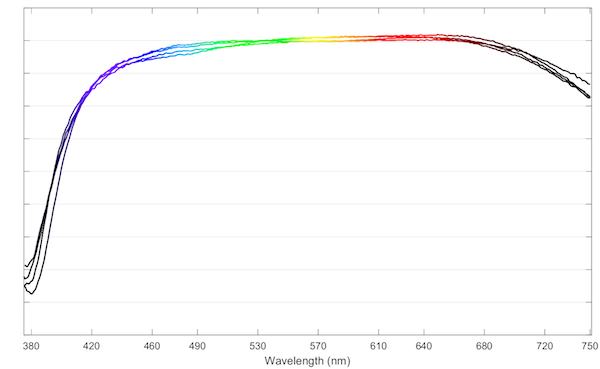
For this post, we overlaid several different focal lengths of one brand of lenses like this, which gives us an idea of any color traits the brand has, if any. In this case they all look pretty similar, so it seems all the lenses of that brand have a similar color tint. (This is a different brand than the Canon lenses above.)
Olaf Optical Testing, 2018
You’ll notice they aren’t the same, but they are pretty close. That makes sense, we expect them to have the same coatings, but perhaps some difference in glass type used and the number of elements. Doing this, although it’s crude, gives us some idea about whether a specific brand has a consistent tint.
So, Show Us Some Spectra Already
OK, you got it. For each brand of Cine prime lenses we carry we did spectra on a 35mm, 50mm, 85mm ( or 75mm in the case of the Schneiders), and either 100mm or 135mm, and then overlaid the graphs like the ones above. This is just a hand overlay, not done to a mathematical formula. We’re doing a feasibility study.
The Canon lenses all tend to pass a bit less blue and violet light but are fairly flat.
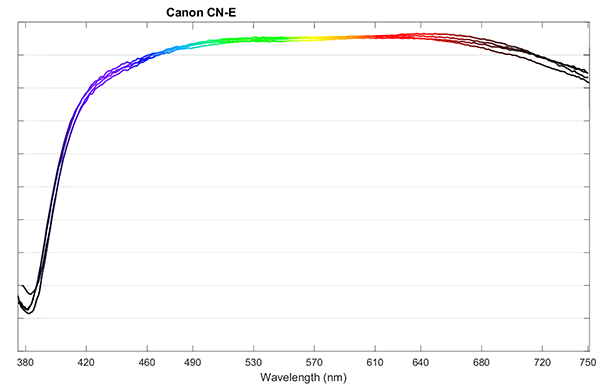
Olaf Optical Testing, 2018
You’ll probably notice the little divot around 450nm, very pronounced in one lens, and a bit more subtle in another, and not apparent at all in two. This isn’t focal-length specific. We’ve tested multiple copies of each focal length, and some Samyang lenses have it, some do not. We’ll look at this more in a later post.
Overall, though, the Samyangs do seem to transmit more at the red end of the spectrum, less at the blue.
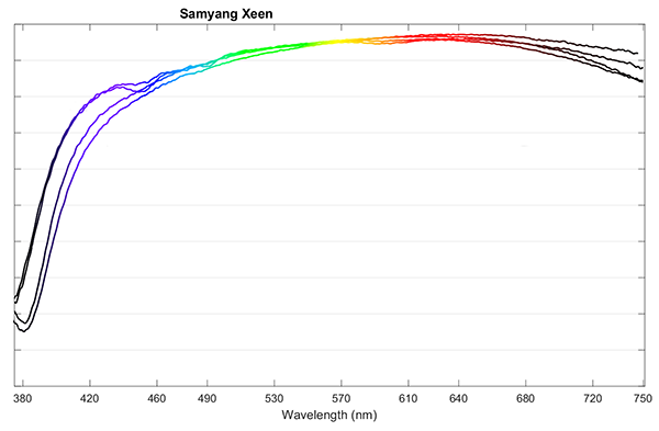
Olaf Optical Testing, 2018
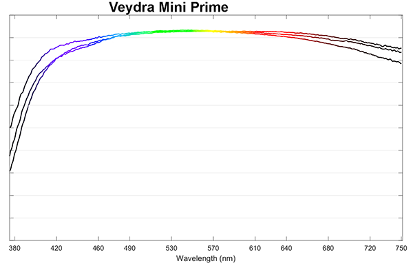
The Xenons we tested seem a bit less identical than other Cine lenses, but we only had a small sample size for this test. Until I run a lot more of each focal length it could be the lenses, could be our technique. They do all seem to transmit best in the center of the spectrum with a little less red and blue passing through.
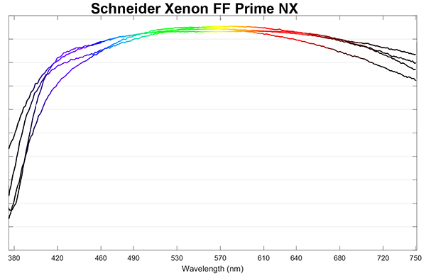
Olaf Optical Testing, 2018
Apparently, the Cine-Xenars look quite a bit warmer than the Xenons, at least from our testing.
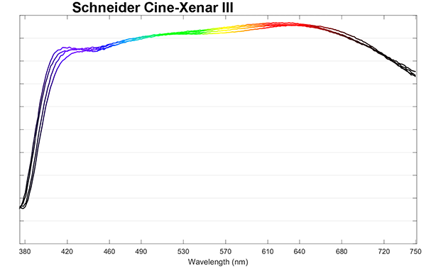
Olaf Optical Testing, 2018
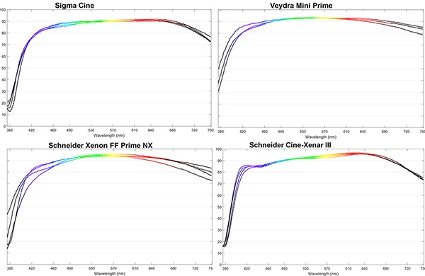
The Sigma Cine lenses are quite similar to the Canons, with just a little bit higher transmission on the red side of the spectrum.
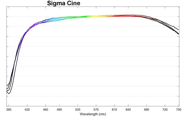
Olaf Optical Testing, 2018
There are only three lenses in this one: 35mm, 50mm, and 85mm. The spectra are pretty flat but these pass a bit more in the center of the spectrum.
Olaf Optical Testing, 2018
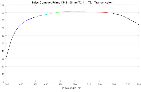
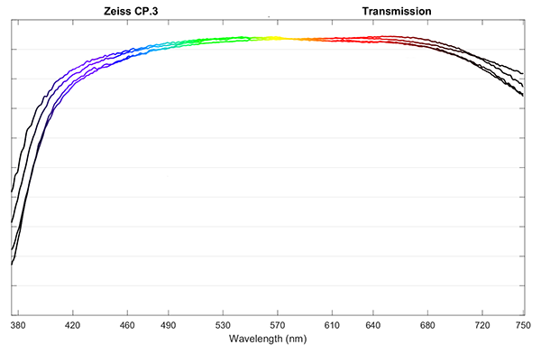
Not surprisingly the CP.2 and CP.3 lenses are very similar, quite flat with perhaps a tiny bit of warm tint.
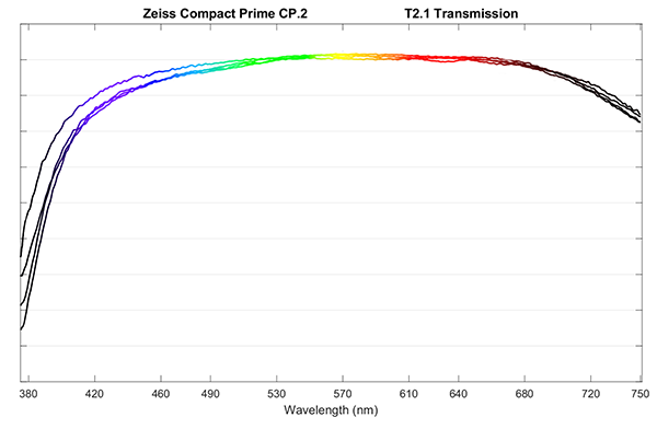
Olaf Optical Testing, 2018
Olaf Optical Testing, 2018
But Can You See It?
That’s what we wanted to know, was it real and can we actually see it. With that in mind, we picked out four lens brands, two that should be relatively warm (red) and two that should be relatively green-yellow (none of these lenses passed blue preferentially). I put thumbnails of the spectra below, so you don’t have to scroll up and down.
Olaf Optical Testing, 2018
Then we had Joey take some 18% gray card images in indirect sunlight with each lens on the same camera; Brandon simulated daylight color balance from the raw files and made a tone swatch for each lens. 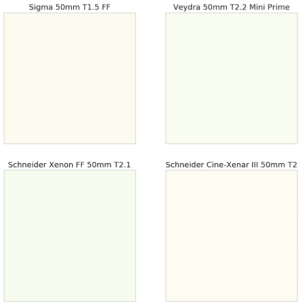
It’s a bit crude, and not particularly sensitive, but (assuming our monitors are reasonably calibrated) you can clearly see the Schneider Cine-Xenar and Sigma Cine lenses are slightly warm, the Schneider Xenon and Veydra a bit greenish. I’m not sure how it will translate to different browsers, but with the original file, the Schneider Cine-Xenar is slightly redder than the Sigma, the Xenon a bit greener than the Veydra.
So at this point, we seem to have some camera-level confirmation that the spectra we’re getting are reasonably accurate.
So What’s the Takeaway?
For Cine lenses at least, a given brand does tend to have a given look, at least in focal lengths of 35mm and longer. The process we’ve developed seems to be correlating with real-world findings. The differences are slight, and I doubt significant at all unless you mix and match brands during a shoot without color balancing.
Remember, the original purpose of the spectrometry was to quickly check for coating abnormalities. It does that great, but we’re still exploring what else it can show us. We have more work to do, of course; statistical analysis, methodology fine-tuning, and calibration between different size integrating spheres. (That, BTW, is why this was limited to 35mm and longer, relatively wide-aperture lenses. They can all be tested on the same sphere, and I didn’t want to add more variables than necessary.)
But we’re already learning some things about lens coatings we didn’t suspect, and we’ll show you more as we continue to refine our methodology in the next few posts.
Roger Cicala, Brandon Dube, Aaron Closz, and Joey Miller
Lensrentals.com
April, 2018
Author: Roger Cicala
I’m Roger and I am the founder of Lensrentals.com. Hailed as one of the optic nerds here, I enjoy shooting collimated light through 30X microscope objectives in my spare time. When I do take real pictures I like using something different: a Medium format, or Pentax K1, or a Sony RX1R.
-
bdbender4
-
Chik Sum
-
Alan
-
Stefanie Daniella
-
Jack Hogan
-
Roger Cicala
-
Joey Miller
-
KWNJr
-
KWNJr
-
KWNJr
-
Roger Cicala
-
Roger Cicala
-
Roger Cicala
-
CheshireCat
-
Chik Sum
-
Matt
-
Emmett
-
Nqina Dlamini
-
Søren Stærke
-
Lars
-
David Bateman
-
Brandon Dube
-
Roger Cicala
-
Doug McEwen
-
Lars
-
Stefan Steib
-
Guenther Schubert
-
Andre Yew
-
Joey Miller
-
Athanasius Kirchner
