Geek Articles
How Your Camera and Image Processor Determine Colors
The Internet is full of debates along the lines of:
- Whether Sony colors are better than Nikon colors
- Whether Canon colors are better than Sony colors
Sometimes, people are talking about in-camera JPEGs, and it is possible to have a moderately fruitful discussion. How fruitful it might be depends on the definition of better. If better means more accurate, careful image analysis can yield objective insights. If better means, “what I like”, a meeting of the minds is far less likely.
However, most people seem to be talking about raw files. Now things become much more murky, because you can’t look at the raw image and draw any meaningful conclusions; you must pass the image through a raw developer. Conflating the camera and the raw development contribution to color is a fundamental error here, albeit one that is rarely stated explicitly. I think many photographers unconsciously perform this pernicious elision. So, the confusion persists, and with it, endless arguments with no resolution. Hence, this more-focused discussion.
In a nutshell:
- Color is a psychological metric, not a physical one; it relates to how people perceive spectra.
- Human perception of color is incredibly complex, but what’s important for basic image capture is much simpler.
- The camera is responsible for the image data recorded in the raw file
- The data in the raw file does not consist of color values, but of responses of the camera’s sensor to light.
- The raw developer is responsible for turning that data into colors.
- Both the camera and the raw developer influence the colors in the final image.
- Of the two, the raw developer has the greater impact.
- For default developer settings, the part of the raw developer that most affects the colors in the final image is the color profile.
If you accept the above bullet points, and are incurious about the whys and wherefores, you can stop reading right now. If some of the above seem unclear, or even wrongheaded, then I will provide an explanation and justification below. Color is a complex subject. I spent six years doing color science research for IBM, and there are still many things that the psychologists know that I don’t, and more things the psychologists don’t know. It’s hard to boil this down, but I’ve tried to steer a course midway between a) covering all the details and showing you the math and b) simplifying to the point of error. If you find something confusing, just skip it and keep reading; I’ve tried to write summaries of the main points.
What is Color?
Color is a word with many definitions. It can refer to the properties of an object: that’s a red car. It can refer to spectral characteristics: that star is a red dwarf. It can refer to the properties of electromagnetic radiation in general: the red part of the rainbow is on the outside. However, when color scientists use the word color in the context of reproduction of the real world, they mean something more specific. First, color is a psychological, not a physical, concept. It describes how color-normal people perceive spectra; it does not describe the spectra themselves. Second, color is quantitative. It is defined by three numbers. What the three numbers mean depends on the system – the technical term is color space – being used. There are many color spaces, and they have one thing in common. They trace their origins to something called the color-matching experiment.
In the original version of this experiment, performed in the 1920s by William Wright using ten observers, and John Guild, who made do with seven, there was a screen in front of the subject upon which light could be shown. On one side of the screen – let’s say it was the right – was the color to be matched (which could be any visible color, including colors with spectra tightly concentrated around one wavelength, called spectral colors), and next to it was the summed output of three projectors of fixed spectra whose brightness was controlled by three knobs operated by the subject. A light was shown on the right side, and the subject was asked to twist the three knobs controlling the intensity of the three left-side projectors until the two colors matched. The projected light took up two degrees of the observers’ visual field – about the maximum width of a thumb held at arm’s length. The entire range of visible spectral colors formed the sample set, and the position of the three knobs was recorded for each sample.
Here’s something about the experiment that I have always found clever. For reasons that I won’t go into, you can’t match all arbitrary spectra with positive values of any three other fixed spectra. Wright and Guild understood this, and set things up so that if the knobs were twisted past the settings that would extinguish the left-side projectors completely, a similar projector with the same spectrum would shine a light on the right side of the screen, modifying the color of the sample. This trick effectively allowed the simulation of negative illumination from each projector.
With some statistical variation, the 17 subjects of the experiment produced the same results. Indeed, except for some small systematic blue deficiency in the original subject group, the results apply to about 92% of males and 99% of females in the general population. Ignoring a tiny portion of women (tetrachromats, for you color nerds), we used to call those people who produced markedly different results than the standard in experiments like these color-blind. Now we call them color-vision deficient. The results of Wright’s and Guild’s color matching experiments were combined and, after some linear algebra, enshrined in the color weighting functions of the CIE 1931 RGB color space and the 1931 CIE XYZ color space. Those color spaces are the foundation of virtually all of today’s color management tools. As a corollary, today’s color management tools won’t work for color-deficient people; like lefties and scissors, these folks can’t catch a break.
The graph below illustrates the position of the knobs with spectral stimuli across the range of visible wavelengths for the three spectra chosen for the color-matching experiment that resulted in the 1931 standard. The r curve goes negative for part of the range, indicating that light from that projector needed to be shown on the sample side of the screen.

The color-matching experiment proves something that has been known since the mid-19th century: the color of any spectrum can be described by three, and only three, numbers, in spite of the fact that there are an infinite number of spectra that can produce any given color. How many numbers would it take to describe a spectrum? Spectra are in general continuous, but let’s assume we quantize the wavelengths between 380 nanometers and 740 nm every 5 nm. That would be 73 numbers. So reducing spectra to colors affords considerable savings in the amount of data that needs to be measured and stored.
Through some linear algebra, a set of stimuli were chosen that didn’t require negative values. Unfortunately, those stimuli, called CIE XYZ, are not physically possible to create; they are mathematical abstractions.

If different spectra resolve to the same color, we call them metamers and say that there is a metameric match. The existence of metameric matches means that we can reproduce colors without reproducing spectra. Within limits, the red, green, and blue dots on your LCD display and the 4, 8, or 12 inks in your printer can represent faithfully color found in sunlit foliage, clear blue skies, or your favorite skin tones by candlelight, even though they can’t come close to producing those spectra.
So the key to color reproduction is converting spectra to color. And, by definition, for color-normal people, you do that by applying a set of color weighting functions to the input spectra. In an ideal world, you would do that for every pixel in the image. But that’s not how consumer cameras work.
Metameric Failure
What’s metameric failure? It’s the lack of occurrence of a metameric match when one might be expected. It can occur for a variety of reasons. Let’s take a look at some.
Let’s imagine that we’re engineers working for an automobile manufacturer, and developing a vehicle with a carbon-fiber roof, aluminum fenders, and plastic bumper covers. The marketing folks have picked out ten paint colors. They don’t care that we meet their color specs exactly, but they do care that the roof matches the fenders and the bumpers match both. We meet with our paint suppliers, and find out that the paint formulations have to be slightly different so that they’ll adhere properly to the three different substrates, and so the bumpers can survive small impacts without the paint flaking off, and so the weave of the carbon fiber won’t show through and wreck the infinitely-deep pool high gloss effect that we’re going for.
Turns out that the reflectance spectra of all three paints are somewhat different, and we mix the paints so that we get a metameric match for a color-normal person for each of the ten colors when the car is parked in bright Detroit sunshine.
What can go wrong?
Plenty.
We have prototypes painted in each of the colors, park them in front of the development building on a sunny day, and call in the brass. Two of them, both men, are what we used to unfeelingly call color blind. One suffers from a variant of red-green color blindness called protanopia (no rho, or long-wavelength, cell contribution), and one the other from a red-green colorblindness called deuteranopia (no gamma, or middle-wavelength, cell contribution). About one percent of males suffer from each.
Each of the color-blind persons says that some of the paints don’t match, but they identify different paint pairs as being the problem ones. This is called observer metameric failure. Everybody else says that the colors match just fine, and can’t figure out what’s wrong with the two guys who are colorblind. There’s one woman who has a rare condition called tetrachromacy (four kinds of cone cells), and none of the color pairs match for her. That’s another kind of observer metameric failure.
Now we call in the photographers and have them take pictures of the cars in bright sunshine. In some of the pictures, the color pairs don’t match. This is called capture metameric failure. The odd thing is that the colors that don’t match for the Phase One shooter are different from the guy with the Nikon.
We bring the cars indoors for a focus group. We carefully screen the group to eliminate all colorblind people and tetrachromats. Indoor lighting is a mixture of halogen and fluorescent lighting. Several people complain that the colors on many of the cars don’t match each other. When this is pointed out to the focus group as a potential problem, all agree that some colors don’t match, and they all agree on which colors they are. This is called illuminant metameric failure.
The photographers take pictures of the cars in the studio using high CRI 3200K LED lighting, and a bunch of colors don’t match, but they’re not all the same colors that didn’t match when the same photographers used the same cameras to take pictures of the cars outside. This is a combination of illuminant metameric failure and capture metameric failure.
We find a set of pictures where the colors match, and the photographer prints them out on an inkjet printer. We look at the prints in the 5000K proofing booth, and the silver car looks neutral. We take the prints into a meeting with the ad agency in a fluorescent-lit conference room, and the silver car looks yellowish. All the observers are color normal. This is a combination of one or more instances of illuminant metameric failure. In the viewing booth, the observer is adapting to the white surround, and the spectrum of the inks depicting the silver car resolves to a color with a chromaticity similar to the surround. In the conference room, the observer is adapting to the white surround, and the spectrum of the inks depicting the silver car resolves to a color with a chromaticity different from the surround. The fact that the printer uses fluorescent yellow ink and the paper has optical brighteners doesn’t help matters.
What’s Missing with this Definition of Color?
The narrow definition of color leaves out a lot of color perception. Our perception of color at any position in the visual field is affected by luminous intensity, the surrounding information, whether we perceive an object to be self-luminous or not, our state of adaptation, the size of the image, and many things stemming from the processing of color information in the brain. I don’t have a reference, but a psychologist once told me that nearly half the neurons in our brains are associated in one way or another with visual processing.
In order to get around all the untested variables in color perception, if we want to reproduce a scene, we can use any spectra we like so long as all the colors match, but the reproduction needs to occupy the same part of the visual field, have the same luminosity, the same surround (a technical term meaning information is the viewer’s field of vision but outside the image), and – this is a big one – the same state of viewer adaptation.
Adaptation and Color Constancy
Human vision evolved when it was a matter of survival to be able to recognize a predator or a potential meal regardless of the lighting. One of the effects of this is that people unconsciously tend to see objects whose reflectance spectra are the same as the same color, even if they are illuminated differently. This effect is called color constancy. It’s not perfect, and it’s influenced by many things, but there’s one aspect to it that we can take advantage of to make our images look more like the real world.
When a scene is illuminated by single-spectrum light – think sunlight, electronic flash, candlelight, etc. – people adapt to the illumination, and, within limits, the colors of objects appear the same regardless of the illuminant.
In the illustration below, the squares labeled A and B are the same color.
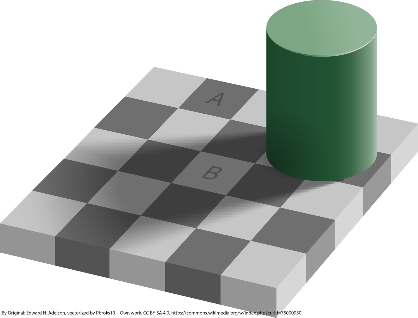
In general, we view images in a different state of adaptation than we’d experience in the original scene. Thus, in order for the colors to appear realistic, we need to change them to account for the difference in adaptation. It’s sort of a paradox: it is necessary to make the colors wrong in an absolute sense so that they appear right to the viewer. The simplest form of this operation is called white balancing. There are many ways to perform corrections for viewer adaptation, such as XYZ Scaling, induced opponent response, Lab shifting, and Von Kries. The algorithm that I prefer is called Bradford. I vaguely remember from somewhere — Eric Chan? — that Lightroom uses Bradford.
In addition to white balancing, there are other kinds of adaptation that humans do that can affect the way that groups of colors are perceived. When I was doing research on image reproduction in the early 1990s, I thought many of these would be incorporated into color management systems long before now. I was wrong. I’ll just mention one effect that is not currently taken into account: the perceived contrast of an image is affected by the brightness of the surround. The people designing slide films, which are intended to be viewed with a dark surround, understood this, and increased the contrast substantially over that of the processing chain that leads to color prints.
With this background on color, we are now ready to look at raw files.
What’s in a RAW File
The camera is responsible for creating the raw file, and the raw developer is tasked with taking that information and making an image from it. The raw file consists of three types of data.
- The raw image data
- A JPEG preview image
- Data about the camera, the conditions of the exposure, and the like. This is collectively called metadata.
The raw image data is the response of each of the camera’s pixels to the light that fell on them during the exposure. If a color filter array (CFA) is used, as it is on most cameras, the file is a monochromatic one, but the CFA needs to be considered in how to interpret the data. A raw file is just a special kind of TIFF file, and you can look at the image data before it gets to the raw developer if you have the right tools. It will look sort of like a black-and-white version of what the camera saw, but with a pattern superimposed.

The white balance information that you enter into the camera or that the camera generates automatically does not affect the raw data. It is stored in metadata fields for use by the raw developer.
Under most conditions, the raw developer ignores the JPEG preview image (Aside; ever wonder why there’s an underscore character in front of some raw files? If it’s there, it indicates that the preview image is in the 1998 Adobe RGB color space; otherwise it’s in sRGB.) The raw developer operates on the raw data using the information in the metadata to produce the image you see in the raw developer.
The Camera’s Contribution to Color
By far, the greatest in-the-camera contributors to the final image color are the spectral characteristics of the three (it’s usually, but not always, three) pigments or dyes in the color filter array (CFA) together with the spectra filtering of the infrared filter (aka hot mirror) and the spectral response of the silicon itself. Fovean sensors are an outlier, and for them, the absorption characteristics of the silicon in the sensor replace the CFA dyes in determining the color information in the raw files.
The in-camera processing between the capture of the image on the sensor and the writing of the raw file has almost nothing to do with the color of the final image. Thankfully, most cameras don’t subtract out the black point before writing the raw file anymore, and visible noise differences away from the darkest shadows are almost entirely due to photon noise. Calibration and white-balance prescaling don’t affect color except to reduce sample variation.
So, the color information encoded in the raw files comes down almost entirely to the hardware.
If all hot mirrors (infrared rejection filters) were perfect, and all CFA filter spectra combined with the silicon frequency response were a linear combination of the responses of the human eye and the raw developer was correctly designed and optimized for accuracy, there would be no difference at all in the color obtainable from various brands and models of cameras. As stated earlier, that condition – known to color aficionados as the Luther-Ives criterion – is met by precisely zero consumer cameras.
The RAW Developer’s Contribution to Color
The raw developer turns the data encoded in the individual planes of the raw file into colors. In this case, as described above, color is a term of art. There is information in the raw file metadata that raw developers can use to convert the image data to color images, but good raw converters ignore that information. Instead, they recognize the camera model and apply precomputed algorithms and lookup tables to convert it to color. The information that describes the differences between cameras and intents (more on intents later) is usually called the color profile. Usually, raw converters offer the user a choice among several raw profiles, and many give the photographer an opportunity to create and install their own profiles. Although not all color profiles are designed this way, I like to think of the color profile as having two components: calibration and intent.
Color Profile Camera Calibration
Because cameras aren’t Luther-Ives devices, it is not possible to map all colors in the photographed scene under all lighting conditions to the same colors in the converted image. The objective of the calibration step is to come as close as possible. The classical way to do that is to generate something called a compromise matrix, multiply it by the data in the raw file, and generate an image in some representation that corresponds to the way most humans see color. The word to describe such an image is colorimetric. There are many colorimetric representations; each one is called a color space. Once an image is encoded in one such colorimetric space, it can be converted to any other by standard mathematical operations, with one significant limitation. Colors outside the range that can be encoded in the destination color space (the jargon is out-of-gamut colors) will be improperly represented.
In the interest of not oversimplifying, I’ve added some details in the above explanation that aren’t strictly necessary. The stripped-down version is camera calibration is an imperfect attempt to get the colors in the image to match the colors in the scene.
Color Profile Intent
Most photographers don’t want their images to have accurate color. They look flat that way, and skin tones look pallid. The second part of the color profile is used to get the “look” that pleases most people. Different distortions from accurate color seem to work best in some circumstances and not in others. Different photographers prefer different color mappings. For these reasons, different profiles are supplied by most raw developer producers. Let’s take Adobe as an example. In Lightroom and Adobe Camera Raw (ACR), there are almost always the following Adobe Standard, Adobe Color, Adobe Portrait, Adobe Landscape, and Adobe Neutral. Adobe Standard is almost always the most accurate. Adobe Color is the most versatile, slightly amping up the colors in Standard to about the point where they are in Capture One’s default profile (I think of Adobe Color as Adobe’s version of New Coke, a formulation designed to make the product more like the chief rival’s offering). Portrait and Landscape are the least accurate, and their purpose is self-explanatory. Neutral is a flat look which is a suitable starting point for many extensive manipulations by the user. For many cameras, Adobe also supplies profiles that start with “Camera”. I’m not sure how the negotiations are carried out, but these profiles seem to represent camera manufacturer’s ideas for what people want. If you have a Fujifilm camera, you will probably see profiles that approximate the look of popular films of yesteryear. If that’s not enough for you, there are many third-party sources for color profiles. If that’s still not enough, you can make your own starting with a kit from XRite or someone else. You can also get software that will allow you to edit your own profiles.
The following image used the Adobe Portrait color profile for development:

The next image used the same development settings except that the profile was changed to Adobe Vivid.

The Relative Impact of Color Profile Intent and Calibration
As users of profiles, we don’t get to separate the calibration and intent components. When we invoke a color profile, we get both. But we can tell which affects the result the most. The way to do that is to compare the results from color profiles from the same sources for the same cameras that have different intents (eg Sony a7RIV with Adobe Color, Adobe Standard, Adobe Portrait, Adobe Landscape, Adobe Vivid). They produce dramatically different results. Then compare the results from profiles with one intent from different cameras (eg Adobe Standard profiles for Sony a7x, a9x, and Nikon Zx cameras). You will find far greater variation among the former set than the latter one, which is evidence that the profile intent is the more important component.
Another way to get an idea of the residual errors from calibration is to make profiles for several different cameras using one of the profile-making software packages, then test the accuracy of those profiles. You will see much less variation among the results than when comparing canned profiles with different intents from different sources.
Some of the Color Differences Are in the Camera
It’s not all in the raw developer. As an example, let’s imagine that a Sony a7RIV sees two spectra that resolve to different colors as the same. No profile will be able to tell which of those spectra produced which set of values in the raw file, and the two different colors will look like the same color in the final image. Now let’s imagine that a Nikon Z7 sees two other different-color spectra as the same, but the Sony sees them as different. The Sony and the Nikon cameras will not produce the same colors from a scene containing the spectra above.
Related Reading
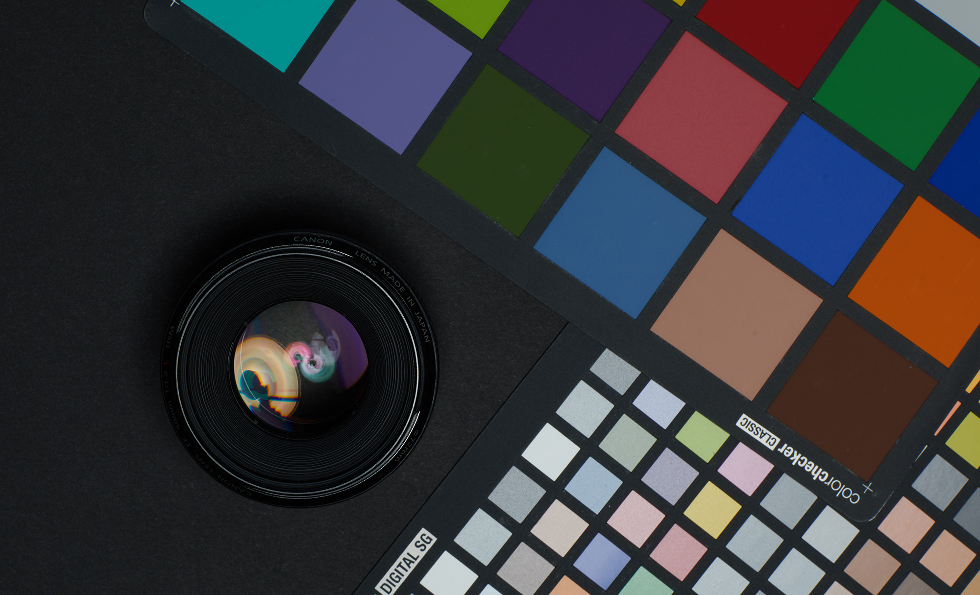
- How to Use an X-Rite ColorChecker to Get Perfect Color
- How Your Camera’s Focus Bracketing System Works
- Why Manufacturers Make a Specific Camera Lens
- Understanding Light Control – Photographing Black on Black and White on White
Author: Jim Kasson
I’ve been a photographer since high school, and an electrical engineer all of my professional life. The two things came together for a while. From 1989 until the middle of 1995, I worked as an IBM Fellow at the Almaden Research laboratory south of San Jose, CA. For those six years, my principal area of research was color management, color processing for digital photography, and color transformations such as gamut mapping. At other times in my career, I researched speech recognition and speech bandwidth compression and developed data acquisition and process control computer systems, telephone switching systems, and data communication systems. I retired in 2000, and for the last 22 years when I’m not serving on NFP boards unrelated to photography, I’ve been spending most of my free time making photographs.-
Sewa Alat Multimedia Pekanbaru
-
Attila Bakos
-
Friedhelm
-
JP
-
Roger Cicala
-
Zach Sutton Photography
